The Trulia Price Monitor and the Trulia Rent Monitor are the earliest leading indicators of how asking prices and rents are trending nationally and locally. They adjust for the changing mix of listed homes and therefore show what’s really happening to asking prices and rents. Because asking prices lead sales prices by approximately two or more months, the Monitors reveal trends before other price indexes do. With that, here’s the scoop on where prices and rents are headed.
Prices Rise 0.8% Month-over-Month in July
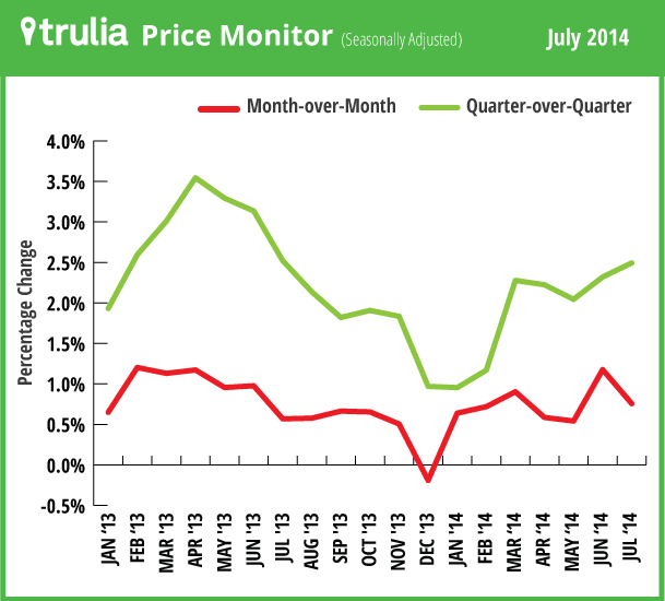
The month-over-month increase in asking home prices of 0.8% was in line with the average monthly gain over the past year, settling back down after a 1.2% month-over-month in June. The quarter-over-quarter increase of 2.5% remains below the level of last spring’s price spurt, when the quarter-over-quarter increase was 3% or higher in March through June 2013.
Although prices aren’t rising as fast as they did in spring 2013, price increases continue to be widespread, with 97 of 100 metros posting year-over-year price gains, and 94 posting quarter-over-quarter gains.

| July 2014 Trulia Price Monitor Summary | |||
| % change in asking prices | # of 100 largest metros with asking-price increases | % change in asking prices, excluding foreclosures | |
| Month-over-month,
seasonally adjusted |
0.8% | N/A | 0.9% |
| Quarter-over-quarter,
seasonally adjusted |
2.5% | 94 | 2.6% |
| Year-over-year | 7.8% | 97 | 7.3% |
| *Data from previous months are revised each month, so data being reported now for previous months might differ from previously reported data. | |||
As Rebound Effect Weakens, Job Growth Takes Center Stage
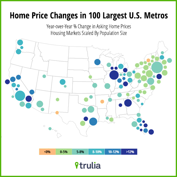
The home-price recovery continues to change shape. For the first time in more than two years, none of the 100 largest U.S. metros had a year-over-year price increase above 15%. Furthermore, the biggest price gains are mostly in the Midwest and South, with only one western market – Riverside-San Bernardino – on the top-10 list for asking-price increases.

| Where Asking Prices Rose Most Year-over-Year, July 2014 | ||||
| # | U.S. Metro | Y-o-Y % asking price change, July 2014 | Y-o-Y % change in jobs, Dec 2013* | Price decline during bust, peak to trough* |
| 1 | Riverside–San Bernardino, CA | 15.0% | 4.3% | -50% |
| 2 | Birmingham, AL | 14.2% | 1.2% | -12% |
| 3 | Miami, FL | 14.1% | 2.5% | -47% |
| 4 | Atlanta, GA | 14.0% | 3.0% | -26% |
| 5 | Detroit, MI | 13.7% | -1.0% | -40% |
| 6 | West Palm Beach, FL | 13.3% | 3.9% | -49% |
| 7 | Cape Coral–Fort Myers, FL | 12.9% | 5.7% | -56% |
| 8 | Chicago, IL | 12.9% | 1.6% | -28% |
| 9 | Lake County-Kenosha County, IL-WI | 12.7% | 2.1% | -27% |
| 10 | Edison–New Brunswick, NJ | 12.4% | 2.2% | -22% |
| Note: among 100 largest metros. Job growth is from the Quarterly Census of Employment and Wages. Peak-to-trough price decline is from the Federal Housing Finance Agency. To download the list of rent changes for the largest metros: Excel or PDF. | ||||
Why are home prices rising faster in these markets than in places like Little Rock, Baltimore, and Rochester, where prices are rising minimally or even falling year-over-year? In part because the housing market is still recovering from the bust, and the local markets where prices had fallen most are now seeing larger price gains – that’s the “rebound effect,” which was fueled by investors and other home buyers scooping up relative bargains. But the rebound effect can’t last forever: once those bargains are gone, there’s no more room to rebound. We’re already seeing price gains slow dramatically or even reverse in some of the boom-bust-and-rebound markets.
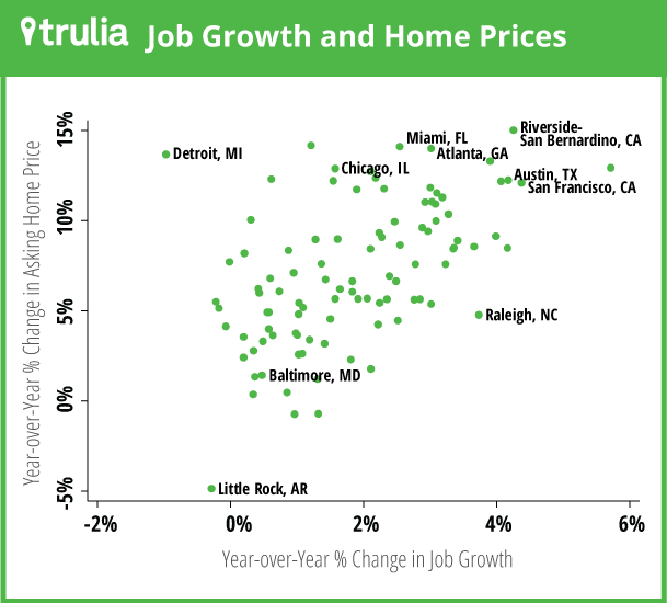
As the rebound effect diminishes, local housing markets need to depend more on job growth, which is a more sustainable driver of housing demand. So are they? We compared year-over-year asking price gains in July 2014 with year-over-year job gains in December 2013, from the Bureau of Labor Statistics’ Quarterly Census of Employment and Wages (QCEW) in the 100 largest U.S. metros (see note). Clearly, housing markets with higher asking-price gains have faster job growth, as the scatterplot shows:

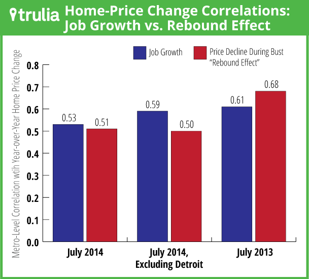
The correlation between price changes and employment changes in July 2014 is 0.53 – a strong and statistically significant relationship. (Remember that correlations range from 1 to -1, where zero means there is no linear relationship.) Detroit is the outlier, with the biggest job loss (-1.0% year-over-year) of any large metro but the fifth-highest home-price gain (see table) – it also has the lowest home prices and highest vacancy rate of any large metro, so it’s a special case in many ways. But excluding Detroit, the correlation between price changes and job growth is 0.59.
By comparison, the correlation between year-over-year price changes and peak-to-trough price decline during the bust in July 2014 is 0.51 (that’s the rebound effect), which is slightly below the correlation between price changes and job growth.

A year ago, the pattern was different: in July 2013, home price changes were more highly correlated with the peak-to-trough price decline than with job growth (year-over-year in December 2012). Over the past year, therefore, the rebound effect has weakened, and as prices continue to return to long-term normal levels the rebound effect will continue to fade. Local housing markets will rely more on jobs and wages to support housing demand and home prices – which is another step on the road to recovery.
Job Growth Boosts Rents in Largest U.S. Rental Markets
Rents rose more than 10% year-over-year in five large rental markets – San Francisco, Sacramento, Oakland, Denver, and Miami. These five markets all had job growth ranging from solid to stellar.Overall, rents rose 6.1% nationally, with rents increasing more in markets with faster job growth. Although both price and rent gains are tied to job growth, rents follow a different logic than prices in other important ways. There’s no “rebound effect” for rents: markets hit harder during the bust don’t necessarily have bigger rent increases today. But at the same time, rents – unlike prices – are rising faster in higher-density metros than in more sprawling markets.
| Rent Trends in the 25 Largest Rental Markets | ||||
| # | U.S. Metro | Y-o-Y % change in rents, July 2014 | Median rent for 2-bedroom, July 2014 | Y-o-Y % change in jobs, Dec 2013* |
| 1 | San Francisco, CA | 14.3% | $3,550 | 4.4% |
| 2 | Sacramento, CA | 14.3% | $1,200 | 2.9% |
| 3 | Oakland, CA | 13.5% | $2,600 | 2.3% |
| 4 | Denver, CO | 11.8% | $1,550 | 3.4% |
| 5 | Miami, FL | 11.6% | $2,450 | 2.5% |
| 6 | San Diego, CA | 9.7% | $2,000 | 2.1% |
| 7 | Philadelphia, PA | 8.8% | $1,600 | 0.6% |
| 8 | Baltimore, MD | 8.8% | $1,600 | 0.5% |
| 9 | Seattle, WA | 8.5% | $1,850 | 3.0% |
| 10 | Chicago, IL | 8.0% | $1,650 | 1.6% |
| 11 | Atlanta, GA | 8.0% | $1,200 | 3.0% |
| 12 | Los Angeles, CA | 7.8% | $2,400 | 2.2% |
| 13 | Phoenix, AZ | 7.5% | $1,050 | 2.8% |
| 14 | Riverside–San Bernardino, CA | 6.1% | $1,550 | 4.3% |
| 15 | St. Louis, MO-IL | 5.8% | $950 | 1.1% |
| 16 | New York, NY-NJ | 5.8% | $3,500 | 2.4% |
| 17 | Las Vegas, NV | 5.3% | $950 | 3.2% |
| 18 | Tampa–St. Petersburg, FL | 5.2% | $1,150 | 2.5% |
| 19 | Boston, MA | 4.9% | $2,400 | 1.8% |
| 20 | Dallas, TX | 4.5% | $1,400 | 2.8% |
| 21 | Houston, TX | 4.2% | $1,500 | 3.3% |
| 22 | Orange County, CA | 4.1% | $2,050 | 1.8% |
| 23 | Portland, OR-WA | 3.4% | $1,300 | 2.9% |
| 24 | Minneapolis–St. Paul, MN-WI | 3.4% | $1,300 | 1.9% |
| 25 | Washington, DC-VA-MD-WV | 3.2% | $2,250 | -0.2% |
| To download the list of rent changes for the largest metros: Excel or PDF. Job growth is from the Quarterly Census of Employment and Wages. | ||||
The next Trulia Price Monitor and Trulia Rent Monitor will be released on Tuesday, September 9.
How did we put this report together? To recap the methodology, the Trulia Price Monitor and the Trulia Rent Monitor track asking home prices and rents on a monthly basis, adjusting for the changing composition of listed homes, including foreclosures provided by RealtyTrac. The Trulia Price Monitor also accounts for the regular seasonal fluctuations in asking prices in order to reveal the underlying trend in prices. The Monitors can detect price movements at least three months before the major sales-price indexes do. Historical data are sometimes revised each month, and historical data in the current release are the best comparison with current data. Our FAQs provide all the technical details.
Note: we use QCEW for job growth because it is more accurate than the payroll survey numbers from the monthly jobs report for metro employment. Although the QCEW is released with a many-month lag, home-price changes tend to reflect lagged employment changes better than they reflect contemporaneous employment changes.

