The Trulia Price Monitor and the Trulia Rent Monitor are the earliest leading indicators of how asking prices and rents are trending nationally and locally. They adjust for the changing mix of listed homes and therefore show what’s really happening to asking prices and rents. Because asking prices lead sales prices by approximately two or more months, the Monitors reveal trends before other price indexes do. With that, here’s the scoop on where prices and rents are headed.
Another Record Month-over-Month Gain: Asking Prices Rise 1.4% in February While Rents Slow
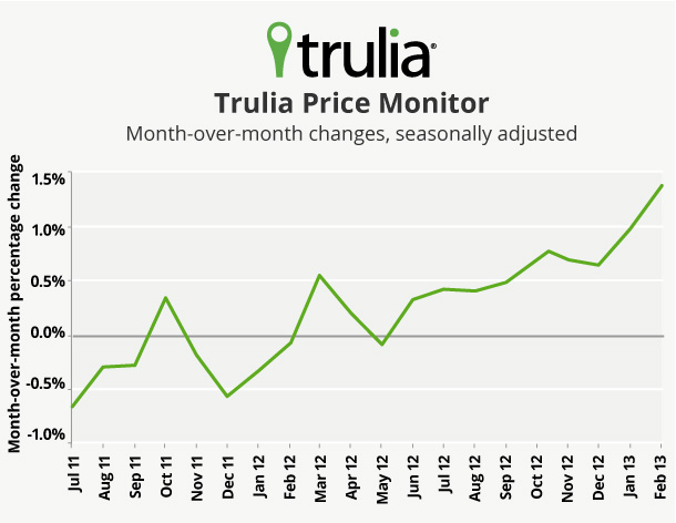
In February, asking prices rose 1.4% month-over-month, seasonally adjusted–the highest monthly gain since the home price recovery began. Year-over-year, asking prices rose 7.0% and were up in 90 of the 100 largest metros, with the biggest gains in Phoenix, Las Vegas, and Oakland. Quarter-over-quarter prices rose 3.0%, seasonally adjusted – yet another post-recession high. February also marks the one-year anniversary of when prices bottomed nationally.
|
February 2013 Trulia Price Monitor Summary |
|||
|
% change in asking prices |
# of 100 largest metros with asking-price increases |
% change in asking prices, excluding foreclosures |
|
| Month-over-month,
seasonally adjusted |
1.4% |
Not reported |
1.6% |
| Quarter-over-quarter,
seasonally adjusted |
3.0% |
92 |
3.5% |
| Year-over-year |
7.0% |
90 |
7.4% |
Rent increases, however, are slowing down, rising just 3.2% year-over-year in February, led by big increases in Houston, Oakland, and Miami. Rents fell slightly in San Francisco and Las Vegas. Three months ago, in November, rents were up 5.4% year-over-year. Prices are now rising faster than rents in 20 of the 25 largest rental markets. (The full list of price and rent changes in the 100 largest metros is available for download here.)
Rising Prices Mean Falling Inventory … in the Short Term
Nationally, inventory fell 23% year-over-year in February, according to the Department of Numbers HousingTracker (whom we thank for sharing their data with us for this analysis). Inventory fell year-over-year in all 50-plus markets they track, and by more than 50% in several California metros. Price increases and disappearing inventory go hand-in-hand: nearly all metros with the biggest inventory declines also had year-over-year price increases of 10% or more, such as Sacramento, San Jose, and Seattle.
Inventory and prices affect each other in three ways:
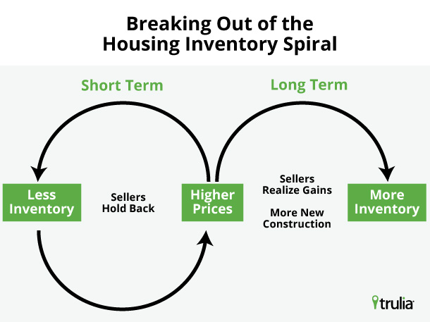
- Less inventory leads to higher prices. That’s because buyers are competing for a limited number of for-sale homes.
- Higher prices lead to less inventory – at least in the short term. Everyone wants to buy at the bottom; no one wants to sell at the bottom. When prices start to rise, buyers get impatient while many would-be sellers want to hold out in the hopes of selling later at a higher price.
- Higher prices lead to more inventory – in the long term. As prices keep rising, more homeowners decide it’s worthwhile to sell, especially those who get back above water, which adds to inventory. Also, builders take rising prices as a cue to rev up construction activity, which also adds to inventory.
In the short term, the first two reasons create an “inventory spiral”: less inventory leads to higher prices, which leads to less inventory, and so on. But the inventory spiral can’t go on forever because eventually rising prices will encourage homeowners to sell and builders to build, which add to inventory and breaks the spiral. The critical question for the housing market – especially for buyers fighting over tight inventories – is how long until that kicks in? How long do prices have to rise before sellers and builders start adding to inventory?
When Will Inventory Turn Around?
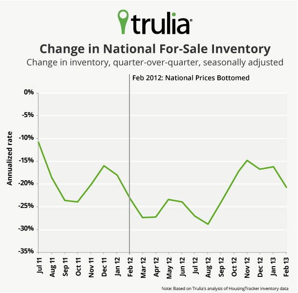
Nationally, inventory is no longer in a free fall. The seasonally adjusted quarter-over-quarter change in inventory is negative, but no longer falling as sharply as it did a few months ago. (Year-over-year changes are slower to show a turnaround because they combine a full year’s worth of changes in a single measure. But looking at quarterly or monthly changes requires a seasonal adjustment because inventory has a strong seasonal pattern that makes the underlying trend hard to see.) The quarter-over-quarter decline in inventory has been at a 14-21% annualized rate since October 2012, compared with a 23-29% annualized rate from March 2012 to September 2012:
In other words, the inventory decline was sharpest just after national prices bottomed in February 2012. But by the fall of 2012, after several months of price increases, the inventory stopped declining as fast even though national price gains accelerated.
How long until inventory turns positive, rather than becoming just less negative? Although prices bottomed nationally 12 months ago, different metros hit their price bottoms at different times. Among the markets with the biggest year-over-year price gains, prices bottomed 2 years ago, give or take, in Phoenix, Miami, and Detroit. In Las Vegas, Oakland, and Sacramento, though, prices bottomed just 1 year ago, even though they’ve also posted dramatic year-over-year gains since then.
|
Metros with Largest Price Gains, Year-over-Year, February 2013 |
|||
|
# |
U.S. Metro |
Y-o-Y % change in asking prices, Feb 2013 |
Months since asking prices bottomed |
|
1 |
Phoenix, AZ |
24.9% |
22 |
|
2 |
Las Vegas, NV |
20.7% |
12 |
|
3 |
Oakland, CA |
19.0% |
12 |
|
4 |
San Jose, CA |
18.5% |
20 |
|
5 |
Sacramento, CA |
18.1% |
12 |
|
6 |
Warren–Troy– |
18.0% |
23 |
|
7 |
Bakersfield, CA |
16.9% |
12 |
|
8 |
Salt Lake City, UT |
16.5% |
12 |
|
9 |
Riverside– |
14.9% |
13 |
|
10 |
Miami, FL |
14.0% |
25 |
|
11 |
Orange County, CA |
13.8% |
13 |
|
12 |
Detroit, MI |
13.7% |
21 |
|
13 |
San Francisco, CA |
13.6% |
13 |
|
14 |
Cape Coral–Fort Myers, FL |
13.4% |
27 |
|
15 |
Atlanta, GA |
13.3% |
12 |
|
16 |
Seattle, WA |
13.1% |
12 |
|
17 |
Minneapolis– |
12.8% |
20 |
|
18 |
West Palm Beach, FL |
12.5% |
19 |
|
19 |
Fresno, CA |
12.3% |
12 |
|
20 |
Portland, OR-WA |
11.7% |
13 |
| Among the 100 largest metros | |||
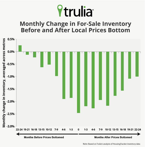
Because prices turned around at different times in different metros, and some metros have seen prices rise for 2 years or more, metro-level inventory changes show what might happen to inventory nationally as the price rebound continues. Averaging across metros, inventory tightens most 0-6 months after local prices bottom:
This chart shows that inventory really starts to tighten 4-6 months before prices bottom. The sharpest inventory decline, though, is during and just after prices bottom: in the first six months of rising prices, inventory falls by more than 2% per month, on average. After that, inventory keeps declining, but at a slower rate: 16-18 months after prices bottom, inventory typically falls by 1.6% per month. Then, 19-24 months after prices bottom, inventory falls by roughly 1% per month, less than half the rate of decline than in the months just after prices bottom.
In short: the longer prices rise, the less inventory declines. That’s because higher prices eventually encourage more homeowners to sell and builders to build. The effect seems to kick in after the first twelve months of price increases, when the market starts to break out of the inventory spiral, and inventory declines less sharply. Nonetheless, metros where prices have been rising for more than 18 months, like Phoenix and Miami, are still seeing inventory decline.
Now, the punchline: it could be at least another year until national inventory starts expanding. Of course, inventory will probably turn up this spring and summer because of the regular seasonal pattern, but the underlying trend will be less inventory than is typical for each season, not more. The experience of metros where prices bottomed earliest suggests that inventory continues to decline even after 2 years of price increases. It also means that inventory should turn around first in metros where prices bottomed first, such as Phoenix, Miami, Detroit, Houston, and Oklahoma City, and later in metros where prices bottomed more recently, such as Sacramento and California’s Inland Empire. Still, inventory is no longer in free-fall nationally: quarter-over-quarter inventory declines are milder now than they were in the months just after prices bottomed 1 year ago. Ultimately, the inventory turnaround will depend not only on how fast prices are rising, but also on whether prices will have been rising for long enough to encourage homeowners to sell and builders to build.
The next Trulia Price Monitor and Trulia Rent Monitor will be released on Thursday, April 4, at 10 AM ET.
How did we put this report together? To recap the methodology, the Trulia Price Monitor and the Trulia Rent Monitor track asking home prices and rents on a monthly basis, adjusting for the changing composition of listed homes, including foreclosures provided by RealtyTrac. The Trulia Price Monitor also accounts for the regular seasonal fluctuations in asking prices in order to reveal the underlying trend in prices. The Monitors can detect price movements at least three months before the major sales-price indexes do. Our FAQs provide all the technical details.


