First, the good news: Rents in the nation’s top 25 rental markets have dropped slightly. The bad news? For the most part, rental homes are still expensive and in some places rental costs are rising.
We conducted a follow up study to our analysis on how high rents were at the end of last year. We found that rents in the 25 metro areas with the largest rental markets declined 1.6% from 2015 to 2016. But relative to historical pricing, rents are still very high, and have become less affordable in areas that had been financially accessible.
Proportion of Affordable Rental Listings By Metro Area
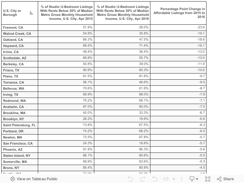
For instance, the Oakland metro area, or East Bay, saw the proportion of affordable studio to two-bedroom listings drop the most, 19.8 percentage points, from 2015 to 2016. Orange County, Calif., metro saw a 10.8 percentage point drop, and Phoenix saw a 9.4 percentage point drop. Rents in Oakland, Orange County, and Phoenix metro areas increased 13.1%, 0.8%, and 8.5%, respectively.
Cities in the Oakland metro area saw the number of affordable studio to two-bedroom listings drop the most – Fremont, Walnut Creek, Oakland, Hayward, and Berkeley saw the number of affordable listings decline by nearly one-fifth (-19.8 percentage points) from a year ago.
Among the other findings (note, we distinguish between cities and metro areas, the close-in regions and populations around cities):
- Miami (6.9% affordable, $1,950 median monthly rent), New York (19.6%, $2,354), and San Francisco (22.2%, $3,500) are home to the nation’s least-affordable rental markets with sky-high rents.
- Of the five New York City boroughs, Brooklyn saw its share of affordable studio to two-bedroom listings drop the most – a 6.6 percentage point drop from 2015 to 2016.
- Manhattan came in last with a 1.2 percentage point drop in affordable listings. Manhattan still has the least proportion of affordable listings among the five boroughs with only 3.6% of studio to two-bedroom listings considered affordable.
- The City of San Francisco saw a 5.7 percentage point drop in affordable studio to two-bedroom listings from 24.3% to 18.6%.
- Dallas area cities Frisco (-10.6 percentage points), Plano (-9.7 percentage points) and Irving (-7.9 percentage points) saw their share of affordable listings decrease. On the other hand, the City of Dallas itself saw the percentage of affordable listings increase by 7.9 percentage points.
- Along with Dallas, Chicago (+8.5 p.p.), and Philadelphia (+10.p.p.) metro areas saw the proportion of affordable listings increase the most.
- Cities Chicago and Philadelphia saw the share of affordable studio to two-bedroom listings jump by 8.4 and 10.0 percentage points, respectively.
Revisiting Where the Rent Was Too Damn High
In the cities of New York, San Francisco, Boston, Los Angeles, and Washington, rents have maintained their high levels for one-bedroom apartments in most cases, and in some neighborhoods, rents have gotten even more expensive. For two-bedroom apartments, results are a bit more mixed. But bottom line, rents for both one-bedroom and two-bedroom apartments are, in the words of Jimmy McMillan, still “too damn high.”
In San Francisco, 61.3% of one-bedroom homes are going for $3,000 or more per month — 6.3 percentage points higher than what we previously reported last year. Meanwhile, 40.4% of one-bedroom homes in Washington are listed for $2,000-plus per month — 2 percentage points higher than our previous findings. Some places did see these price levels drop slightly. For instance, Manhattan saw a 1.5 percentage point decrease in $3,000-plus one-bedroom listings. Boston similarly saw a 2.1 percentage point decrease in $3,000-plus one-bedrooms.
Share of Highly Priced 1-Bedroom Rental Listings, April 2016
| City or Borough | % of 1-Bedrooms Renting for $2000+/Mo | % of 1-Bedrooms Renting for $2500+/Mo | % of 1-Bedrooms Renting for $3000+/Mo | % of 1-Bedrooms Renting for $4000+/Mo |
| San Francisco | 92.3% | 83.3% | 61.3% | 19.2% |
| Manhattan (NYC) | 89.0% | 74.6% | 56.0% | 20.4% |
| Boston | 66.1% | 31.6% | 11.7% | 2.1% |
| Brooklyn (NYC) | 51.5% | 29.9% | 15.1% | 2.2% |
| Washington, D.C. | 40.4% | 16.2% | 7.2% | 1.6% |
| Los Angeles | 33.2% | 17.4% | 9.7% | 3.2% |
| Queens (NYC) | 25.9% | 11.0% | 4.1% | 0.3% |
| Note: Sorted by % of 1-bedrooms renting for $2,000+/month. | ||||
For Two-Bedroom Apartment Rentals, The Outlook Is Mixed
Two-bedroom apartments showed even more mixed results for different price points and cities. San Francisco was the exception in that there were no decreases in these metrics at any price point. San Francisco two-bedroom apartments saw a 2 percentage point rise in $4,000-plus units, a 1.5 percentage point rise in $3,000-plus units, and a 0.5 percentage point rise in $2,500-plus units. Los Angeles, Manhattan, and Boston, on the other hand, saw decreases: In Manhattan, there was a 0.5 percentage point drop in $4,000-plus two-bedroom units and a much larger 2.9 percentage point drop in $3,000-plus units. Boston saw a 4.3 percentage point drop and L.A. saw a 2.6 percentage point drop in $3,000-plus units.
Share of Highly Priced 2-Bedroom Rental Listings, April 2016
| City or Borough | % of 2-Bedrooms Renting for $2000+/Mo | % of 2-Bedrooms Renting for $2500+/Mo | % of 2-Bedrooms Renting for $3000+/Mo | % of 2-Bedrooms Renting for $4000+/Mo |
| San Francisco | 97.7% | 96.2% | 92.3% | 65.3% |
| Manhattan(NYC) | 95.0% | 86.5% | 73.2% | 47.2% |
| Boston | 86.2% | 63.3% | 35.2% | 9.9% |
| Washington, D.C. | 75.7% | 57.6% | 31.9% | 10.4% |
| Los Angeles | 75.3% | 53.7% | 33.1% | 13.2% |
| Brooklyn (NYC) | 73.7% | 45.2% | 26.0% | 10.0% |
| Queens (NYC) | 63.0% | 24.6% | 10.2% | 2.9% |
| Bronx (NYC) | 12.5% | 4.1% | 1.4% | 0.2% |
| Note: Sorted by % of 2-bedrooms renting for $2,000+/month | ||||
San Francisco
San Francisco Neighborhoods With the Most Expensive One-Bedroom Rentals
| # | Neighborhood | % of 1-Bedrooms Renting for More than $3,000 | Median Rent |
| 1 | South Beach | 89.0% | $3,950 |
| 2 | Castro | 84.4% | $3,798 |
| 3 | Fisherman’s Wharf | 83.3% | $3,575 |
| 4 | Pacific Heights | 80.5% | $3,650 |
| 5 | Mission Bay | 79.8% | $3,650 |
| 6 | Telegraph Hill | 79.7% | $3,623 |
| 7 | Buena Vista Park | 77.1% | $3,500 |
| 8 | Duboce Triangle | 74.3% | $3,735 |
| 9 | Mission | 73.3% | $3,400 |
| 10 | Mission Dolores | 71.7% | $3,448 |
Manhattan
Manhattan Neighborhoods With the Most Expensive One-Bedroom Rentals
| # | Neighborhood | % of 1-Bedrooms Renting for More than $3,000 | Median Rent |
| 1 | Tribeca | 98.4% | $4,395 |
| 2 | Battery Park City | 92.0% | $3,805 |
| 3 | Midtown South Central | 90.0% | $4,250 |
| 4 | Koreatown | 89.8% | $3,650 |
| 5 | Flatiron District | 89.0% | $4,245 |
| 6 | Civic Center | 87.5% | $3,550 |
| 7 | NoHo | 86.2% | $3,850 |
| 8 | Hell’s Kitchen | 85.7% | $3,550 |
| 9 | Stuyvesant Town | 85.4% | $3,395 |
| 10 | Theater District – Times Square | 84.6% | $3,700 |
Brooklyn
| # | Neighborhood | % of 1-Bedrooms Renting for More than $3,000 | Median Rent |
| 1 | Vinegar Hill | 90.7% | $3,785 |
| 2 | Downtown/DUMBO | 55.6% | $3,078 |
| 3 | Brooklyn Heights | 49.3% | $3,000 |
| 4 | Greenpoint | 44.7% | $2,900 |
| 5 | Cobble Hill | 42.7% | $2,900 |
| 6 | West Brighton | 41.0% | $2,945 |
| 7 | Boerum Hill | 38.1% | $2,800 |
| 8 | Fort Greene | 34.0% | $2,750 |
| 9 | Red Hook | 28.5% | $2,000 |
| 10 | Williamsburg | 24.5% | $2,600 |
Queens
Queens Neighborhoods With the Most Expensive One-Bedroom Rentals
| # | Neighborhood | % of 1-Bedrooms Renting for More than $2,000 | Median Rent |
| 1 | Hunters Point | 97.4% | $2,995 |
| 2 | Clearview | 51.8% | $2,100 |
| 3 | Astoria | 39.3% | $1,900 |
| 4 | Rego Park | 30.7% | $1,835 |
| 5 | Sunnyside | 30.2% | $1,900 |
| 6 | Forest Hills | 23.8% | $1,850 |
| 7 | Ditmars Steinway | 14.7% | $1,750 |
| 8 | Ridgewood | 12.2% | $1,600 |
| 9 | College Point | 11.2% | $1,400 |
| 10 | Flushing | 10.2% | $1,650 |
Boston
Boston Neighborhoods With the Most Expensive One-Bedroom Rentals
| # | Neighborhood | % of 1-Bedrooms Renting for More than $2,000 | Median Rent |
| 1 | Chinatown/Leather District | 96.3% | $3,045 |
| 2 | West End | 92.9% | $2,515 |
| 3 | Downtown Boston | 90.5% | $2,928 |
| 4 | Back Bay | 85.9% | $2,500 |
| 5 | South End | 81.4% | $2,500 |
| 6 | Bay Village | 75.4% | $2,400 |
| 7 | Beacon Hill | 74.5% | $2,275 |
| 8 | Charlestown | 73.1% | $2,300 |
| 9 | Fenway-Kenmore | 67.0% | $2,200 |
| 10 | South Boston | 61.9% | $2,200 |
Los Angeles
Los Angeles Neighborhoods With the Most Expensive One-Bedroom Rentals
| # | Neighborhood | % of 1-Bedrooms Renting for More than $2,000 | Median Rent |
| 1 | Downtown Los Angeles | 87.1% | $2,600 |
| 2 | Century City | 72.9% | $2,775 |
| 3 | Brentwood | 68.1% | $2,195 |
| 4 | Westwood | 67.4% | $2,425 |
| 5 | Beverly Center | 55.6% | $2,200 |
| 6 | Bel Air | 51.4% | $2,100 |
| 7 | Hollywood Hills | 49.1% | $2,000 |
| 8 | Miracle Mile | 49.1% | $1,995 |
| 9 | Melrose | 48.9% | $2,000 |
| 10 | CBS Television City | 48.5% | $1,998 |
Washington, D.C.
Washington Neighborhoods With the Most Expensive One-Bedroom Rentals
| # | Neighborhood | % of 1-Bedrooms Renting for More than $2,000 | Median Rent |
| 1 | Downtown | 87.9% | $2,398 |
| 2 | Mount Vernon Square | 80.1% | $2,495 |
| 3 | George Washington University | 79.4% | $3,037 |
| 4 | Cardozo-Shaw | 72.7% | $2,250 |
| 5 | West End | 72.4% | $2,495 |
| 6 | Logan Circle-Shaw | 71.2% | $2,400 |
| 7 | Dupont Circle | 67.8% | $2,200 |
| 8 | Georgetown | 67.3% | $2,400 |
| 9 | Woodley Park | 63.2% | $2,200 |
| 10 | Kalorama Heights | 63.2% | $2,190 |
Methodology
Unless specified otherwise, rent percent-increase metrics are based on median advertised-rent-per-square-foot for studio to two-bedroom listings from 2014 to 2016 on a year-over-year basis from April 2015 to April 2016. Current median rent figures were calculated using trailing 1-year data as of April 2016. Unless specified otherwise, rent-percent increase and median rent metrics were calculated at the metro area level, not at the city level. We define affordable rental listings as rental listings whose advertised rent is less than 30% of inflation adjusted median gross household income for a given geography. Following this definition, we computed affordability metrics for each of the 25 metro areas with the largest rental markets using studio to two-bedroom listings found on our site for 2016. We repeated this exercise for 2015 and compared the two years to spot changes in affordability. We calculated affordability metrics for cities belonging to the top 25 rental metro areas. For this calculation, we used inflation adjusted median household income of the metro area which the city belongs to and studio to two-bedroom listings found within the city for 2016. We repeated this exercise for 2015 and compared the numbers. Then we ranked cities by the degree to which affordable listings disappeared. Cities that did not have a large enough number of listings in either 2016 or 2015 were excluded from the study.