The Trulia Price Monitor and the Trulia Rent Monitor are the earliest leading indicators of how asking prices and rents are trending nationally and locally. They adjust for the changing mix of listed homes and therefore show what’s really happening to asking prices and rents. Because asking prices lead sales prices by approximately two or more months, the Monitors reveal trends before other price indexes do. With that, here’s the scoop on where prices and rents are headed.
Asking Prices Rise a Record 0.9% Month-over-Month Nationally
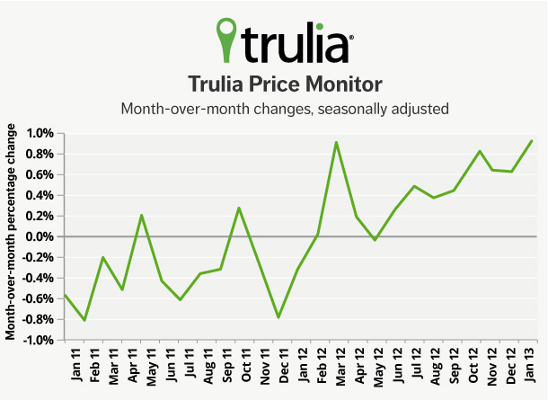
In January, asking prices rose 0.9% month-over-month, seasonally adjusted — the highest monthly gain since the price recovery began. Year-over-year, asking prices rose 5.9%; excluding foreclosures, asking prices rose 6.5%. Quarter-over-quarter prices rose 2.2%, seasonally adjusted. Prices typically fall in the wintertime, but asking prices still rose slightly (0.3%) quarter-over-quarter even without seasonal adjustment, indicating the strength of the price recovery. Asking prices were up year-over-year in 86 of the 100 largest metros.
|
January 2013 Trulia Price Monitor Summary |
|||
|
% change in asking prices |
# of 100 largest metros with asking-price increases |
% change in asking prices, excluding foreclosures |
|
| Month-over-month,
seasonally adjusted |
0.9% |
Not reported |
1.2% |
| Quarter-over-quarter,
seasonally adjusted |
2.2% |
79 |
2.9% |
| Year-over-year |
5.9% |
86 |
6.5% |
Most Housing Markets with Biggest Price Gains Aren’t Healthy
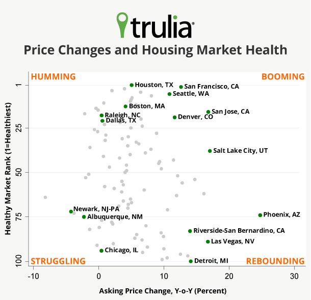
Should we all envy Phoenix, where prices have risen 24.8% year-over-year? Probably not. Huge price gains in Phoenix and elsewhere are not necessarily a healthy sign. As part of our 2013 housing outlook, we ranked the 100 largest metros on the health of their housing markets, based on three market fundamentals: strong job growth, low vacancy rate, and low foreclosure inventory. On this list of healthiest markets, Houston ranked #1.
Weaknesses on these fundamentals are red flags for a local housing market – even when prices are galloping ahead. Few of the markets with the biggest price gains are “healthy” in terms of these fundamentals: eight of the 10 top price gainers were in the bottom half of the “healthy markets” ranking. For example, Detroit – despite a 14.2% price increase – was dead last, ranked 100 out of 100. None of the 10 markets with the largest price gains was also among the top 10 healthiest markets for 2013, though San Francisco came close, with the 11th largest price increase and the 2nd healthiest market.
| # | U.S. Metro |
Y-o-Y % change in asking prices, Jan 2013 |
Healthy Market Rank (1=healthiest, 100=least healthy) |
| 1 | Phoenix, AZ |
24.8% |
74 |
| 2 | Salt Lake City, UT |
17.1% |
38 |
| 3 | San Jose, CA |
16.8% |
16 |
| 4 | Las Vegas, NV |
16.8% |
89 |
| 5 | Warren–Troy– |
16.1% |
62 |
| 6 | Oakland, CA |
14.8% |
54 |
| 7 | Detroit, MI |
14.2% |
100 |
| 8 | Riverside– |
14.0% |
83 |
| 9 | West Palm Beach, FL |
13.7% |
97 |
| 10 | Sacramento, CA |
12.8% |
56 |
Although most of the housing markets with big price gains exhibit unhealthy fundamentals, some markets with rising prices are healthy. Furthermore, modest price increases aren’t necessarily a sign of poor health: markets with flat or falling prices include both healthy and unhealthy markets. Looking at both price gains and market health reveals four types of local housing markets:
- Booming markets have big price increases and healthy market fundamentals. Their price gains are supported by strong job growth, and future foreclosures are unlikely to threaten today’s price increases. San Francisco, Seattle, Denver, San Jose, and Salt Lake City are the best examples of booming markets.
- Rebounding markets also have big price increases, but with weaker market fundamentals. They had big price declines during the housing bust, and bargains have attracted investor interest, which has helped boost prices. These rollercoaster markets won’t sustain the price gains they’re seeing now because investors will look elsewhere – and eventually sell – when no bargains are left to be found. Rebounding markets include Phoenix, Las Vegas, Riverside–San Bernardino, and Detroit.
- Humming markets have strong market fundamentals without dramatic price gains. They’re humming along after avoiding the worst of the housing bubble and bust. Moreover, many are now seeing lots of construction activity. Houston, Boston, Raleigh, and Dallas are good examples of humming markets.
- Struggling markets don’t have either strong market fundamentals or big price gains. Even though the rebounding markets suffered more during the housing bust, these struggling markets haven’t benefitted much from the housing recovery. Struggling markets include Newark, Chicago, and Albuquerque.
This scatter plot shows that price gains and market health often don’t go hand-in-hand:
Rent Gains Ease As Rental Supply Expands
Nationally, rents rose 4.1% year-over-year, falling behind the year-over-year national asking-price gain for the first time since the price recovery began. Just six months ago, in July 2012, the year-over-year increase in rents nationally was 4.7%.
Rent gains have slowed because of more supply, not less demand. Rental demand remains strong, and the homeownership rate remains at its lowest level in many years. But supply is expanding as more new multi-unit buildings, many of which are rental buildings, have come onto the market. The number of completed units in multi-unit buildings was up 23% in the second half of 2012, year-over-year. In contrast, completed single-family homes were up just 11%. In San Francisco, where rent gains cooled the most (2.4% now versus 11.5% six months ago), construction activity has been well above normal, nearly all in multi-unit buildings.
|
Where Rent Increases Have Cooled Off Most |
||||
| # | U.S. Metro |
% change in rents, Y-o-Y, Jan 2013 |
% change in rents, Y-o-Y, Jul 2012 |
Percentage Point Difference* |
| 1 | San Francisco, CA |
2.4% |
11.5% |
-9.1% |
| 2 | Portland, OR-WA |
4.7% |
9.2% |
-4.4% |
| 3 | Seattle, WA |
6.4% |
10.8% |
-4.4% |
| 4 | Denver, CO |
7.4% |
10.3% |
-2.9% |
| 5 | San Diego, CA |
2.0% |
4.4% |
-2.4% |
| 6 | Boston, MA |
6.0% |
8.2% |
-2.2% |
| 7 | Philadelphia, PA |
4.6% |
6.4% |
-1.8% |
| 8 | Sacramento, CA |
2.0% |
3.8% |
-1.8% |
| 9 | St. Louis, MO-IL |
2.1% |
3.4% |
-1.3% |
| 10 | Miami, FL |
9.1% |
10.2% |
-1.2% |
| 11 | Minneapolis– |
3.3% |
4.4% |
-1.1% |
| 12 | Washington, DC-VA-MD-WV |
2.6% |
3.7% |
-1.1% |
| 13 | Atlanta, GA |
4.5% |
5.2% |
-0.6% |
| 14 | New York, NY-NJ |
5.0% |
5.6% |
-0.6% |
| 15 | Oakland, CA |
10.0% |
10.6% |
-0.5% |
| 16 | Chicago, IL |
4.9% |
5.2% |
-0.3% |
| 17 | Tampa– |
3.8% |
3.9% |
-0.1% |
| 18 | Baltimore, MD |
3.9% |
3.9% |
-0.1% |
| 19 | Orange County, CA |
4.2% |
4.1% |
0.0% |
| 20 | Las Vegas, NV |
-0.2% |
-1.7% |
1.6% |
| 21 | Phoenix, AZ |
2.9% |
0.7% |
2.2% |
| 22 | Dallas, TX |
4.9% |
2.5% |
2.5% |
| 23 | Los Angeles, CA |
3.7% |
0.8% |
2.9% |
| 24 | Riverside– |
4.6% |
0.4% |
4.2% |
| 25 | Houston, TX |
15.8% |
8.8% |
7.1% |
| Among 25 largest rental markets. | ||||
*All figures are rounded, and differences (rightmost column) were calculated before rounding, so some differences shown may not equal the difference of the rounded values.
The next Trulia Price Monitor and Trulia Rent Monitor will be released on Tuesday, March 5, at 10 AM ET.
How did we put this report together? To recap the methodology, the Trulia Price Monitor and the Trulia Rent Monitor track asking home prices and rents on a monthly basis, adjusting for the changing composition of listed homes, including foreclosures provided by RealtyTrac. The Trulia Price Monitor also accounts for the regular seasonal fluctuations in asking prices in order to reveal the underlying trend in prices. The Monitors can detect price movements at least three months before the major sales-price indexes do. Our FAQs provide all the technical details.


