The Trulia Price Monitor and the Trulia Rent Monitor are the earliest leading indicators of housing price and rent trends nationally and locally. They adjust for the changing mix of listed homes and show what’s really happening to asking prices and rents. Asking prices lead sales prices by approximately two or more months. As a result, the Monitors reveal trends before other price indexes do. Here then is the scoop on where prices and rents are headed.
Asking Prices Slowed in December, Rising 0.5% Month-Over-Month
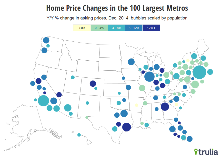
Nationwide, asking prices on for-sale homes were up 0.5% month-over-month in December, seasonally adjusted — a slowdown after larger increases in September, October, and November. Year-over-year, asking prices rose 7.7%, down from the 9.5% year-over-year increase in December 2013. Asking prices increased year-over-year in 97 of the 100 largest U.S. metros.
| December 2014 Trulia Price Monitor Summary | |||
| % change in asking prices | # of 100 largest metros with asking-price increases | % change in asking prices, excluding foreclosures | |
| Month-over-month, seasonally adjusted | 0.5% | N/A | 0.7% |
| Quarter-over-quarter, seasonally adjusted | 3.4% | 87 | 3.7% |
| Year-over-year | 7.7% | 97 | 8.1% |
| Data from previous months are revised each month, so current data reported for previous months might differ from previously reported data. | |||
Where and When Falling Oil Prices Will Hurt — Or Help — Home Prices
Four of the five markets where asking prices rose most year-over-year are in the South, including Atlanta, Cape Coral-Fort Myers, North Port-Sarasota-Bradenton, and Deltona-Daytona Beach-Ormond Beach. Of the top 10, four are in the Midwest, including Cincinnati, Detroit, Lake-Kenosha Counties, and Indianapolis. Among markets with the largest asking price increases, Houston stands out for having a large local oil industry, accounting for 5.6% of jobs there.
| Where Prices Increased Most in December | |||
| # | U.S. Metro | Y-o-Y % asking price change, Dec 2014 | % of jobs in oil-related industries |
| 1 | Atlanta, GA | 15.9% | 0.3% |
| 2 | Cape Coral-Fort Myers, FL | 15.5% | 0.1% |
| 3 | North Port-Sarasota-Bradenton, FL | 15.0% | 0.1% |
| 4 | Cincinnati, OH | 14.8% | 0.1% |
| 5 | Deltona-Daytona Beach-Ormond Beach, FL | 14.7% | 0.1% |
| 6 | Oakland, CA | 14.5% | 0.4% |
| 7 | Houston, TX | 13.4% | 5.6% |
| 8 | Detroit, MI | 12.9% | 0.6% |
| 9 | Lake-Kenosha Counties, IL-WI | 12.7% | 0.1% |
| 10 | Indianapolis, IN | 12.6% | 0.2% |
| Note: among 100 largest metros. Employment in oil-related industries is from County Business Patterns, 2012 (see note at end of post). To download the list of asking home price changes for the largest metros: Excel or PDF. | |||

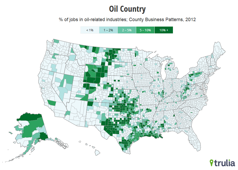
Only Bakersfield and Baton Rouge have an even higher employment share in oil-related industries than Houston. Oklahoma City, Tulsa, New Orleans, and Fort Worth round out the seven large metros where oil-related industries account for at least 2% of employment. It’s not until you look at smaller metros that you find oil-related industries representing a larger employment share. In Williston, ND, and Midland, TX, they account for almost 30% of local jobs.

On average, in the seven large metros where oil-related jobs are at least 2% of the total, home prices rose 10.5% year-over-year — faster than the 7.7% increase for the 100 largest metros overall.
| Home Price Changes in Top Oil-Employment Markets | |||
| # | U.S. Metro | Y-o-Y % asking price change, Dec 2014 | % of jobs in oil-related industries |
| 1 | Bakersfield, CA | 12.4% | 6.9% |
| 2 | Baton Rouge, LA | 3.0% | 6.1% |
| 3 | Houston, TX | 13.4% | 5.6% |
| 4 | Oklahoma City, OK | 6.3% | 4.3% |
| 5 | Tulsa, OK | 10.1% | 3.7% |
| 6 | New Orleans, LA | 7.3% | 2.6% |
| 7 | Fort Worth, TX | 10.2% | 2.5% |
| 8 | Gary, IN | 7.3% | 1.8% |
| 9 | Wichita, KS | 5.3% | 1.4% |
| 10 | Toledo, OH | 10.2% | 1.0% |
| Note: among 100 largest metros. Employment in oil-related industries is from County Business Patterns, 2012 (see note at end of post). | |||
Oil prices have plunged from over $100/barrel in July 2014 to around $50/barrel in early January 2015, threatening oil-producing economies around the world. Within the U.S., big oil price drops have historically been associated with job losses and falling home prices in energy-producing regions. In particular, plummeting oil prices in the 1980s were followed by declines in employment and home prices in Houston, Oklahoma City, Tulsa, New Orleans, and other nearby markets.
We looked at year-over-year trends in oil prices, jobs, and home prices from 1980 to the present in the 100 largest metros and found that:
- In oil-producing markets, home prices tend to follow oil prices, but with a lag. For instance, in the 1980s, the largest year-over-year oil price declines were in early- and mid-1986. In Houston, job losses were steepest in late 1986. But home prices didn’t slide most until the third quarter of 1987. Since 1980, employment in oil-producing markets has followed oil-price movements roughly two quarters later and home prices have followed oil-price movements roughly two years later.
- While home prices and oil prices move in the same direction in oil-producing markets, they tend to move in the opposite direction in many other markets. Cheaper oil lowers the costs of driving, heating a home, and other activities, boosting local economies outside oil-producing regions. In the Northeast and Midwest especially, home prices tend to rise after oil prices fall. The specific markets where home prices get the biggest jolt depend on which years we analyze.
This history offers three lessons for today’s housing market. First, any negative impact of falling oil prices on home prices should be concentrated in oil-producing markets in Texas, Oklahoma, Louisiana, and other places with large oil-related industries. Second, in these markets, oil prices won’t tank home prices immediately. Rather, falling oil prices in the second half of 2014 might not have their biggest impact on home prices until late 2015 or in 2016. Third, falling oil prices will probably help local economies and home prices in markets that lack oil-related industries.
Rental Affordability Toughest in Miami, Los Angeles, and New York
Nationwide, rents rose 6.1% year-over-year in December. The least affordable rental markets are Miami, Los Angeles, and New York, where median rent for a two-bedroom unit eats up more than half of the local average wage. Rents are rising faster than the national average in the markets that are already the least affordable. The most affordable large rental markets are St. Louis, Phoenix, and Houston. Although Denver had the largest year-over-year increases, Denver rentals remain more affordable than those in most of the big coastal markets.
| Rent Trends in the 25 Largest Rental Markets | ||||
| # | U.S. Metro | Y-o-Y % change in rents, Dec 2014 | Median rent for 2-bedroom, Dec 2014 | Median rent for 2-bedroom as share of average local wage |
| 1 | Miami, FL | 7.4% | 2300 | 57% |
| 2 | Los Angeles, CA | 7.0% | 2450 | 53% |
| 3 | New York, NY | 9.3% | 3200 | 52% |
| 4 | Oakland, CA | 11.6% | 2400 | 45% |
| 5 | San Francisco, CA | 10.8% | 3600 | 45% |
| 6 | Riverside-San Bernardino, CA | 5.0% | 1500 | 44% |
| 7 | Orange County, CA | 7.4% | 2050 | 44% |
| 8 | San Diego, CA | 4.1% | 1950 | 42% |
| 9 | Cambridge-Newton-Framingham, MA | 6.8% | 2250 | 39% |
| 10 | Boston, MA | 4.3% | 2300 | 39% |
| 11 | Newark, NJ | 7.1% | 2100 | 37% |
| 12 | Chicago, IL | 6.0% | 1750 | 37% |
| 13 | Baltimore, MD | 8.7% | 1550 | 35% |
| 14 | Washington, DC | 2.9% | 2000 | 34% |
| 15 | Denver, CO | 14.1% | 1500 | 31% |
| 16 | Philadelphia, PA | 7.5% | 1500 | 31% |
| 17 | Seattle, WA | 6.1% | 1700 | 31% |
| 18 | Portland, OR | 8.8% | 1300 | 30% |
| 19 | Tampa-St. Petersburg, FL | 7.5% | 1100 | 29% |
| 20 | Dallas, TX | 5.4% | 1400 | 29% |
| 21 | Atlanta, GA | 5.9% | 1250 | 28% |
| 22 | Minneapolis-St. Paul, MN | 3.2% | 1300 | 28% |
| 23 | Houston, TX | 3.1% | 1400 | 27% |
| 24 | Phoenix, AZ | 8.6% | 1050 | 26% |
| 25 | St. Louis, MO | 8.5% | 900 | 22% |
| Note: average local wage is from the Quarterly Census of Employment and Wages for the year up to 2014 Q2. | ||||
The next Price and Rent Monitors are scheduled to be released on Tuesday, February 10.
Notes:
The share of jobs in oil-related industries is based on County Business Patterns, 2012. Oil-related industries include NAICS codes 211, 213111, 213112, 2212, 23712, 32411, 333132, 4247, 4861, 4862,and 48691; these cover oil and gas extraction, drilling, support operations, refineries, machinery construction, pipeline construction, and pipeline transportation. Nationally, 0.9% of jobs are in these oil-related industries. For counties where the exact industry employment level was suppressed for confidentiality reasons, we estimated employment based on the establishment size distribution.
To estimate the relationship among trends in oil prices, employment, and home prices, we identified the lags that yielded the highest correlations between the time series for individual metros. Because the results are sensitive to the time period analyzed and other assumptions, we are reporting only the broad results that hold under various assumptions.
This post (and future Trulia Trends posts) uses new government metropolitan area definitions, as explained in this FAQ.
The Trulia Price Monitor and the Trulia Rent Monitor track asking home prices and rents on a monthly basis, adjusting for the changing composition of listed homes, including foreclosures provided by RealtyTrac. The Trulia Price Monitor also accounts for regular seasonal fluctuations in asking prices in order to reveal underlying price trends. The Monitors can detect price movements at least three months before the major sales-price indexes. Historical data are revised monthly. Thus, historical data presented in the current release are the best comparison with current data. Our FAQs provide the technical details.

