Each month we publish the Trulia Price Monitor and Trulia Rent Monitor, which are the earliest leading indicators of how asking prices and rents are trending nationally and locally, adjusted for the mix of listed homes and seasonal factors. Here’s the scoop on how prices and rents did in May.
After Three Months of Increases, Asking Prices Flat in May
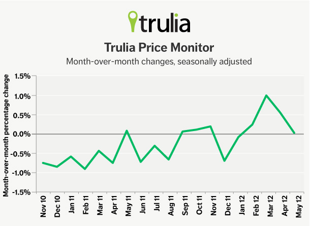
Asking prices on for-sale homes were unchanged in May month over month, seasonally adjusted. Because prices rose in February, March and April, prices remain 1.6% higher in May than one quarter ago, and most of the country has seen price increases: 86 of the 100 largest metro areas had quarter-over-quarter price increases in May, seasonally adjusted.
|
May 2012 Trulia Price Monitor Summary |
|||
| % change in asking prices | # of 100 largest metros with asking-price increases | % change in asking prices, excluding foreclosures | |
| Month-over-month, seasonally adjusted | 0.0% | (not reported) | 0.4% |
| Quarter-over-quarter, seasonally adjusted | 1.6% | 86 | 2.1% |
| Year-over-year | -0.2% | 41 | 1.0% |
Asking prices have now been steady or increasing in eight of the last nine months. Since September 2011, seasonally-adjusted month-over-month changes have been positive or near zero every month except December 2011. Before September, prices had fallen almost every month.

Without seasonal adjustment, prices rose 1.0% month over month and 5.2% quarter over quarter. Those changes reflect what buyers and sellers are actually seeing on the ground. Asking prices typically rise in the springtime, so buyers looking for the year’s best deals should wait until winter when prices are lowest. But we focus on seasonally adjusted data in order to detect the underlying trend in home prices as the market tries to recover.
Year over year, prices fell slightly by 0.2%. But in 41 of the 100 largest metros, prices rose, with Phoenix and Miami leading the pack. The top and bottom metros for year-over-year price changes are here:
|
Top 10 Metros With Largest Price Increases |
||
| # | U.S. Metro | Y-o-Y % Change in Asking Price |
| 1 | Phoenix, AZ | 16.5% |
| 2 | Miami, FL | 14.5% |
| 3 | Cape Coral–Fort Myers, FL | 12.0% |
| 4 | West Palm Beach, FL | 7.5% |
| 5 | Warren–Troy–Farmington Hills, MI | 6.7% |
| 6 | Pittsburgh, PA | 6.3% |
| 7 | Denver, CO | 6.2% |
| 8 | Detroit, MI | 5.3% |
| 9 | Little Rock, AR | 5.1% |
| 10 | Orlando, FL | 4.3% |
|
Top 10 Metros With Largest Price Declines |
||
| # | U.S. Metro | Y-o-Y % Change in Asking Price |
| 1 | Edison–New Brunswick, NJ | -7.7% |
| 2 | Gary, IN | -7.3% |
| 3 | Wilmington, DE-MD-NJ | -6.4% |
| 4 | Lake County-Kenosha County, IL-WI | -6.3% |
| 5 | Tacoma, WA | -6.3% |
| 6 | Chicago, IL | -5.7% |
| 7 | Allentown, PA-NJ | -4.8% |
| 8 | Providence, RI-MA | -4.6% |
| 9 | Atlanta, GA | -4.5% |
| 10 | Columbia, SC | -4.3% |
Note: Rankings based on the year-over-year changes in asking price among the 100 largest U.S. metropolitan areas. Want to see the full list of price and rent changes for all 100 metros? You can download it here.
Are you surprised not to see Las Vegas in the bottom ten anymore? Things are looking up in Sin City: Las Vegas has achieved “turnaround” metro status. This means that prices turned up in the last quarter (February to May, 2012) after falling a lot in the preceding 12 months (February 2011 to February 2012). Las Vegas is one of six metros where prices rose more than 2% in the latest quarter, seasonally adjusted, after falling more than 8% in the preceding year, along with Cleveland, Milwaukee and Toledo in the Midwest, and Seattle and Tacoma in Washington State.
In the other direction, four metros had price declines in the past quarter after enjoying price increases in the preceding 12 months. Two Florida metros – Fort Lauderdale and Orlando – along with Fort Worth, TX, and Greenville, SC, had quarterly price declines after year-over-year price increases.
|
Top “Turnaround” Metros |
|
| Metros turning UP most | Metros turning DOWN most |
| Cleveland, OH | Fort Lauderdale, FL |
| Las Vegas, NV | Fort Worth, TX |
| Milwaukee, WI | Greenville, SC |
| Seattle, WA | Orlando, FL |
| Tacoma, WA | |
| Toledo, OH | |
Note: “Turnaround” metros are those with largest percentage change from decrease to increase (first column) or increase to decrease (second column), comparing recent Q-o-Q (Feb-May 2012) with preceding Y-o-Y (Feb 2011-Feb 2012). Metros listed in alphabetical order.
Foreclosures Hold Back Price Recovery
The Trulia Price Monitor has always included REO-stage (“real estate owned”) foreclosure listings, but for this month’s Monitor, we decided to take a closer look at how foreclosures are affecting home prices.
The typical listing price of a foreclosed home, after adjusting for property and neighborhood attributes, is about 17% lower than a non-foreclosed home. And the gap has been growing: whereas asking prices overall fell 0.2% Y-o-Y, asking prices excluding foreclosures rose 1.0% Y-o-Y, while foreclosure prices fell 5.8% Y-o-Y.
Especially in metros where the housing bubble led to widespread defaults, foreclosures are dragging down the overall price trend. For example, in hard-hit Las Vegas, Atlanta and Sacramento (where foreclosures make up about half of the homes on Trulia), asking prices actually rose Y-o-Y when we excluded foreclosures from our calculations. But with foreclosures included, prices declined Y-o-Y.
Why The Housing Market Needs A Healthy Job Market
As house prices are slowly beginning to recover, we see three key factors driving local price changes:
- 1) Foreclosures: as discussed above, metros where foreclosures make up a larger share of the listed homes for sale tend to have smaller price gains or larger price declines.
- 2) Rebound effect: metros where prices fell more from the peak of the housing bubble to the bottom during the bust tend to have larger price gains now. This is because many of the hardest-hit metros during the bust are attracting demand among investors, foreigners and others who are looking for discounted homes.
- 3) Jobs: metros with faster job growth tend to have larger price gains. This section takes a closer look at jobs and prices.
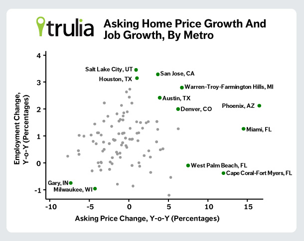
Jobs matter for price growth because a strong job market fuels demand both for renting, which we talk about below, and for buying homes. The graph below shows this relationship:

San Jose, Austin, Denver, Phoenix and the suburban Detroit area of Warren–Troy–Farmington Hills all had strong asking-price growth and strong job growth over the past year. (The job growth data are from the Bureau of Labor Statistics and are April 2011 to April 2012, which are the latest published data.) But the relationship between job growth and asking-price growth is far from tight: three Florida metros had large price increases with only modest job growth (Miami) or job losses (West Palm Beach and Cape Coral – Fort Myers). These Florida metros had strong price growth without strong job growth thanks to two other factors in their favor: fewer foreclosures for sale (many foreclosures in Florida haven’t completed the slow foreclosure process and made it onto the market), and having had bigger price declines during the bust from which to rebound.
Of the three factors driving price increases, job growth is the best long-term bet. Why not the others? The rebound effect can’t last forever – it is, by definition, a rebound. And the relatively low share of foreclosures among listed homes in Florida today (compared with California, Nevada and Georgia) should go up as the state’s slow process churns out more foreclosures. Once that happens, we can expect prices to falter.
As ever, the housing market depends on jobs, both nationally and locally.
Rent Increases Accelerate to 6 Percent Nationally
Finally, let’s look at rents. In May, rents were 6.0% higher than they were a year ago, up from the 5.4% Y-o-Y rent increase in April, and 4.8% in March.[1] That means that finding a cheap apartment isn’t getting any easier. In San Francisco, rents rose 14.4% Y-o-Y in May; Oakland, Miami and Denver rents are also up over 10 percent Y-o-Y. Of the 25 largest rental markets in the U.S., only in Las Vegas did rents decline Y-o-Y.
| Where Rents Rose Most Among Largest Rental Markets | ||
| # | U.S. Metro | Y-o-Y % Change in Asking Rent, May 2012 |
| 1 | San Francisco, CA | 14.4% |
| 2 | Oakland, CA | 11.4% |
| 3 | Miami, FL | 11.3% |
| 4 | Denver, CO | 10.5% |
| 5 | Boston, MA | 9.8% |
| 6 | Seattle, WA | 9.6% |
| 7 | Houston, TX | 9.2% |
| 8 | Portland, OR-WA | 6.8% |
| 9 | Chicago, IL | 6.4% |
| 10 | New York, NY-NJ | 5.9% |
Note: Rankings based on the year-over-year changes in asking rents among the 25 largest U.S. rental markets. Want to see the full list of price and rent changes for all metros? You can download it here.
Why do rents keep going up? Because the economy has strengthened enough to increase rental demand, but not yet enough for renters to become homeowners. And, although construction of new multifamily buildings ramped up last year, most of those buildings haven’t been completed yet. As rent increases keep outpacing price increases, owning a home will become even more affordable relative to renting – but only for those who can afford a down payment and qualify for a mortgage.
See you next month. On Tuesday, July 3, 2012 at 10AM ET, we’ll report on June price and rent trends.
How did we put this report together? To recap the methodology, the Trulia Price Monitor and the Trulia Rent Monitor track asking home prices and rents on a monthly basis, adjusting for the changing composition of listed homes. The Trulia Price Monitor also accounts for the regular seasonal fluctuations in asking prices in order to reveal the underlying trend in prices. The Monitors can detect price movements at least three months before the major sales-price indexes do. Our FAQs provide all the technical details.
[1] Revised from rent increases previously reported.

