The Trulia Price Monitor and the Trulia Rent Monitor are the earliest leading indicators of how asking prices and rents are trending nationally and locally. They adjust for the changing mix of listed homes and therefore show what’s really happening to asking prices and rents. Because asking prices lead sales prices by approximately two or more months, the Monitors reveal trends before other price indexes do. With that, here’s the scoop on where prices and rents are headed.
Asking Prices Up 11.9% Y-o-Y in December, Slower Than in November
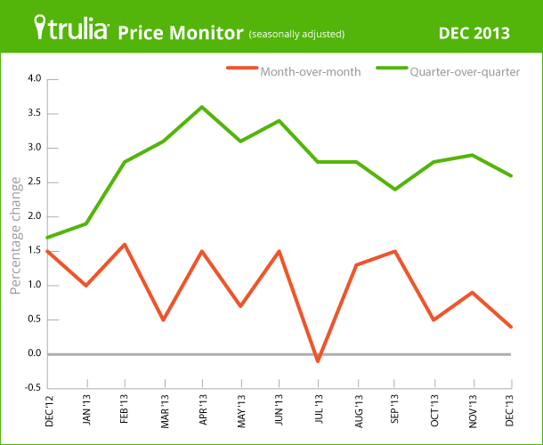
In December, the year-over-year increase in asking home prices slowed for the first time since the price recovery began in early 2012: prices rose 11.9% year-over-year in December, compared with November’s 12.2% year-over-year increase. Asking prices rose 0.4% month-over-month, seasonally adjusted, the third straight month of gains less than 1%.
Quarter-over-quarter, prices rose 2.6% seasonally adjusted, which is also a slowdown from previous months. Quarter-over-quarter asking prices rose in 83 of the 100 largest metros and fell in 17, which is the most metros with quarter-over-quarter price declines in 10 months.
|
December 2013 Trulia Price Monitor Summary |
|||
|
% change in asking prices |
# of 100 largest metros with asking-price increases |
% change in asking prices, excluding foreclosures |
|
| Month-over-month,
seasonally adjusted |
0.4% |
Not reported |
-0.5% |
| Quarter-over-quarter,
seasonally adjusted |
2.6% |
83 |
1.6% |
| Year-over-year |
11.9% |
98 |
11.3% |
| *Month-over-month change is December versus November. Quarter-over-quarter and year-over-year changes are three-month averages. Data from previous months are revised each month, so data being reported now for previous months might differ from previously reported data. | |||
Asking Prices in 2013 Rose Most in Hardest-Hit Metros
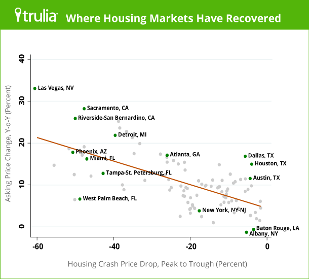
All of the 10 metros with the largest year-over-year price increases in December were hard-hit during the housing bust. Asking prices fell by at least a third from peak to trough in these 10 metros, and by almost half or more in the three metros with the biggest price rebounds year-over-year: Las Vegas, Sacramento, and Riverside–San Bernardino.
|
Where Asking Home Prices Rose Most in 2013 |
||||
| # | U.S. Metro |
Y-o-Y % asking price change, Dec 2013 |
Price change in bust, peak to trough |
Y-o-Y % change in jobs, Nov 2013 |
| 1 | Las Vegas, NV |
33.0% |
-61% |
2.4% |
| 2 | Sacramento, CA |
28.2% |
-48% |
1.5% |
| 3 | Riverside–San Bernardino, CA |
25.9% |
-50% |
0.9% |
| 4 | Oakland, CA |
25.2% |
-39% |
0.3% |
| 5 | Ventura County, CA |
23.6% |
-38% |
2.0% |
| 6 | Warren–Troy–Farmington Hills, MI |
22.7% |
-37% |
1.7% |
| 7 | Detroit, MI |
21.8% |
-40% |
-0.2% |
| 8 | Los Angeles, CA |
21.3% |
-35% |
1.7% |
| 9 | Orange County, CA |
19.9% |
-33% |
2.1% |
| 10 | Fort Lauderdale, FL |
19.1% |
-48% |
2.4% |
| Note: peak-to-trough price change from Federal Housing Finance Agency (FHFA). Change in employment from Bureau of Labor Statistics (BLS); November is the most recently published metro employment data. Among 100 largest metros. To download the list of asking price changes for the largest metros: Excel or PDF. | ||||
In most metros where the housing bust was milder, prices rose modestly year-over-year. The exceptions are Dallas, Houston, and Austin, where the housing bust was mild but prices experienced double-digit increases in 2013. West Palm Beach and several other Florida metros, in contrast, stand out for having had a severe housing bust but slower price gains in 2013 than most metros in California and Nevada.
The 10 metros with the smallest year-over-year price increases – or even declines – all had a milder housing bust than the 10 metros with the largest year-over-year price increases:
|
Where Asking Home Prices Rose Least in 2013 |
||||
| # | U.S. Metro |
Y-o-Y % asking price change, Dec 2013 |
Price change in bust, peak to trough |
Y-o-Y % change in jobs, Nov 2013 |
| 1 | Albany, NY |
-1.3% |
-5% |
0.5% |
| 2 | Baton Rouge, LA |
-0.6% |
-3% |
0.0% |
| 3 | Little Rock, AR |
0.0% |
-4% |
1.8% |
| 4 | Hartford, CT |
1.0% |
-14% |
1.5% |
| 5 | Rochester, NY |
1.5% |
-2% |
0.6% |
| 6 | Syracuse, NY |
1.9% |
-3% |
0.7% |
| 7 | Albuquerque, NM |
2.4% |
-17% |
0.9% |
| 8 | Camden, NJ |
2.5% |
-23% |
1.2% |
| 9 | Tulsa, OK |
2.7% |
-4% |
2.2% |
| 10 | Long Island, NY |
3.2% |
-20% |
2.5% |
| Note: peak-to-trough price change from Federal Housing Finance Agency (FHFA). Change in employment from Bureau of Labor Statistics (BLS); November is the most recently published metro employment data. Among 100 largest metros. To download the list of asking price changes for the largest metros: Excel or PDF. | ||||
Overall, regression analysis shows that recent price gains are most strongly associated with the severity of the local housing bust. Markets where prices fell most during the bust (roughly 2006 to 2011, but varies by metro) offered bargains for investors and other buyers who have helped bid prices back up over the past two years. A second important factor is foreclosures: adjusting for other factors, metros with a higher foreclosure inventory today – including many in Florida – have slower price growth. Job growth, however, had little impact on local home price gains in 2013: the relationship between job growth and price gains was positive but not statistically significant.
Therefore, year-over-year price gains in December 2013 are still primarily a reaction to the housing bust, but this rebound effect is fading as we enter 2014. Looking at the quarter-over-quarter price changes throughout 2013, the relationship between the severity of the housing bust and the recent price recovery was stronger earlier in the year than later in the year. More specifically, the correlation between peak-to-trough price change (FHFA) and the Trulia Price Monitor quarter-over-quarter change was -.59 in March; -.45 in June; -.43 in September; and -.33 in December. This correlation is moving closer to zero, which signifies that the rebound effect is fading.
As the housing market continues to recover, factors other than the rebound effect – like job growth – will matter more for price gains. That means slower but more sustainable price increases.
Rent Gains Driven More by Job Growth
In December, rents rose 3.0% year-over-year nationally. Among the 25 largest rental markets, rents rose fastest in San Francisco, Portland, and San Diego. Unlike recent price gains, rent gains have a positive, statistically significant relationship with job growth. Of the five large rental markets with the biggest rent increases, four had job growth of 2% or more. But of the five large rental markets with rent declines or slowest increases, just one had job growth of 2% or more.
|
Rent and Job Growth Trends in the 25 Largest Rental Markets |
|||
| # | U.S. Metro |
Y-o-Y % change in rents, Dec 2013 |
Y-o-Y % change in jobs, Nov 2013 |
| 1 | San Francisco, CA |
10.6% |
2.4% |
| 2 | Portland, OR-WA |
10.5% |
2.0% |
| 3 | San Diego, CA |
9.5% |
1.8% |
| 4 | Seattle, WA |
8.9% |
2.3% |
| 5 | Denver, CO |
7.6% |
2.5% |
| 6 | Miami, FL |
6.9% |
1.5% |
| 7 | Houston, TX |
6.3% |
3.1% |
| 8 | Atlanta, GA |
5.9% |
2.5% |
| 9 | Phoenix, AZ |
5.4% |
2.3% |
| 10 | Dallas, TX |
5.2% |
2.6% |
| 11 | Chicago, IL |
5.0% |
1.5% |
| 12 | Orange County, CA |
3.2% |
2.1% |
| 13 | Riverside–San Bernardino, CA |
3.1% |
0.9% |
| 14 | Minneapolis–St. Paul, MN-WI |
3.0% |
1.8% |
| 15 | Sacramento, CA |
2.5% |
1.5% |
| 16 | Tampa–St. Petersburg, FL |
2.4% |
3.3% |
| 17 | New York, NY-NJ |
2.3% |
2.4% |
| 18 | Oakland, CA |
2.2% |
0.3% |
| 19 | Los Angeles, CA |
2.1% |
1.7% |
| 20 | Las Vegas, NV |
1.9% |
2.4% |
| 21 | St. Louis, MO-IL |
1.3% |
0.5% |
| 22 | Boston, MA |
0.9% |
2.4% |
| 23 | Baltimore, MD |
-0.1% |
1.9% |
| 24 | Philadelphia, PA |
-0.1% |
1.0% |
| 25 | Washington, DC-VA-MD-WV |
-1.6% |
0.5% |
| To download the list of rent changes for the largest metros: Excel or PDF | |||
The next Trulia Price Monitor and Trulia Rent Monitor will be released on Thursday, February 6. Here’s the full 2014 release schedule:
| Month | Release Date |
| January | Thursday, January 9 at 12:01AM ET |
| February | Thursday, February 6 at 12:01AM ET |
| March | Thursday, March 6 at 12:01AM ET |
| April | Thursday, April 10 at 12:01AM ET |
| May | Thursday, May 8 at 12:01AM ET |
| June | Thursday, June 5 at 12:01AM ET |
| July | Thursday, July 10 at 12:01AM ET |
| August | Thursday, August 7 at 12:01AM ET |
| September | Tuesday, September 9 at 12:01AM ET |
| October | Thursday, October 9 at 12:01AM ET |
| November | Thursday, November 6 at 12:01AM ET |
| December | Tuesday, December 9 at 12:01AM ET |
How did we put this report together? To recap the methodology, the Trulia Price Monitor and the Trulia Rent Monitor track asking home prices and rents on a monthly basis, adjusting for the changing composition of listed homes, including foreclosures provided by RealtyTrac. The Trulia Price Monitor also accounts for the regular seasonal fluctuations in asking prices in order to reveal the underlying trend in prices. The Monitors can detect price movements at least three months before the major sales-price indexes do. Historical data are sometimes revised each month, and historical data in the current release are the best comparison with current data. Our FAQs provide all the technical details.


