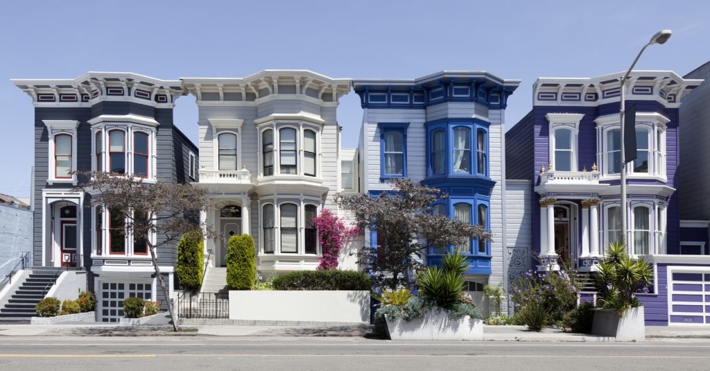
We wanted to see just how dramatic those changes have been over different time frames in some of the country’s largest metro areas. To do this, we ranked the larger neighborhoods in each metro from most to least expensive based on estimated median home value. We then searched out which had moved up or down most in rank (see methodology).
The results? Looking at a 20-year comparison, many of the neighborhoods on the rise are close to city centers that have seen a resurgence in the past two decades. These neighborhoods are often described as gentrifying. Others are areas that have converted largely from warehouse and industrial use to more residential-friendly spaces. Here are some highlights of rising neighborhoods in a handful of large metros:
- Hunters Point in Metro New York – This Queens neighborhood has seen the single largest home value rank change, going from 272nd most expensive in 1998 to 23rd in 2018 of 296 New York metro neighborhoods in the comparison.
- Oakhurst in Atlanta – This area has climbed from 53rd to 21st most expensive out of 69 neighborhoods in the city.
- Logan Square in Chicago – Has jumped from 89th to 39th most expensive of 138.
- Passyunk Square in Philadelphia – Passyunk Square, as well as nearby Dickinson Narrows and East Passyunk, is among the most changed in the nation. Passyunk Square went from the 77th most expensive neighborhood in 1998 to 18th of 88.
- Boise in Portland, Oregon – Is now 46th most expensive out of 189 neighborhoods. In 1998, it was nearly the cheapest—176th out of 181.
- The Mission District in San Francisco – Has moved from 105th two decades ago to 77th of 130 today.
| Neighborhoods Moving Up | |||||
| Metro Area | Neighborhood | Median Home Value 1998 | Median Home Value 2018 | 1998 Rank | 2018 Rank |
| New York | Hunters Point | $120,700 | $1,195,400 | 272/296 | 23/304 |
| Atlanta | Oakhurst | $131,000 | $598,900 | 53/69 | 21/69 |
| Chicago | Logan Square | $121,700 | $344,700 | 89/137 | 39/138 |
| Portland, Ore. | Boise | $102,000 | $510,200 | 176/181 | 46/189 |
| Philadelphia | Passyunk Square | $39,300 | $341,100 | 77/83 | 18/88 |
| San Francisco | Mission | $278,400 | $1,490,000 | 105/129 | 77/130 |
| Note: The number of neighborhoods tracked in some metros has grown as data has improved.
Click here to download the full data set looking at neighborhood rankings in 87 larger metros. |
|||||
For every neighborhood moving up in the ranks, at least one is moving down. A common denominator? Most of the neighborhoods that have fallen furthest are in suburbs or exurbs.
- Whittingham in Metro New York – This neighborhood on the New Jersey side of the metro fell from 91st to the 261st.
- Atlanta’s Midwest Cascades – Roughly 10 miles west of downtown, went from 26th to 64th.
- Dunning in Chicago – Dropped from 55th to the 101st most expensive of 138 neighborhoods.
- Philadelphia’s Burholme & Fox Chase neighborhoods – Northeast of downtown, along with Village Green/Green Ridge in Aston, southwest of downtown, dropped most in rank. Village Green/Green Ridge, for example, went from fourth most expensive 20 years ago to 37th.
- Austin’s Ridge at Steeds Crossing – East of Round Rock, has had gone through the largest downward rank change, going from 17th to 84th out of 91 tracked neighborhoods.
| Lagging Neighborhoods | |||||
| Metro Area | Neighborhood | Median Home Value 1998 | Median Home Value 2018 | 1998 Rank | 2018 Rank |
| New York | Whittingham | $209,300 | $351,800 | 91/296 | 261/304 |
| Atlanta | Midwest Cascade | $228,500 | $241,400 | 26/69 | 64/69 |
| Chicago | Dunning | $145,400 | $224,700 | 55/137 | 101/138 |
| Philadelphia | Burholme | $86,700 | $176,500 | 27/83 | 64/88 |
| Austin, Texas | Ridge at Steeds Crossing | $203,800 | $200,600 | 17/91 | 84/91 |
| Note: The number of neighborhoods tracked in some metros has grown as data has improved.
Click here to download the full data set looking at neighborhood rankings in 87 larger metros. |
|||||
Looking at metro levels as a whole, Philadelphia has seen the most dramatic neighborhood rank changes over the past two decades. It is followed by Baltimore, New Haven, Conn. and Austin, Texas. Akron, Ohio and Albany, N.Y. have been the most stable. Click here to take a look at the full data set and to compare today’s neighborhood rankings with those of 5, 10, 15 and 20 years ago for 87 large metro areas.
Methodology
We ranked the larger neighborhoods in each metro in order of most to least expensive according to estimated median home value, looking for those that moved most in rank. We compared today’s most current data with home value estimates from 5, 10, 15 and 20 years ago. We then determined which neighborhoods had experienced the most dramatic changes in neighborhood rank. To normalize comparisons between metros with many neighborhood and metros with fewer, we used rank percentile changes. Additionally, in some metros, the number of neighborhoods with adequate data has grown as more data has become available. Using rank percentile changes helps make comparisons possible over time in metros where the number of neighborhoods with data suitable for ranking has grown.


