For the first time in more than two years, when it comes to price, homebuyers and sellers are finally moving closer together.
Market mismatch – our measure of the price gap between search interest and available listings – is flat from a year ago, but has dropped 15%, falling to 11.1 from 13.1 the previous quarter; the first such drop since prior to the start of 2016. In other words, more homebuyers are searching at price points where listings are more common.
But what looks like good news among very tough market conditions for starter home buyers comes with some hefty caveats. Rather than being a story of increasing inventory meeting high demand for starter homes, instead, searches are just shifting increasingly toward pricier options. Regardless of the reason though, this means that starter home shoppers, who are more likely to be younger, might are getting hints of relief, but are not out of the woods yet.
Here are some key takeaways from our analysis:
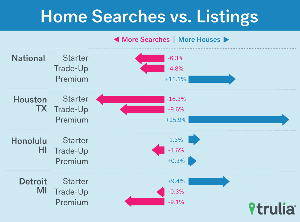
- Nationally, the mismatch gap shrunk to 11.1 from 13.1 last quarter as the share of searches for starter homes fell to 28.7% from 31.1%. While part of this shift could be attributed seasonality, it is the first quarter to quarter drop we have seen and compares with mismatch increase from 9.7 to 11.1 during the same period last year.
- It’s not all good news thoughas the starter listing’s share continued to slide and is now down to 22.4% of all listings from 22.8% last quarter and the first quarter of 2017.
- Premium buyers got pinched this quarter for the first time in more than two years.Premium home searches made up 41.4% of all searches and comprised 52.5% of listings. Still comfortable, but down from a larger gap of 38.4% of searches going to 51.5% of listings last quarter and on par with the mismatch a year ago.
- What looks like starter home buyer relief on a national level may just be signs of shoppers giving up. Recent changes are driven by search activity growing more slowly for starter homes than for trade-up and premium homes.
- San Francisco saw the biggest improvement for starter home shoppers from last quarteras starter inventory increased to 40.2% from 36.1% of all listings and searches to those homes dropped to 42.7% from 45.5% of all searches.
How Trulia Evaluates a Market Mismatch
On a scale of 0 to 100, with 0 being perfectly matched and 100 being completely mismatched, it’s a measure of the difference between the price points where searches occur and the price points of listed properties. For example, if all searches in a market occurred in the starter category, but all listings were in the premium category, the market would be completely mismatched and receive a mismatch score of 100.
Alternatively, if 20%, 50%, and 30% of listings were starter, trade-up, and premium listings respectively and 20%, 50%, and 30% of all search activity was for starter, trade-up, and premium homes, then the market would be perfectly matched a have a mismatch score of 0.
During the first quarter of 2018, our housing market mismatch score for all homes fell to 11.1 from 13.1 the previous quarter and is unchanged from the first quarter of 2017 but remains well above the 7.5 scored two years ago during Q1 2016. For comparison, during the same quarter-over-quarter period 1-year ago, the mismatch score grew 14.2% from 9.7 to 11.1. Fifty-five of the 100 largest metros saw their mismatch rates fall since last quarter and 51 have fallen since the same quarter a year ago. So, the tide on what has been a steady stream of bad news for most buyers, and especially starter home buyers, seems to be shifting. But stubbornly low inventory means that, rather than seeing the home buying process get less competitive for starter home shoppers, competition for shoppers in the premium market is beginning to look a little more like what it’s been like in the starter-home market for some time now. For a full data set of the mismatch score and key metrics for the 100 biggest housing markets, click here.
The Good, the Bad, and the Ugly for Young Homebuyers
Starter-home shoppers are much more likely to be millennials and first-time homebuyers than those looking for trade-up and premium homes. For this reason, the market trends of the past few years (declining inventory, ballooning prices, and hyper competition in many markets) have been particularly hard on them. Buried in the national numbers is some good news for these people in a few metro areas that have the largest populations of millennials – along with some bad news in other markets.
Philadelphia, millennials looking to buy a home have a pretty good deal. In addition to having more affordable housing in general (34thmost affordable among the largest 100 metros), 26.8% of all listings in Q1 2018 were considered starter homes, while only 22.7% of searches were for these homes. It’s trade-up home buyers getting squeezed in this market with 33.6% of searches chasing only 27% of listings. Conditions are better this quarter than last for starter-home buyers as searches last quarter made up 24.4% of searches while listings accounted for 25.5%. Things were even easier for starter home buyers a year ago though when only 18.5% of searches were chasing 25.3% of listings.
San Francisco, the metro with the highest proportion of people ages 20-34, has the second lowest mismatch of any of the largest 100 metros. This is a big improvement from the previous quarter and the same period a year ago when starter listings made up a smaller share of all listings and starter searches a larger share of all search activity. What’s driving these changes? It’s not a sudden increase in starter inventory. Instead, searches for starter homes are down almost 10% from the previous year in a sign of price fatigue in the most expensive large metro. But if you arein the market for a starter home in San Francisco, you are now not any worse off than home shoppers looking in other price tiers.
For Starter homes in Colorado Springs, Colo.,on the other hand, during Q1 2018, 29.8% of searches were chasing 16.8% of listings. While this is slight improvement for buyers from the previous quarter, conditions are tougher than they were a year ago. This is happening among the context of declining inventory for all price tiers, but the starter home inventory is declining faster at the same time more people seem to be showing interest in them.
| Markets With the Most Millennials | |||||||||
| U.S. Metro | Percent of Population Ages 20-34* | Market Mismatch Score | % of All Searches for Starter Homes | % of All Listings that are Starter Homes | % of All Searches for Trade-Up Homes | % of All Listings that are Trade-Up Homes | % of All Searches for Premium Homes | % of All Listings that are Premium Homes | |
| Colorado Springs, CO | 23.6% | 18.7 | 29.8% | 16.8% | 28.4% | 22.8% | 41.7% | 60.4% | |
| Boston, MA | 23.8% | 15.1 | 38.1% | 25.0% | 28.5% | 26.5% | 33.4% | 48.4% | |
| Madison, WI | 24.4% | 14.2 | 28.8% | 22.6% | 29.1% | 21.2% | 42.1% | 56.2% | |
| Virginia Beach-Norfolk, VA | 23.9% | 12.6 | 31.1% | 25.9% | 34.6% | 27.2% | 34.3% | 46.8% | |
| Salt Lake City, UT | 23.2% | 11.2 | 33.5% | 22.3% | 29.0% | 31.4% | 37.6% | 46.3% | |
| San Diego, CA | 24.3% | 9.1 | 32.2% | 25.8% | 26.3% | 23.5% | 41.5% | 50.7% | |
| Baton Rouge, LA | 23.2% | 8.8 | 19.8% | 18.6% | 32.8% | 25.2% | 47.4% | 56.2% | |
| Austin, TX | 24.5% | 8.4 | 26.8% | 18.4% | 30.4% | 38.2% | 42.8% | 43.4% | |
| Philadelphia, PA | 24.7% | 6.6 | 22.7% | 26.8% | 33.6% | 27.0% | 43.7% | 46.2% | |
| San Francisco, CA | 24.9% | 2.6 | 42.7% | 40.2% | 23.2% | 25.7% | 34.2% | 34.1% | |
| Note: Market Mismatch Score on a scale of 0 to 100. 100 means the market is completely mismatched, and 0 means the market is perfectly matched between the available inventory and home searches for starter, trade-up and premium homes.
*Based on Census 2016 Population Estimates. These numbers compare with 20.8% Nationally |
|||||||||
Sellers See the Other Side of the Same Coin
Throughout this discussion, it’s important to remember though; a market mismatch that makes it tough for buyers usually makes a great sellers’ market and vice versa. In addition to much of the country being a sellers’ market for some time now, the market mismatch in most places suggests that trade-up and especially starter-home buyers have felt this pain most acutely, with limited options and lots of competition. If you are or have been a starter home sellerrecently though, depending on where you live, your experience has likely been easy, with lots of interest in your home and possibly multiple offers to consider. Premium home sellers are less likely to have seen that kind of action with a persistent surplus of inventory relative to search interest. These shifts in market mismatch suggest things may be getting a little easier for premium home sellers in the current peak home buying season as interest has been picking up more quickly than in the starter and trade-up categories.
Places where premium sellers are feeling the recent shift in their favor include Ventura County, Calif., Austin, and Buffalo, N.Y.In Buffalo, for example, during this past quarter 37.6% of all listings were for premium homes and 37.9% of searchers were for those homes; so, a pretty close match with a slight favor to sellers. During Q4 2017 though, 39.1% of listings were for premium homes and 34.8% of traffic was to them; a more sizeable edge toward buyers. The Q4 2017 mismatch is similar to what was seen a year ago in Q1 2017, indicating that shift is more than a seasonal change.
| Markets Where Premium Sellers Are Feeling a Lift From Last Quarter and the Same Time a Year Ago | |||||
| U.S. Metro | % of All Listings that were Premium Homes Q1 2018 | % of All Searches for Premium Homes Q1 2018 | Percentage point gap in the premium market Q1 2018 | Percentage point gap in the premium market Q4 2017 | Percentage point gap in the premium market Q1 2017 |
| San Francisco, CA | 34.1% | 34.2% | -0.1 | 3.8 | 9.1 |
| Austin, TX | 43.4% | 42.8% | 0.5 | 4.5 | 7.7 |
| Denver, CO | 53.0% | 41.8% | 11.2 | 15.0 | 18.3 |
| Ventura County, CA | 48.5% | 44.7% | 3.8 | 9.4 | 9.2 |
| Buffalo, NY | 37.6% | 37.9% | -0.4 | 4.3 | 3.8 |
| Note: Percentage Point Gaps on a scale of -100 to 100 with 0 being perfectly matched. 100 is completely in the buyer’s favor and -100 is completely in the seller’s favor. | |||||
So, the tide on what has been a steady narrative of bad news for starter home buyers, seems to be shifting. Yet, persistent low inventory counts mean that rather than seeing the home buying process get less competitive for starter home shoppers, trade-up and premium shoppers are sharing a more similar experience of hyper competition and few options with starter home buyers for the first time in a while.
Methodology
Note: The calculation for the market mismatch was adjusted from the first three installments of this report. This means the numbers between this installment and the previous one are not directly comparable. However, all the data presented in this report was pulled using the updated method.
Additionally, while the same price cut-offs are used to define starter, trade-up, and premium homes nationally and in the 100 largest U.S. metros as in the quarterly Trulia Price and Inventory Watch, the weights assigned to listings differ, resulting in some differences in the inventory make-up. This different weighting was necessary to ensure that we are only counting site traffic to properties when they are actively on the market.
The Market Mismatch Score was based on all the for-sale listings on Trulia, which were pulled on a quarterly basis beginning in Q1 2016. The distribution of prices for each metro and nationally was calculated by taking each active listing and adding up the number of days it was on the market during the quarter. All unique price points were consolidated and counted by summing these day & price combinations. In other words, if 10 properties were on the market for a combined 600 days at a price of $200,000, then the $200,000 price point would receive a weight of 600.
Site traffic from Trulia was matched to each unique property (and therefore price) on the market during the same time periods and added up for each quarter and price.
Listings and searches were assigned starter, trade-up, and premium price categories based on the price cutoffs for each metro area. We define the price cutoffs of each segment based on home value estimates of the entire housing stock, not listing price. For example, we estimate the value of each single-family home and condo and divide these estimates into three groups: the lower third we classify as starter homes, the middle third as trade-up homes, and the upper third as premium homes. We classify a listing as a starter home on the market if its listing price falls below the price cutoff between starter and trade-up homes.
“Market Mismatch” scores were then calculated by taking the difference between the percentage of listings in each of the three price tiers and the percentage of site traffic that went to each price tier. The average deviation from 0, regardless of the sign of the difference (+/-), for each category was averaged to come up with an overall mismatch score.
Millennial population estimates for 2016 were gathered from the Census Bureau: Annual Estimates of the Resident Population by Sex, Race, and Hispanic Origin for the United States, States, and Counties: April 1, 2010 to July 1, 2016