Wouldn’t it be nice if there were a local housing market that we could use as the nation’s crystal ball? If one market regularly ran ahead of the national trends, we could pay extra attention to what’s happening there in order to know what the rest of the country should expect. During the housing bubble and bust over the last decade, there were clearly markets – like Las Vegas – that had more extreme swings in prices than others did, but being more extreme isn’t the same as being first.
To see which markets – if any – tend to get ahead of the national trend, we looked at home-price changes between 1980 and 2014 in the 100 largest U.S. metros and the U.S. overall, using the Federal Housing Finance Agency (FHFA) home-price index. Our crystal-ball score, calculated for each metro individually, is the correlation between the year-over-year home price change in that metro with the year-over-year home price change for the U.S. overall one year later. In other words, we’re measuring how closely the ups and downs in a local market’s home prices match the national ups and downs one year later. Remember that correlations range from 1 to -1: the higher the correlation, the stronger the forecast. A negative correlation means that a better year for a metro’s home prices is typically followed by a worse year for the nation’s home prices (and vice versa).
The Crystal Ball Award Goes to the Twin Cities
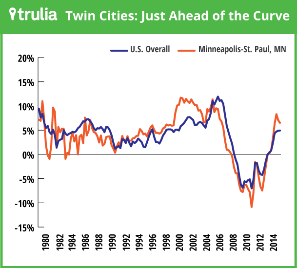
Among the 100 largest metros, the housing market with the highest crystal-ball score is Minneapolis-St. Paul. Other markets that are relatively good bellwethers include San Diego, Ventura County, and Sacramento in California; West Palm Beach and three other Florida metros; Washington, DC; and St. Louis. In general, these markets had a more severe housing bust last decade and faster historical price growth over the past three decades than other markets. But it’s an eclectic bunch, with St. Louis, Washington, and Minneapolis-St. Paul having had a milder bust than the markets in California and Florida.
| # | U.S. Metro | Crystal-ball score: Correlation of local price change with following year’s national price change |
| 1 | Minneapolis–St. Paul, MN-WI | 0.79 |
| 2 | San Diego, CA | 0.76 |
| 3 | West Palm Beach, FL | 0.76 |
| 4 | Cape Coral–Fort Myers, FL | 0.73 |
| 5 | Ventura County, CA | 0.73 |
| 6 | Washington, DC-VA-MD-WV | 0.72 |
| 7 | Sacramento, CA | 0.72 |
| 8 | Palm Bay–Melbourne–Titusville, FL | 0.71 |
| 9 | North Port–Bradenton–Sarasota, FL | 0.71 |
| 10 | St. Louis, MO-IL | 0.71 |
This graph shows what a 0.79 correlation actually looks like. Year-over-year home prices in Minneapolis – St. Paul tend to look like national changes but a little bit ahead:

What Happens in Texas, Stays in Texas
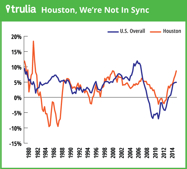
On the flip side, the markets that are the worst predictors of next year’s home price movements are clustered in and near the Gulf states. The six metros with the lowest correlations are all in Louisiana, Texas, and Oklahoma. The correlation is actually slightly negative for Baton Rouge.
| # | U.S. Metro | Crystal-ball score: Correlation of local price change with following year’s national price change |
| 1 | Baton Rouge, LA | -0.02 |
| 2 | Houston, TX | 0.02 |
| 3 | San Antonio, TX | 0.03 |
| 4 | Austin, TX | 0.03 |
| 5 | Tulsa, OK | 0.04 |
| 6 | Oklahoma City, OK | 0.05 |
| 7 | Salt Lake City, UT | 0.06 |
| 8 | El Paso, TX | 0.06 |
| 9 | Greenville, SC | 0.14 |
| 10 | Buffalo, NY | 0.22 |
Looking further at Texas, Dallas and Fort Worth would rank #11 and #13, respectively, on the lowest-correlation list. And if we extended the analysis to smaller metros, the lowest scores would be the next-door metros of Midland and Odessa, TX, with correlations of -.24 and -.22, respectively. Several other smaller Texas and Louisiana metros also have negative crystal-ball scores.
What’s with Texas? The state was among the least affected by the bubble and bust of the 2000s; its worst period for home prices was in the mid-1980s, even though national home prices were fairly strong. Texas home prices are influenced by the swings in the energy industry, which means real estate in Texas and Gulf Coast tends to beat to a different drummer more than any other market in the country. Here’s how Houston’s price trend compares with the U.S.:

Can “Crystal Ball” Markets Really Tell the Future?
Before anyone starts booking tickets to Minneapolis, San Diego, or West Palm Beach to see what the future holds, here’s the reality check. While some markets are better leading indicators than others, none of them are that great. Our test of “great” is whether any local market’s price change in a given year is a better predictor of next year’s national home price change than this year’s national price change is. That means the number for a local market to beat is the correlation between national home price changes in one year and the next, which is .77. That’s higher than the correlations for 99 of the 100 largest metros — except for Minneapolis-St. Paul, which is just a hair better at .79.
Even though Minneapolis-St. Paul is the best predictor of national price trends for the 1980-2014 period overall, different metros are better predictors of the national trend for narrower time periods. During the recent cycle, from 2000 to 2014, Sacramento, San Diego, and Providence, RI, best predicted national trends; but from 1980 to 2000, three Massachusetts metros — Middlesex County, Worcester, and Boston –showed most clearly what the future had in store. The Twin Cities didn’t do so well in predicting national price trends in the 1980s and 1990s.
The answer, therefore, is that the crystal-ball award isn’t worth much more than the glass it’s made of. In no local market do home price trends consistently and reliably outperform the national price trend in predicting next year’s national price trends. There’s just no shortcut for understanding the U.S. housing market.

