America’s starter-home shortage is worsening. The number of available homes for the average first-time homebuyer saw its steepest year-over-year drop in three years, 12.1%. And buyers have to pay more to get them: 1.9% more of their income, an increasingly unaffordable pace.
We took a look back at affordability since 2012 and compared annual change until 2015 to declines in affordability in the last year and found some markets have drastically slowed their pace of unaffordability, while in others, declines in affordability of starter homes continue to plague first time home buyers.
Examining the housing stock across the nation from Q4 2015 to Q4 2016, we found:
- Starter homes continue to represent less than one-quarter of available inventory nationwide, while premium homes make up more than half.
- Starter and trade-up home inventory have tumbled 12.1% and 12.9% respectively during the last year. Affordability of starter homes has declined more than twice as much as trade-up homes, and nearly four times as much as premium homes.
- Starter home unaffordability persists in a number of California markets such as Sacramento, Calif., Los Angeles, San Francisco, San Diego as well as Miami. These cities ranked in the top 10 annual declines in affordability for starter homes from 2012 to 2015 and remain in the top 10 for declines in affordability for starter homes from 2015 to 2016.
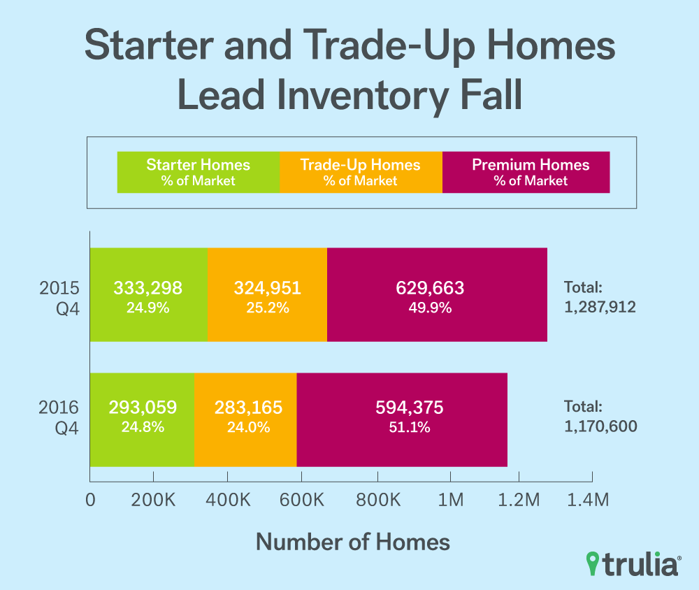
| Starter Homes (% of Market) | Trade-Up Homes (% of Market) | Premium Homes (% of Market) | Total | |
| 2015 Q4 | 333,298 (24.9%) | 324,951 (25.2%) | 629,663 (49.9%) | 1,287,912 |
| 2016 Q4 | 293,059 (24.8%) | 283,165 (24.0%) | 594,375 (51.1%) | 1,170,600 |
Nationally, housing inventory fell for the sixth consecutive quarter, dropping 9.1% from a year ago. Moreover:
- The number of starter homes on the market fell by 12.1%, while the share of starter homes dropped slightly, from 24.9% to 24.8%. Starter homebuyers will need to to pay 1.9% more of their income towards a home purchase than last year;
- The number of trade-up homes on the market decreased by 12.9%, while the share of trade-up homes decreased from 25.2% to 24.0%. Trade-up homebuyers today will need to spend 0.9% more of their income for a home than last year;
- The number of premium homes on the market decreased 5.6%, while the share of premium homes increased from 49.9% to 51.1%. Premium homebuyers will need to spend 0.5% more of their income for a home than last year.
2014 Q4 Inventory Monitor
| 2016 Q4 Inventory | Change, 2015 Q4 – 2016 Q4 | |||||||
| Housing Segment | Median List Price | Share | Inventory | % of income needed to buy median price home in segment | % change in median list price | Percentage point change in share | % change in inventory | Additional share of income needed to buy a home (percentage point change) |
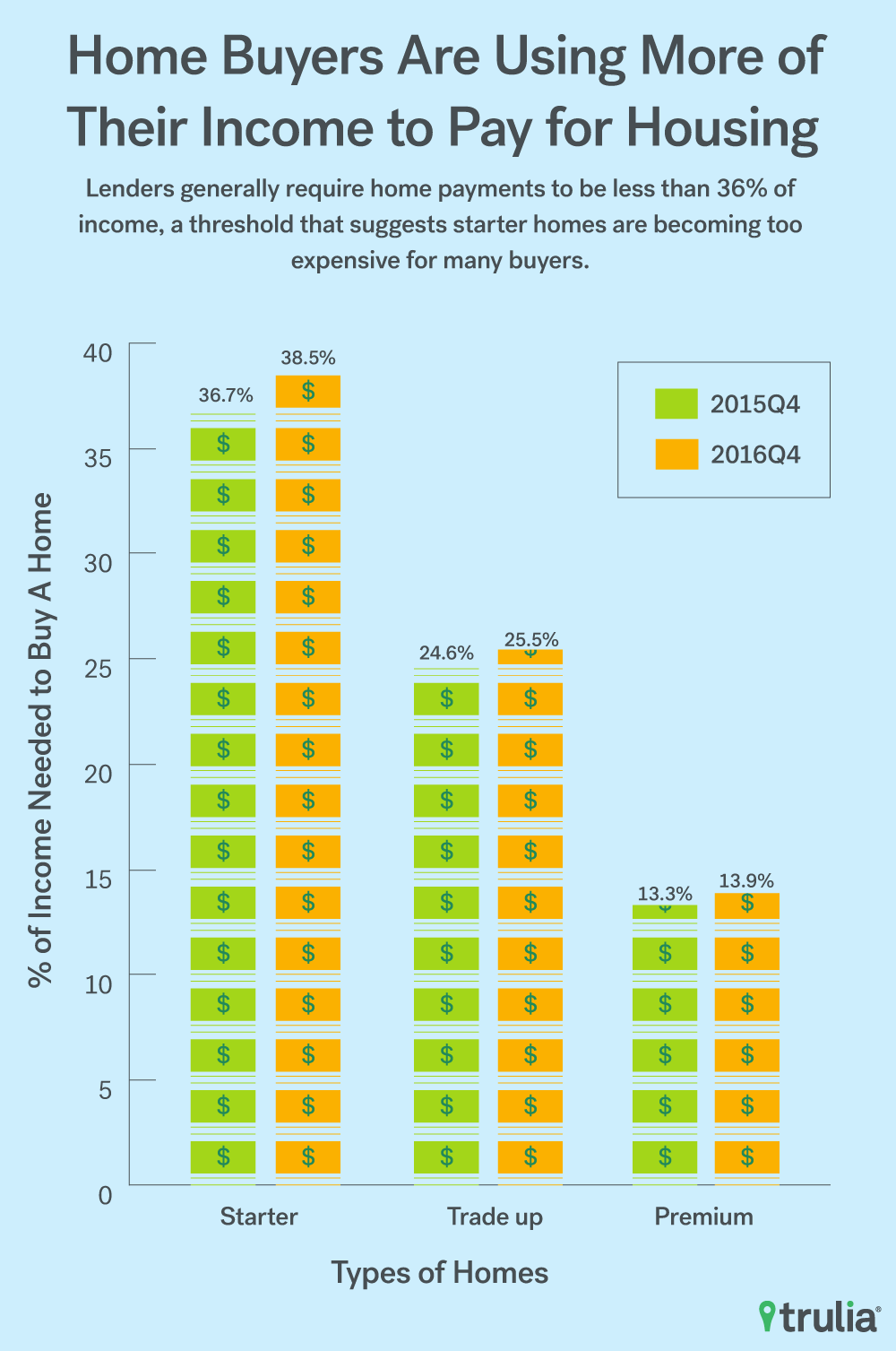
| Starter | $164,920 | 24.8% | 293,059 | 38.5% | 7.6% | -0.1 pts | -12.1% | 1.9 pts |
| Trade- Up | $285,895 | 24.0% | 283,165 | 25.5% | 6.3% | -1.2 pts | -12.9% | 0.9 pts |
| Premium | $591,262 | 51.1% | 594,375 | 13.9% | 7.2% | +1.2 pts | -5.6% | 0.5 pts |
| Among the 100 largest U.S. metro areas. Share is the percent of for-sale homes that fall into each segment, which is defined separately for each metro. Median price for each segment is the stock-weighted average of the median price of each segment in each metro. Some point change estimates may be slightly different than stated values because our differing procedure occurs before rounding. | ||||||||
Inventory continues to fall across all housing segments, with the biggest decreases in the starter and trade-up housing segments. Starter home inventory dropped 12.1% from this time last year and trade-up homes fell 12.9% while premium home inventory fell a more moderate 5.6%.
Even if first-time buyers can find a home, they may not be able to afford it. Households will need to spend nearly 39% of their monthly income to purchase a home. This represents a 1.9 percentage point increase over the previous year in terms of share of income needed to purchase a starter home. It’s more than double the increase in income needed to buy trade-up home (0.9 percentage points) and nearly four times the amount the increase in income needed to purchase a premium home (0.5 percentage points). Trade-up and premium homes remain relatively affordable, requiring 25.5% and 13.9% of monthly income to purchase homes in these segments, respectively.
The Starter Home Squeeze
When it comes to affordability, markets matter.
In some markets affordability has eroded significantly. In six markets the share of income needed to buy a starter home increased an average of 3.3 percentage points in the last year, compared to the prior three-year period. If we look at the 10 markets that saw the biggest increase in the percentage of income needed to buy the median priced starter home since last year, and compare that to their average annual increase from Q4 2012 through Q4 2015, we see that six out of 10 of markets are new to the top 10 list. Northport-Sarasota, Fla., moved up to the metro with the 4th largest increase in the percentage of income needed to buy the median starter home, demanding 6.1 percentage points more income from Q4 2015 to Q4 2016 compared with an average of 1.5 percentage points annually from Q4 2012 through Q4 2015.
|
Markets with Largest Decrease in Starter Home Affordability 2016 vs 2015 |
||||
| U.S. Metro | Additional Share of Income Needed to Buy Starter Home in 2015 Q4 vs. 2012 Q4 (Annual Average Percentage Point Change) | 2015 vs. 2012 Change Rank | Additional Share of Income Needed to Buy Starter Home in 2016 Q4 vs. 2015 Q4 | 2016 vs. 2015 Change Rank |
| Tacoma, WA | 2.5% | 19 | 7.7% | 1 |
| Portland, OR-WA | 3.5% | 14 | 6.9% | 2 |
| Miami, FL | 4.9% | 10 | 6.5% | 3 |
| North Port-Sarasota-Bradenton, FL | 1.5% | 31 | 6.1% | 4 |
| San Francisco, CA | 6.0% | 7 | 5.7% | 5 |
| Sacramento, CA | 7.0% | 5 | 5.7% | 6 |
| San Diego, CA | 7.6% | 3 | 5.6% | 7 |
| Los Angeles, CA | 7.0% | 6 | 5.4% | 8 |
| West Palm Beach, FL | 2.7% | 17 | 5.1% | 9 |
| Denver, CO | 2.7% | 18 | 5.0% | 10 |
| NOTE: Among 100 largest U.S. metros. Download the full data set here. | ||||
Other markets saw unaffordability easing in the past year versus previous years. For example, starter home buyers in Las Vegas saw a 5.1 percentage point annual increase in the percentage of income needed to buy the median starter home from 2012 through 2015, the ninth-largest increase of the top 100 metros. From Q4 2015 to Q4 2016, however, that rate slowed to 1.7 percentage points, making it the 44th fastest increase.
A number of markets reflect persistent unaffordability. Metros such as Sacramento, Calif., San Francisco, San Diego, Los Angeles, and Miami occupy spots in both the top 10 list of declining affordability from Q4 2012 to Q4 2015 and the top 10 list of declining affordability in the last year, reflecting unabating unaffordability in these markets.
|
Markets with Largest Decrease in Starter Home Affordability 2015 vs 2012 |
||||
| U.S. Metro | Additional Share of Income Needed to Buy Starter Home in 2015 Q4 vs. 2012 Q4 (Annual Average Percent Change) | 2015 vs. 2012 Change Rank | Additional Share of Income Needed to Buy Starter Home in 2016 Q4 vs. 2015 Q4 | 2016 vs. 2015 Change Rank |
| Oakland, CA | 8.8% | 1 | 3.2% | 22 |
| San Jose, CA | 7.6% | 2 | 4.4% | 13 |
| San Diego, CA | 7.6% | 3 | 5.6% | 7 |
| Orange County, CA | 7.3% | 4 | 4.8% | 11 |
| Sacramento, CA | 7.0% | 5 | 5.7% | 6 |
| Los Angeles, CA | 7.0% | 6 | 5.4% | 8 |
| San Francisco, CA | 6.0% | 7 | 5.7% | 5 |
| Riverside-San Bernardino, CA | 5.1% | 8 | 3.0% | 23 |
| Las Vegas, NV | 5.1% | 9 | 1.6% | 44 |
| Miami, FL | 4.9% | 10 | 6.5% | 3 |
| NOTE: Among 100 largest U.S. metros | ||||
Methodology
Each quarter Trulia’s Inventory and Price Watch provides three metrics: (1) the number and share of inventory that are starter homes, trade-up homes, and premium homes, (2) the change in share and number of these homes, and (3) the affordability of those homes for each type of buyer.
We define the price cutoffs of each segment based on home value estimates of the entire housing stock, not listing price. For example, we estimate the value of each single-family home and condo and divide these estimates into three groups: the lower third we classify as starter homes, the middle third as trade-up homes, and the upper third as premium homes. We classify a listing as a starter home on the market if its listing price falls below the price cutoff between starter and trade-up homes. This is a subtle but important difference between our inventory report price points and others. This is because the mix of homes on the market can change over time, and can cause large swings in the price points used to define each segment. For example, if premium homes comprise a relatively large share of homes for sale, it can make the lower third of listings look like they’ve become more expensive when in fact prices in the lower third of the housing stock are unchanged.
Our national metrics are a weighted sum of listings and weighted average of affordability of the 100 largest metropolitan areas and and our inventory measure is an average of snapshots taken on the first of each month of the quarter. Last, we measure affordability as the share of income needed to purchase the median priced home in each segment relative to metro-area household income terciles. To lessen the downward skew of income of households in the lowest tercile, we estimate starter homebuyer’s income using only household incomes of homeowners within this segment.
Note that this quarter’s report uses the recently released U.S. Census 2015 American Community Survey (ACS). As a result, affordability figures have been recalculated to reflect the updated data.