Note: we have added a data set for this report. For details see the methodology section below.
U.S. home inventory tumbled for the fifth consecutive quarter in July to near record lows, the longest streak of inventory decline since the housing market bottom in 2012.
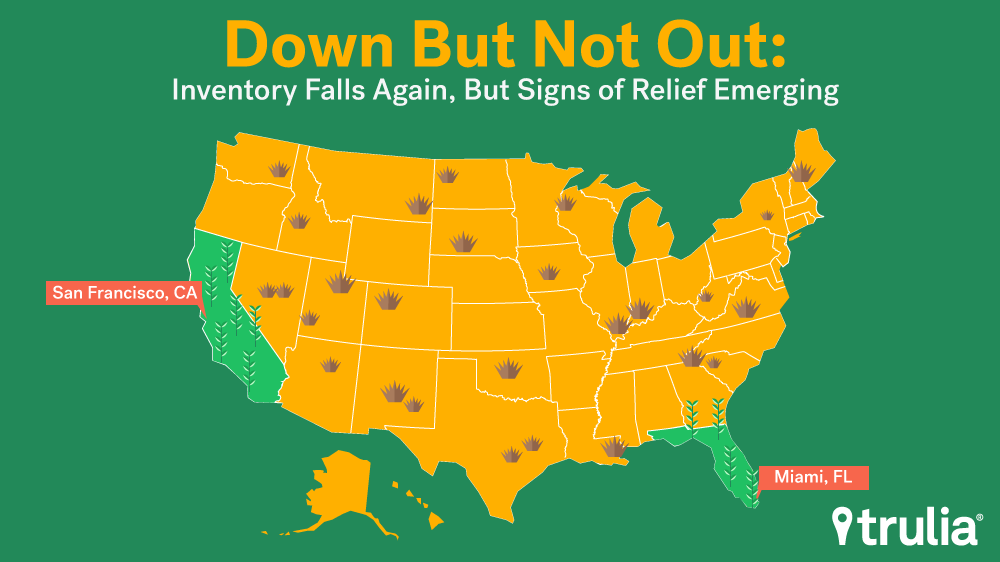
Despite the decline, there are some signs housing supply is easing. Inventory in a few California and Florida cities is on the rise. What’s more, many of these markets have seen consecutive quarterly increases in available housing, suggesting an upward trend rather than a one-time blip. For example, inventory is up in San Francisco and Miami by 19.3% and 33.1%, respectively. For San Francisco it’s the fourth straight quarterly gain; the second straight for Miami.
In this edition of Trulia’s Inventory and Price Watch, we take a detailed dive into the markets where inventory is showing signs of picking up.
The Trulia Inventory and Price Watch is an analysis of the supply and affordability of starter homes, trade-up homes, and premium homes currently on the market. Segmentation is important because home seekers need information not just about total inventory, but also about inventory in the price range they are interested in buying. For example, changes in total inventory or median affordability don’t provide first-time buyers useful information about what’s happening with the types of homes they’re likely to buy, which are predominantly starter homes.
Looking at all the housing stock nationally and in the 100 largest U.S. metros from July 1, 2015 to July 1, 2016, we found:
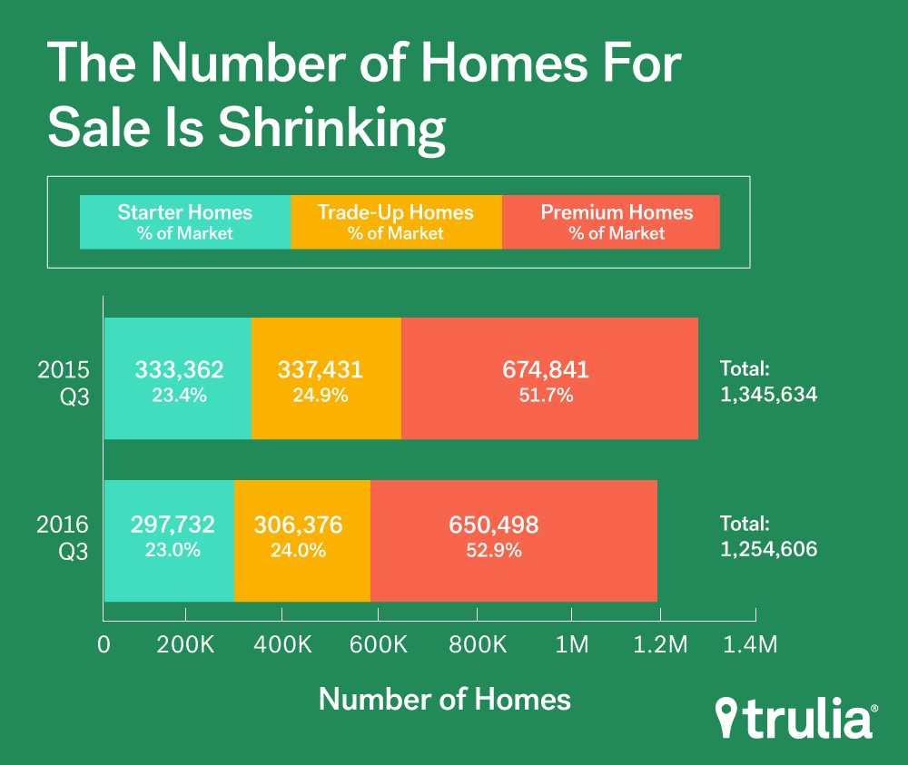
- Nationally, the number of starter and trade-up homes continues to drop at or near double-digit rates annually, while inventory has fallen less than 3.2% for premium homes;
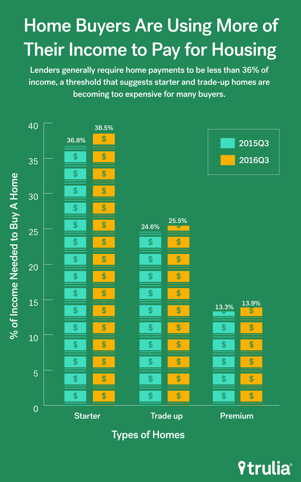
- The persistent and disproportional drop in starter and tradeup home inventory is pushing affordability further out of reach of homebuyers. Starter and trade-up homebuyers need to spend 1.7% and 0.9% more of their income than this time last year, whereas premium homebuyers only need to shell out 0.6% more of their income;
- Low inventory is not a permanent condition. Several large markets expected to face long-term inventory shortages are now experiencing increases in inventory at double digit rates. For example, housing availability in San Francisco and Miami has grown by 19.3% and 33.1%, respectively.
Summer Extends the Slump
Nationally, housing inventory continues to dive. This summer, the number of homes on the market dropped for the fifth straight quarter, dropping 6.7% over the past year. In addition:
- The number of starter homes on the market dropped by 10.7%, while the share of starter homes dropped from 23.4% to 23%. Starter homebuyers today will need to shell out 1.7% more of their income towards a home purchase than last year;
- The number of trade-up homes on the market decreased by 9.2%, while the share of trade-up homes dropped from 24.9% to 24%. Trade-up homebuyers today will need to pay 0.9% more of their income for a home than last year;
- The number of premium homes on the market decreased by 3.6%, while the share of premium homes increased from 51.7% to 52.9%. Premium homebuyers today will need to spend 0.6% more of their income for a home than last year.
| 2016 Q3 National Inventory Monitor | ||||||||
| Housing Segment | 2016 Q3 Inventory | Change, 2015 Q3 – 2016 Q3 | ||||||
| MedianList Price | Share | Inventory | % of Income Needed toBuy Median Price Home in Segment | % Change in MedianList Price | PercentagePointChange in Share | % Change in Inventory | Additional Share of IncomeNeeded to Buy aHome(Percentage-Point Change) | |
| Starter | $161,202 | 23.0% | 297,732 | 38.5% | 7.4% | -0.4 pts | -10.7% | +1.7 pts |
| Trade-Up | $280,579 | 24.0% | 306,376 | 25.5% | 6.4% | -0.9 pts | -9.2% | +0.9 pts |
| Premium | $579,713 | 52.9% | 650,498 | 13.9% | 7.5% | +1.2 pts | -3.6% | +0.6 pts |
| Among the 100 largest U.S. metro areas. Share is the percent of for-sale homes that fall into each segment, which is defined separately for each metro. Median price for each segment is the stock-weighted average of the median price of each segment in each metro. Some point change estimates may be slightly different than stated values because our differing procedure occurs before rounding. | ||||||||
Falling inventory continues to take a toll on affordability. Starter homebuyers need to dedicate 38.5% of their monthly income to buy a starter home – a 1.7 point increase from last year. This figure is important because spending 38.5% of income towards a mortgage payment is larger than the 36% guideline used by GSEs such as Fannie Mae. While not a hard ceiling, applying for a mortgage with a debt-to-income ratio of more than 36% will make the mortgage approval process more complicated, especially when factoring in other debt like student loans, credit cards, and auto payments. Most trade-up and premium home buyers, and the other hand, are still in the clear. Each would need to spend just 25.5% and 13.9% of their income to buy a home, respectively, which are well below the 36% limit.
Nothing is Permanent in this Wicked World. Not Even Low Inventory
Low inventory has been the talk of the real estate world for much of the year, and rightly so. Inventory nationally, and in many of the largest markets, has been on the decline over the past several years, dropping by over 8% nationally since the third quarter of 2014 . But there are signs that relief may be on the way for homebuyers in some markets. Of the 100 largest markets, 21 have experienced increases in inventory over the past year, with many showing double digit gains. However, half of these markets are in just two states: California and Florida.
| Housing Markets where Inventory is on the Rise | |||
| U.S. Metro | Total Inventory, 2015Q3 | Total Inventory, 2016Q3 | % Change in Inventory |
| Cape Coral-Fort Myers, FL | 4,991 | 6,825 | 36.7% |
| Miami, FL | 11,216 | 14,928 | 33.1% |
| Las Vegas, NV | 10,315 | 13,394 | 29.8% |
| Fresno, CA | 1,370 | 1,705 | 24.4% |
| North Port-Sarasota-Bradenton, FL | 5,646 | 6,967 | 23.4% |
| Oklahoma City, OK | 4,993 | 5,996 | 20.1% |
| San Francisco, CA | 1,063 | 1,269 | 19.3% |
| West Palm Beach, FL | 10,083 | 11,879 | 17.8% |
| Fort Lauderdale, FL | 8,984 | 10,417 | 15.9% |
| Bakersfield, CA | 2,134 | 2,360 | 10.6% |
| San Diego, CA | 6,304 | 6,897 | 9.4% |
| San Jose, CA | 1,809 | 1,966 | 8.7% |
| Memphis, TN | 3,898 | 4,202 | 7.8% |
| Phoenix, AZ | 19,067 | 20,383 | 6.9% |
| Winston-Salem, NC | 2,870 | 3,041 | 6.0% |
| Salt Lake City, UT | 1,689 | 1,779 | 5.3% |
| Houston, TX | 23,079 | 24,248 | 5.1% |
| Milwaukee, WI | 4,022 | 4,139 | 2.9% |
| Denver, CO | 7,225 | 7,426 | 2.8% |
| Little Rock, AR | 3,971 | 4,063 | 2.3% |
| San Antonio, TX | 7,549 | 7,580 | 0.4% |
| NOTE: Among the 100 largest U.S. metro areas. Full data available here. | |||
Homebuyers in Florida markets won’t need to look far to find more inventory. Five Florida markets saw gains in inventory over the past year, with Cape Coral-Fort Myers and Miami leading the country with increases of 36.7% and 33.1%, respectively. Two other markets in the greater Miami area – West Palm Beach and Fort Lauderdale – also saw noticeable increases at 17.8% and 15.9%. Sarasota was the market with the fifth-biggest increase, having grown inventory by 23.4%.
On the West Coast, homebuyers may be in for some relief heading into the remainder of the year. Notably, the two least affordable markets in the U.S. – San Francisco and San Jose – have both witnessed strong inventory growth over the past year, jumping by 19.3% and 8.7% respectively. San Diego also saw gains of 9.4% over the past year, while two inland California markets – Bakersfield and Fresno – had 10.6% and 24.4% more inventory than last year. This is cautiously optimistic news for frustrated buyers in the Golden State, who have seen prices soar whilst inventory remained flat over the past few years. While prices aren’t likely to fall anytime soon because of healthy demand, growing inventory may help moderate the strong price gains that these markets have experienced since market bottom in 2012.
While inventory is certainly on the rise in the Golden and Sunshine States, there are other notable markets where supply is on the rise. Inventory in Denver – which decreased over 10 consecutive quarters – rose by 2.8% in third quarter of 2016. Similarly, Phoenix showed its first increase in six quarters, growing by 6.9% over the past year.
Where Inventory is Trending Up
Though inventory has increased in some markets, a one quarter increase does not make a trend. In fact, if we look at markets where inventory is trending upwards, that is, where inventory has increased at least three consecutive quarters, just four made the cut: Bakersfield, San Francisco, Sarasota, and West Palm Beach. Of these, Bakersfield has the longest streak, showing gains over 15 straights quarters. San Francisco has the second longest, with four consecutive quarters. The two Florida markets hit a trend with three straight quarterly gains.
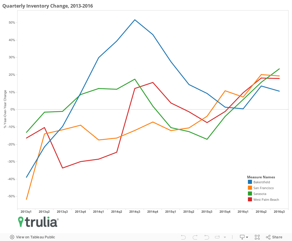
While inventory is trending upwards in just these four markets, nine others are near-trending by having shown two consecutive quarters of gains. Of these nine, three six are either in California or Florida. San Jose, Calif., showed increases of 5.9% and 8.7% in the second and third quarters respectively, while San Diego showed similar increases of 5% and 9.4%. With Fort Lauderdale and Miami also near-trending, inventory in all three metros in the greater Miami metropolitan area appear to be on the upswing, with the former growing 10.3% and 15.9% and the latter 10.7% and 33.1% in second and third quarters, respectively.
The Recap
Inventory continues to fall nationally, with starter homes and tradeup homes continuing to take the biggest hit. The further drop in inventory is also pushing declines in affordability, with starter homebuyers having to dedicate a larger share of their income towards a home than tradeup and premium buyers over the last year. However, we do have one big takeaway: nothing is permanent, not even low inventory. Notoriously stingy markets for homebuyers, such as San Francisco, San Jose, and Denver, are showing signs of picking up after prolonged periods of declines in 2014 and 2015. Finally, last week also brought some positive news for homebuyers: incomes are finally on the rise. Real incomes increased over 5% in 2015 according to the most recent U.S. Census Income and Poverty report. This was the largest annual jump in recorded history, and when combined with income growth, may help break what has been a gridlocked housing market as homebuyers experience gains in both income and choice.
Methodology
Each quarter, Trulia’s Inventory Monitor provides three metrics: (1) the number and share of inventory that are starter homes, trade-up homes, and premium homes, (2) the change in share and number of these homes, and (3) the affordability of those homes for each type of buyer. For the first edition of this report, we back-calculate inventory for each quarter back to the first quarter of 2012 through the first quarter of 2016.
We define the price cutoffs of each segment based on home value estimates of the entire housing stock, not listing price. For example, we estimate the value of each single-family home and condo and divide these estimates into three groups: the lower third we classify and starter homes, the middle third as trade-up homes, and the upper third as premium homes. We then classify a listing as a starter home on the market if its listing price falls below the price cutoff between starter and trade-up homes. This is a subtle but important difference between our inventory report and others. This is because the mix of homes on the market can change over time, and can cause large swings in the price points used to define each segment. For example, if premium homes comprise a relatively large share of homes for sale, it can make the lower third of listings look they’ve become more expensive when in fact prices in the lower third of the housing stock are unchanged.
Our national metrics are a weighted sum of listings and weighted average of affordability of the 100 largest metropolitan areas and our inventory measure is an average of snapshots taken on the first of each month of the quarter. Last, we measure affordability as the share of income needed to purchase the median priced home in each segment relative metro household income terciles. To lessen the downward skew of income of households in the lowest tercile, we estimate starter homebuyer’s income using only household incomes of homeowners within this segment.
Note that though the U.S. Census released updates to the 2015 American Community Survey (ACS) last week, which included new metropolitan level estimates of median income, we cannot yet update the income data used in this report because doing so requires individual survey records. Individual 2015 ACS survey records will not be available until later this Fall. The 2016Q4 Trulia Inventory and Price Watch will include updated these updated estimates.
Change to Methodology
Beginning this quarter and into subsequent releases, the Trulia Inventory and Price will include not only properties that are verified through public records, but all properties reported to us by Multiple Listing Services. In this report all data cited, including historical results, includes results from the additional MLS set. In previous releases of this report, we included just those that could be verified using assessor’s records. Including unverified properties into our sample did not change the underlying distribution of properties based on listing price, but, on average, did increase counts by about 10%.