Since the Great Recession officially ended in the US in late-2009, the road to recovery of the job and housing markets has been slow, but steady. Of course, not all parts of the country have experienced the same degree of recovery, but the difference between some of the largest metro areas and rural America is especially stark—many metros have seen robust growth in jobs and home prices, while many rural areas have stagnated. This divergence has boosted demand for housing in the nation’s cities, fueling rapid rises in home prices. A major factor affecting how fast housing prices rise has been the pace of home building: Among the larger metro areas where population has grown since home prices bottomed nationally in 2012, a strong relationship has emerged between the amount of home construction and how much home values have appreciated.
We’ve picked apart employment, population, building permit and home value data to come up with a more holistic view of what has happened across the country since the recession. Here are some key findings:
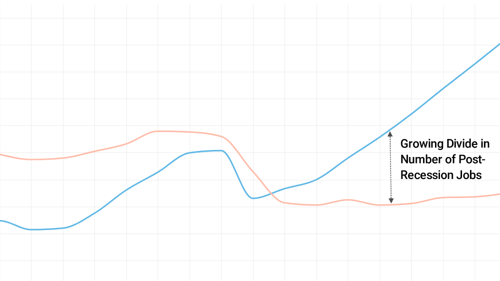
- In the largest 100 metro areas, the number of people employed returned to pre-recession levels by mid-2012 and grew an additional 9.6% through mid-2017. This compares with mere 0.6% employment growth in rural counties during the same period, which have yet to recover to pre-recession employment levels.
- Home values across the country increased 45.1% from mid-2012 to mid-2018. Home values in the 100 largest metro areas grew 53.1% though, nearly double the gain in rural counties, which increased 27.9%.
- From 2012 to 2017, the US population grew 3.7%. In the 100 largest metro areas though, it expanded 4.8%, while population in rural counties fell 1.0%.
- Among metros where population grew from mid-2012 through mid-2017, the rise in home values over the past six years is strongly related to the number of new residents added per building permit issued.
The differences between metro and rural areas in job and home value trends did not start with the recovery from the recession of the past decade. The employment pattern seen since 2010 was already visible before the recession. Nevertheless, this urban-rural divergence has become especially apparent in recent years. Economic trends in the aftermath of the housing crisis seems to have intensified the conditions pushing people away from rural areas and toward larger employment centers. Probable culprits include the tepid recovery of manufacturing and increasing automation in the agricultural sector. Additionally, the employment sectors that have grown the most are professional and nonprofessional services that cluster in larger metro areas.
The effects of this shifting employment pattern on the housing market are reflected in how much home values appreciation varies across different parts of the country. Especially in large metro areas, faster population and employment growth have put upward pressure on housing demand, pushing up prices.
| 10 Largest Metros (Ordered by Size) | ||||
| Area | Population Growth 2012-2017 | Employment Growth 2012-2017 | New People Per Permit Issued | Home Value Appreciation 2012 – 2018 |
| New York, NY | 2.7% | 8.5% | 1.46 | 31.0% |
| Los Angeles, CA | 2.1% | 11.6% | 1.74 | 68.4% |
| Chicago, IL | -0.1% | 5.3% | -0.06 | 39.0% |
| Houston, TX | 11.5% | 9.0% | 2.12 | 47.7% |
| Atlanta, GA | 7.9% | 14.0% | 2.48 | 77.4% |
| Washington, DC | 6.1% | 8.0% | 2.03 | 29.0% |
| Phoenix, AZ | 9.6% | 16.6% | 2.88 | 75.3% |
| Dallas, TX | 10.9% | 16.6% | 2.00 | 69.9% |
| Minneapolis-St. Paul, MN | 5.2% | 9.0% | 2.20 | 53.9% |
| Riverside-San Bernardino, CA | 5.5% | 15.7% | 3.64 | 87.4% |
| Non-Metro Areas | -1.0% | 0.6% | -1.03 | 27.9% |
| 100 Largest Metro Areas | 4.8% | 9.6% | 1.94 | 53.1% |
| All Metro and Micro Areas | 4.0% | 8.2% | 1.71 | 49.1% |
| National | 3.7% | 7.7% | 1.64 | 45.1% |
| Note: Click here to download the full data set. | ||||
| High-Growth Metros with Big Home Value Appreciation | ||||
| Area | Population Growth 2012-2017 | Employment Growth 2012-2017 | New People Per Permit Issued | Home Value Appreciation 2012 – 2018 |
| San Jose, CA | 5.3% | 14.5% | 2.13 | 122.7% |
| Las Vegas, NV | 10.4% | 14.2% | 2.99 | 114.2% |
| Oakland, CA | 6.6% | 11.9% | 3.81 | 108.4% |
| San Francisco, CA | 5.4% | 15.3% | 2.56 | 101.4% |
| Fort Lauderdale, FL | 6.6% | 11.4% | 4.33 | 101.3% |
| Seattle, WA | 9.1% | 12.4% | 2.00 | 99.6% |
| Other High-Growth Metros with More Modest Home Value Appreciation | ||||
| Austin, TX | 15.3% | 20.5% | 1.99 | 57.2% |
| Charlotte, NC | 10.1% | 18.6% | 1.95 | 48.3% |
| North Port-Sarasota-Bradenton, FL | 11.7% | 18.5% | 2.10 | 71.1% |
| Raleigh, NC | 12.3% | 18.0% | 1.78 | 37.8% |
| Orlando, FL | 12.7% | 17.7% | 2.50 | 81.8% |
| Nashville, TN | 10.2% | 16.9% | 1.76 | 71.7% |
| Note: Click here to download the full data set. | ||||
As home prices rise, concerns about housing affordability continue to grow. The data suggest that, even in this relatively brief window of a few years, construction has helped keep prices in check. Among those metro areas where population has grown since 2012, the ones that have built the most housing per each additional resident have, for the most part, avoided the most dramatic swings in home values. It stands to reason, of course. The law of supply and demand tells us that, all else equal, more inventory means less pressure on prices.
Nationally, the population has grown by 1.6 people for every building permit issued. But, in the 100 largest metros, 1.9 people have been added for every permit issued. At one extreme are places like Fort Lauderdale, Fla., and Oakland, Calif., which have added 4.3 and 3.8 people per permit issued–and home values in those metros have more than doubled. By contrast, Raleigh, N.C., and Austin, Tex., have added 1.8 and 2.0 people per permit issued and home prices have appreciated a more modest 37.8% and 57.2%, respectively.
It’s important to remember though that this period of five or six years didn’t take place in a vacuum. Some of the places that were overbuilt in the mid-2000s and suffered the biggest home value depreciation during the recession have not recently constructed as much housing relative to the number of new arrivals. For some of those places, this is probably a healthy level of development. To the same point, San Francisco and San Jose did not become the most expensive large metro areas in the country just because of five years of under building. A mounting body of evidence shows prices in those metros—and increasingly in the Bay Area more generally—reflect decades of low-density zoning and restricted housing development relative to population growth.
Methodology
A combination of the Census Bureau’s Population and Housing Unit Estimates and Building Permit Survey data was combined with data from the Bureau of Labor Statistics’ Local Area Unemployment Statistics (LAUS) survey at the county level as well as our proprietary home value data. Geographies were aggregated OMB defined metro and micropolitan areas and metro-divisions where available. Any counties that are not part of a OMB defined metro or micro area were considered rural.