Trulia’s Bubble Watch shows whether home prices are overvalued or undervalued relative to fundamentals by comparing prices today with historical prices, incomes, and rents. The more prices are overvalued, the greater the chance that a bubble might be forming. Sharply rising prices aren’t necessarily a sign of a bubble. By definition, a bubble develops when prices look high relative to fundamentals.
Bubble watching is as much an art as a science because there’s no definitive measure of fundamental value. To try to put numbers on it, we look at the price-to-income ratio, the price-to-rent ratio, and prices relative to their long-term trends. We use multiple data sources, including the Trulia Price Monitor as a leading indicator of where home prices are heading. We combine these measures of fundamental value rather than relying on a single factor because no one measure is perfect. Trulia’s first Bubble Watch report, from May 2013, explains our methodology. This FAQ gives more detail for interpreting the results. Here’s what we found this quarter.
Home Prices 2% Undervalued Nationally
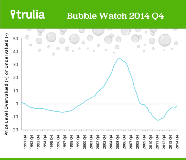
We estimate that home prices nationally were 2% undervalued in the fourth quarter of 2014. In the first quarter of 2006, at the height of the past decade’s housing bubble, home prices soared to 34% overvalued before dropping to 14% undervalued in the first quarter of 2012. One year ago, in the fourth quarter of 2013, prices looked 5% undervalued. This chart shows how far current prices are from a bubble:

Eight of the Ten Most Overvalued Markets are in California and Texas
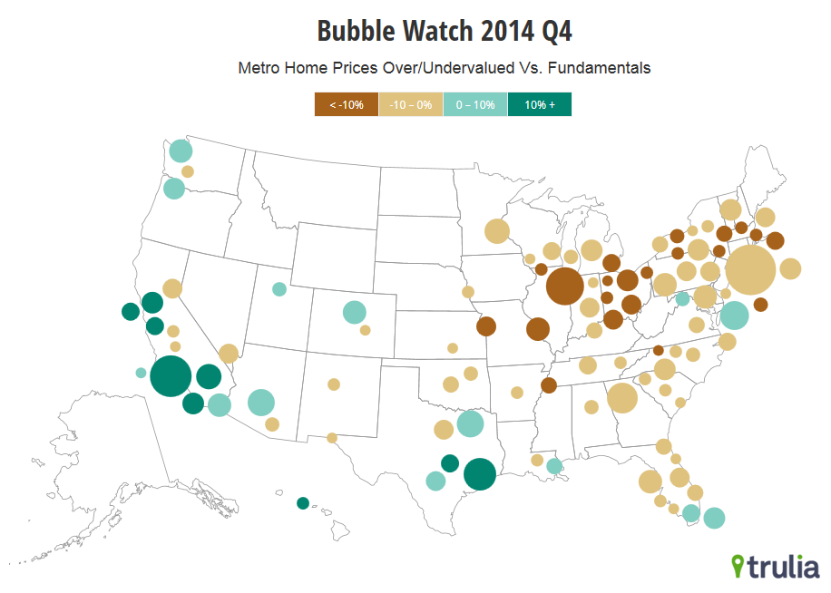
The most overvalued market is now Austin, at 16%, followed by Orange County and Los Angeles in Southern California. Nine of the 100 largest metros are 10% or more overvalued. Miami, the 10th most overvalued metro, rounds up to 10%, but is actually a hair below that level.
| Top 10 Metros Where Home Prices Are Most Overvalued | ||||
| # | U.S. Metro | Home prices relative to fundamentals, 2014 Q4 | Home prices relative to fundamentals, 2006 Q1 | Year-over-year change in asking prices, Dec 2014 |
| 1 | Austin, TX | +16% | +2% | 12.2% |
| 2 | Orange County, CA | +15% | +65% | 6.1% |
| 3 | Los Angeles, CA | +13% | +73% | 7.0% |
| 4 | Honolulu, HI | +13% | +37% | 5.4% |
| 5 | San Francisco, CA | +12% | +47% | 9.5% |
| 6 | Riverside-San Bernardino, CA | +12% | +87% | 11.0% |
| 7 | San Jose, CA | +12% | +53% | 8.4% |
| 8 | Oakland, CA | +10% | +68% | 14.5% |
| 9 | Houston, TX | +10% | +1% | 13.4% |
| 10 | Miami, FL | +10% | +76% | 11.9% |
| Note: Among the 100 largest metros. Positive numbers indicate overvalued prices, negative numbers undervalued. Click here to see the price valuation for all 100 metros: Excel or PDF. | ||||
All of the most undervalued metros today are in the Midwest and New England, led by Cleveland and Akron. But some of the most undervalued metros have recently had double-digit price increases, including Lake-Kenosha Counties (just north of Chicago), Toledo, and Detroit.
| Top 10 Metros Where Home Prices Are Most Undervalued | ||||
| # | U.S. Metro | Home prices relative to fundamentals, 2014 Q4 | Home prices relative to fundamentals, 2006 Q1 | Year-over-year change in asking prices, Dec 2014 |
| 1 | Cleveland, OH | -20% | +13% | 1.8% |
| 2 | Akron, OH | -17% | +12% | 0.6% |
| 3 | Dayton, OH | -17% | +8% | 4.9% |
| 4 | Lake-Kenosha Counties, IL-WI | -16% | +25% | 12.7% |
| 5 | New Haven, CT | -16% | +32% | 2.6% |
| 6 | Toledo, OH | -15% | +16% | 10.2% |
| 7 | Hartford, CT | -15% | +20% | 3.7% |
| 8 | Fairfield County, CT | -14% | +30% | 1.0% |
| 9 | Worcester, MA | -14% | +39% | 2.0% |
| 10 | Detroit, MI | -14% | +33% | 12.9% |
| Note: Among the 100 largest metros. Positive numbers indicate overvalued prices, negative numbers undervalued. Click here to see the price valuation for all 100 metros: Excel or PDF. | ||||

Today’s most overvalued markets are generally less affordable than the most undervalued markets. Nevertheless, overvaluation and undervaluation aren’t necessarily the same as affordability. Our valuation measure looks at local prices relative to what’s normal historically in each local market. Right now, New York and Boston both look several percentage points undervalued relative to long-term fundamentals, even though they’re far more expensive than Houston or Austin on a price-per-square-foot basis. What’s more, in the past, extremely affordable markets such as Detroit sometimes looked overvalued relative to local fundamentals, while very expensive markets such as San Francisco looked undervalued.
Prices Look Healthier Than At Any Point in Recovery
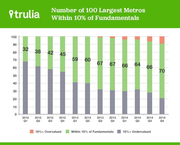
As of the fourth quarter of 2014, prices in 70 of the 100 largest metros were within 10% of fundamentals—that is, they were neither overvalued nor undervalued by more than 10%. Among the 100 largest metros, only nine were overvalued by more than 10%, and 21 were undervalued by more than 10%. The number of markets within 10% of fundamentals is at its highest level since prices hit bottom in early 2012.

Even better, home prices may be leveling off in healthy territory—in other words, without the national housing market moving back into bubble range. In 2006, nearly half of large metros were more than 30% overvalued. No large metro comes close to that degree of overvaluation today. Prices increases are slowing nationally, well before a bubble has formed. The trend is visible in most metros, particularly those that had the most severe housing bust in the past decade and unsustainably fast price rebounds more recently. And we expect price increases to keep slowing in 2015. Bubble-watchers can continue to rest easy.
Notes:
Each quarter’s Bubble Watch includes revisions to previous estimates because the underlying data are often revised or updated. To compare the national or metro trend over time, look at the current report’s historical numbers, not previously reported numbers.
This post uses a newer set of metropolitan area definitions than previous Bubble Watch analyses. This FAQ provides the details.

