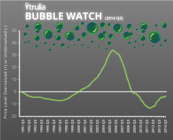
Home prices now look 3% undervalued measured by long-term fundamentals. Just 7 of the 100 largest metros are more than 10% overvalued.
(UPDATE 10/15/14: We’ve created an FAQ that answers frequently-asked questions about Trulia’s Bubble Watch report. It’s available here.)
Trulia’s Bubble Watch shows whether home prices are overvalued or undervalued relative to their fundamental value by comparing prices today with historical prices, incomes, and rents. The more prices are overvalued relative to fundamentals, the closer we are to a housing bubble – and the bigger the risk of a price crash. Sharply rising prices aren’t necessarily a sign of a bubble. By definition, a bubble develops when prices look high relative to fundamentals.
Bubble watching is as much an art as a science because there’s no definitive measure of fundamental value. To try to put numbers on it, we look at the price-to-income ratio, the price-to-rent ratio, and prices relative to their long-term trends. We use multiple data sources, including the Trulia Price Monitor, as leading indicators of where home prices are heading. We combine these various measures of fundamental value rather than relying on a single factor because no one measure is perfect. Trulia’s first Bubble Watch report, from May 2013, explains our methodology in detail. Here’s what we found this quarter. (This report contains larger-than-usual revisions of previous Bubble Watch estimates. See note.)
Home Prices are 3% Undervalued Nationally
We estimate that home prices nationally are 3% undervalued in the third quarter of 2014 (2014 Q3). In 2006 Q1, during the past decade’s housing bubble, home prices soared to 34% overvalued before dropping to 13% undervalued in 2012 Q1. One quarter ago (2014 Q2), prices looked 5% undervalued; one year ago (2013 Q3), prices looked 6% undervalued. This chart shows how far current prices are from a bubble:

Texas and California Metros Look Most Overvalued
The most overvalued market is now Austin, at 19%, followed by the California metros of Los Angeles, Orange County, San Francisco, and Riverside–San Bernardino. The California metros on the top-10 list were all significantly overvalued during the past bubble, ranging from 46% overvalued in San Francisco to a dizzying 87% in Riverside–San Bernardino. By contrast, Austin and Houston are the only metros out of the 100 largest that look more overvalued today than in 2006. Texas markets avoided the worst of the housing bubble during the past decade. Recently, they’ve had double-digit home-price increases.
| Top 10 Metros Where Home Prices Are Most Overvalued | ||||
| # | U.S. Metro | Home prices relative to fundamentals, 2014 Q3 | Home prices relative to fundamentals, 2006 Q1 | Year-over-year change in asking prices, Aug 2014 |
| 1 | Austin, TX | +19% | +2% | 11.9% |
| 2 | Los Angeles, CA | +15% | +73% | 8.9% |
| 3 | Orange County, CA | +15% | +66% | 6.0% |
| 4 | San Francisco, CA | +12% | +46% | 11.2% |
| 5 | Riverside–San Bernardino, CA | +11% | +87% | 13.8% |
| 6 | Honolulu, HI | +10% | +36% | 6.7% |
| 7 | San Jose, CA | +10% | +53% | 10.4% |
| 8 | Houston, TX | +8% | +1% | 10.4% |
| 9 | Denver, CO | +7% | +17% | 9.4% |
| 10 | Oakland, CA | +7% | +67% | 12.4% |
| Note: positive numbers indicate overvalued prices; negative numbers indicate undervalued, among the 100 largest metros. Click here to see the price valuation for all 100 metros: Excel or PDF. | ||||
Almost all of the most undervalued metros today are in the Midwest and New England, led by Dayton and Cleveland. One year ago, Las Vegas and two Florida metros, Lakeland-Winter Haven and Palm Bay-Melbourne-Titusville, were on the most-undervalued list. Since then, price gains have lifted them off this list. In the past year, price gains in the undervalued Midwestern markets like Detroit have outpaced price gains in the undervalued New England markets like New Haven.
| Top 10 Metros Where Home Prices Are Most Undervalued | ||||
| # | U.S. Metro | Home prices relative to fundamentals, 2014 Q2 | Home prices relative to fundamentals, 2006 Q1 | Year-over-year change in asking prices, May 2014 |
| 1 | Dayton, OH | -21% | 8% | 8.8% |
| 2 | Cleveland, OH | -19% | 13% | 5.9% |
| 3 | Detroit, MI | -18% | 33% | 11.9% |
| 4 | Akron, OH | -18% | 13% | 8.9% |
| 5 | Lake County-Kenosha County, IL-WI | -17% | 24% | 12.2% |
| 6 | Toledo, OH | -17% | 17% | 9.6% |
| 7 | New Haven, CT | -16% | 31% | -0.9% |
| 8 | Camden, NJ | -15% | 31% | 1.8% |
| 9 | Worcester, MA | -15% | 38% | 3.5% |
| 10 | Fairfield County, CT | -14% | 30% | 0.4% |
| Note: positive numbers indicate overvalued prices; negative numbers indicate undervalued, among the 100 largest metros. Click here to see the price valuation for all 100 metros: Excel or PDF. | ||||
Are We Headed Toward The Next Bubble?
One test of whether it’s time to sound the bubble alarm is whether prices are rising faster in markets that are already overvalued. Price gains in overvalued markets are a sign that we’re headed for danger, while price gains in undervalued markets are probably just a sign of getting back toward normal.
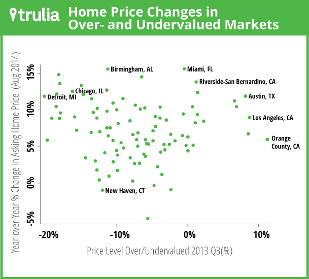
To measure this, we compare the most recent year-over-year asking-price change from the Trulia Price Monitor with our Bubble Watch measure from 2013 Q3, one year ago. That’s because what matters is whether overvalued markets subsequently see faster price gains (remember that current Bubble Watch values, by design, incorporate recent price trends).
The scatterplot below shows the relationship. Hard to see a pattern, right? Actually, there’s a negative relationship, but it’s small (correlation = -0.07) and not statistically significant. At least we can say that overvalued markets are not systematically seeing larger price increases, though some individual overvalued markets like Austin and Riverside-San Bernardino did have big price jumps.

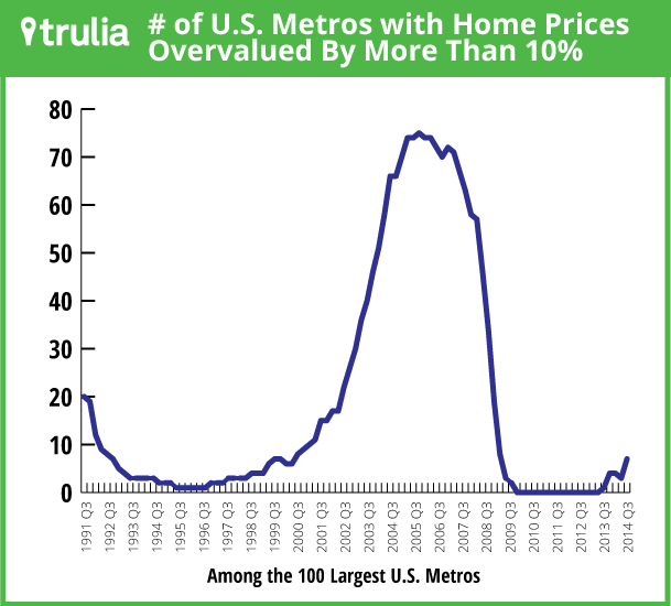
Another measure of bubble risk is how many markets are more than 10% overvalued. As of 2014 Q3, only seven of the top 100 metros exceeded this level, as shown in the table above. That’s the highest number since 2009 Q1, when prices were plummeting and the past bubble had mostly deflated. The last time that the number of 10%+ overvalued markets was at least seven and rising was 2000 Q2 – early in the formation of that bubble.

All this means that bubbles should not be our top housing worry today. Our latest Housing Barometer shows that weak construction and subpar young-adult employment are the recovery’s big red flags. By contrast, prices are slowing to a sustainable pace and staying within striking distance of normal.
Note: each quarter’s Bubble Watch includes revisions to previous estimates because the underlying data are often revised or updated. To compare the national or metro trend over time, look at the current report’s historical numbers, not previously reported numbers. This quarter’s Bubble Watch contains larger-than-usual revisions because a key input data series – the Case-Shiller national index – recently had significant revisions that resulted in less extreme price swings during the boom and bust.

