(After publishing this post, we got great feedback and decided to do a more technical and detailed follow-up, which is here — JDK.)
Why did Obama win? Throughout the campaign and in exit polls, voters said the economy was their #1 issue. But election data shows that voters did not reward the President in markets where the jobs and housing recoveries are strongest.
How Obama Fared In 2012 Versus 2008
To see how the local housing and jobs recoveries affected the election, let’s first compare Obama’s margin in 2008 with Obama’s margin in 2012, using county-level election results compiled by the U.S. Election Atlas. Nationally, the latest count shows that Obama won 50.6% of the popular vote in 2012 compared to 47.8% for Romney – a margin of 2.7% (the numbers don’t add up due to rounding). In 2008, Obama won 52.9% versus 45.7% for McCain – a margin of 7.3%. Nationally, therefore, Obama’s margin fell from 7.3% in 2008 to 2.7% in 2012 – a drop of 4.5 percentage points.
In general, in metro areas where voters favored Obama in 2008, they favored him again in 2012. (The correlation between Obama’s margin in 2008 and Obama’s margin in 2012 across metro areas was 0.99.) But Obama’s margin grew in some metros between 2008 and 2012 while falling in most metros. Comparing the presidential votes in 2008 and 2012 among the 100 largest metros, Obama’s margin increased most in Miami and New Orleans. His margin also increased in New York and the upstate metros of Syracuse and Albany.
|
Where Obama’s Margin Increased the Most |
||||
| # | U.S. Metro |
Change in Obama’s margin, 2012 vs 2008 |
Obama’s margin vs Romney, 2012 |
Obama’s margin vs McCain, 2008 |
| 1 | Miami, FL |
7.6 |
23.7 |
16.1 |
| 2 | New Orleans, LA |
6.1 |
-0.1 |
-6.2 |
| 3 | New York, NY-NJ |
2.4 |
48.3 |
45.9 |
| 4 | Baton Rouge, LA |
1.8 |
-12.4 |
-14.2 |
| 5 | Edison–New Brunswick, NJ |
1.5 |
3.1 |
1.6 |
| 6 | Syracuse, NY |
1.5 |
16.9 |
15.4 |
| 7 | San Jose, CA |
1.0 |
41.3 |
40.4 |
| 8 | Albany, NY |
0.9 |
15.5 |
14.6 |
| 9 | Fort Lauderdale, FL |
0.2 |
34.9 |
34.7 |
| 10 | Columbus, OH |
0.2 |
6.1 |
5.9 |
| Among 100 largest metros. | ||||
In the other direction, Obama did worse relative to his Republican challengers in 2012 than in 2008 in most metros – and more than 10 points worse in Salt Lake City, Indianapolis, and Lake County – Kenosha County (just north of Chicago).
|
Where Obama’s Margin Decreased the Most |
||||
| # | U.S. Metro |
Change in Obama’s margin, 2012 vs 2008 |
Obama’s margin vs Romney, 2012 |
Obama’s margin vs McCain, 2008 |
| 1 | Salt Lake City, UT |
-19.5 |
-20.1 |
-0.6 |
| 2 | Indianapolis, IN |
-10.5 |
-8.0 |
2.5 |
| 3 | Lake County-Kenosha County, IL-WI |
-10.3 |
9.0 |
19.3 |
| 4 | St. Louis, MO-IL |
-9.4 |
6.6 |
16.0 |
| 5 | Grand Rapids, MI |
-8.5 |
-9.6 |
-1.1 |
| 6 | Kansas City, MO-KS |
-8.3 |
-3.1 |
5.2 |
| 7 | Omaha, NE-IA |
-8.3 |
-10.9 |
-2.6 |
| 8 | Austin, TX |
-7.0 |
7.1 |
14.1 |
| 9 | Ventura County, CA |
-6.9 |
5.3 |
12.2 |
| 10 | Allentown, PA-NJ |
-6.7 |
2.6 |
9.3 |
| Among 100 largest metros. | ||||
Obama Gained Votes In Markets That Are Worse Off Than 4 Years Ago
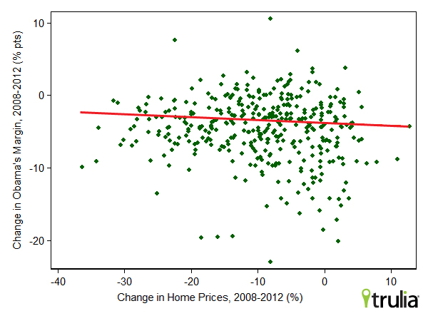
You might have expected – as I did — that people would reward Obama if they were better off in 2012 than in 2008 and punish him if they were worse off. In the past four years, some markets have done much better than others, in terms of both home prices and jobs. For instance, home prices were higher in 2012 than at the end of 2008 in Pittsburgh, Houston, and several other markets, yet more than 25% lower in Phoenix, Orlando, and Las Vegas, according to the Federal Housing Finance Agency. If voters wanted to reward or punish Obama for how he handled housing, Obama’s margin should have gone up between 2012 and 2008 in places like Pittsburgh and Houston, but down in places like Phoenix, Orlando, and Las Vegas. But it turns out that the change in local home prices had no relationship with the change in voting for Obama or his Republican opponent:
In fact, the bigger the home-price gain, the more Obama’s margin FELL: the scatterplot above shows that the relationship between the change in home prices and the change in Obama’s margin is slightly negative (correlation = -0.08, not statistically significant). If voters had chosen to reward Obama in areas with a stronger local housing market recovery, the line in the graph above would have been upward sloping.
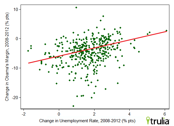
What about jobs? As with the housing market, the more the local labor market improved during Obama’s term, the bigger the increase in the Republican candidate’s share and the bigger the decline in Obama’s share. The scatterplot shows that in metros where the local unemployment rate fell most (on the left side of the graph), Obama’s margin dropped more from 2008 to 2012:
This relationship is fairly strong (correlation=0.35) and statistically significant. Again, this is surprising: if voters rewarded Obama in areas with a strong jobs recovery, then voters in metros where unemployment fell more should have voted more for Obama in 2012 than in 2008, not less, and the line in the graph above would have been downward sloping, not upward sloping.
Perhaps voters rewarded or punished Obama for how their local jobs or housing market performed just in the last year, rather than the whole four-year term? No. Neither a drop in unemployment or increase in home prices in the past year was associated with stronger support for Obama. Voters simply did not treat the 2012 election as a referendum on whether Obama helped their local housing or jobs market recover.
If Not Jobs Or Housing, Then What?
If lower unemployment or higher home prices can’t explain why some areas – like Miami and New York – swung more toward Obama while others – like Salt Lake City and Indianapolis – voted more Republican in 2012 than in 2008, what can? Part of the story is that candidates typically get a boost in markets where they have personal ties: surely it helped Romney in Salt Lake City and elsewhere in Utah that he lived in the state, ran the 2002 Salt Lake City Olympics, and his mother was born there. More broadly, though, two factors stand out.
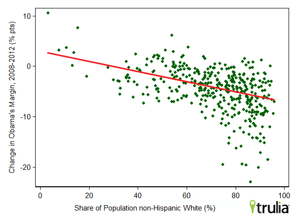
First: demographics. Metros with a lower share of Whites and a higher share of Hispanics, Blacks, or Asians increased their margin for Obama between 2008 and 2012. (We followed Census definitions of race and ethnicity, described here.) Not only did Obama do better than Romney among these groups in 2012, but the gap widened between 2008 and 2012. The relationship between the percent of the population that is non-Hispanic White and the change in Obama’s margin is very strong (correlation = -0.48) and statistically significant:
Second: Hurricane Sandy. Obama got rave reviews for the government’s response, even from New Jersey’s Republican governor Chris Christie. Look at the table above, which shows that Obama’s margin increased most between 2008 and 2012 in Miami, New York, New Orleans, Baton Rouge, LA, and Edison-New Brunswick, NJ. All five of those metros have been directly affected by either Hurricane Sandy two weeks ago (New York and Edison–New Brunswick), Hurricane Katrina (New Orleans, of course, and Baton Rouge was overwhelmed by people leaving New Orleans), and Hurricane Andrew (Miami). Coincidence? Possibly. But it’s also possible that people in areas affected by hurricanes in the past, present, and likely in the future voted more for Obama in 2012 than 2008 in response to his handling of Hurricane Sandy – especially in contrast to President Bush’s much-criticized response to Hurricane Katrina in 2005.
To sum up: voters say the economy is their #1 issue, but they didn’t appear to reward or punish Obama for their local jobs and/or housing recovery over the past four years. Perhaps they were thinking more about the economic opportunities and challenges that the country faces in the future than whether they’re better or worse off than four years ago. It also seems that race, ethnicity, and the government’s response to Hurricane Sandy swung some voters. It looks like asking voters if they are better off now than four years ago turns out to have been the wrong question to predict how they would vote.


