In the past year, affordability for homebuyers has fallen in 89 of the 100 largest housing markets thanks to rising home prices and stagnant income growth in many metros. We’ve also found a polarizing trend in affordability: the least affordable markets have become even less affordable for homebuyers over the past year, while the most affordable markets have remained relatively stable. However, mortgage payments, property taxes and insurance aren’t the only factors affecting housing affordability. The cost of commuting and utilities can also play a big role depending on where you live. For example, households living in metros with cold winters and hot summers might have larger utility bills, and those living in low-density, sprawling metros might have to spend more time and gas driving around town. When we took these two non-housing essential costs into account, we found that some of the most affordable markets don’t look that cheap anymore.
To paint a more accurate picture of housing affordability across the country, we first measured how much of a middle-class household’s monthly income would be spent on the monthly mortgage payment if they bought the median-priced home today in the 100 largest U.S. metros. We assumed a 30-year fixed-rate loan at 4% interest rate, and included both property taxes and insurance into our calculations. The median-priced home for each metro was based on all the for-sale listings on Trulia in August 2015. To calculate utility costs, we used data from the 2013 American Community Survey (ACS) on the median monthly household expenditure on electricity, gas, and water for each of the 100 largest U.S. metros. To calculate commuting costs, we also used 2013 ACS data to calculate the median household commute time to work for each metro. We then transformed commute time into a monthly dollar amount by assuming a $7 per hour operating cost ($3.50 per gallon, 20 miles per gallon average, and 40 miles per hour average speed) plus 25% of the local median hourly wage. We excluded commute time for household members that used non-automobile modes for their commute (e.g., trains and subways). Finally, to find out how utilities and commuting costs affect affordability, we calculated the monthly share of the median household’s income spent on all three essentials. Using this methodology, here are the most and least affordable places to live.
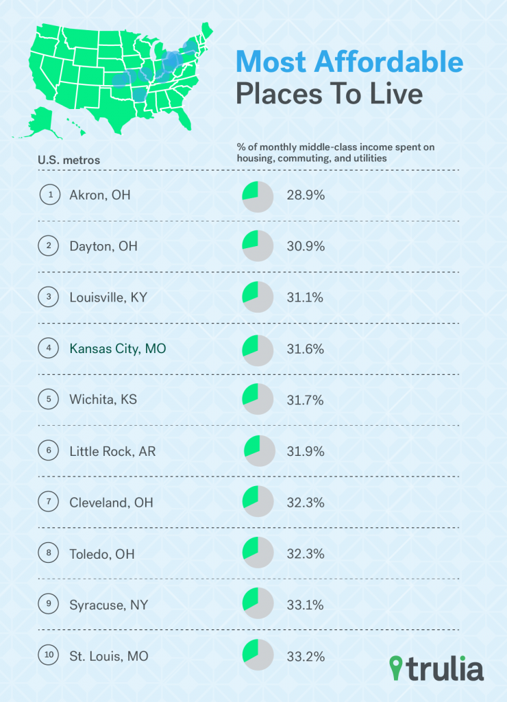
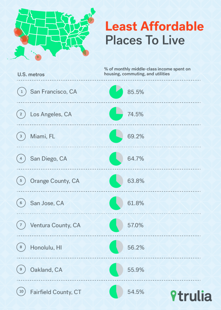
Now, let’s dive into each of these costs and how they affect a market’s affordability to middle-class homebuyers.
Housing Most Affordable in Ohio, Least in California
The Midwest is the most affordable place to be, especially in Ohio. Middle-class homebuyers in Akron, Dayton, Cleveland, and Toledo can get away with paying less than 20% of their monthly income on mortgage payments on a median priced home. To put this into context, the U.S. Department of Housing and Urban Development considers housing expenditures greater than 31% of your incoming as unaffordable. What’s even better, homebuyers in most top 10 most affordable housing markets are actually spending even less of their income on housing since last year. And in market where there was an increase, the share of income spent on housing has jumped by no more than 0.7 percentage points.
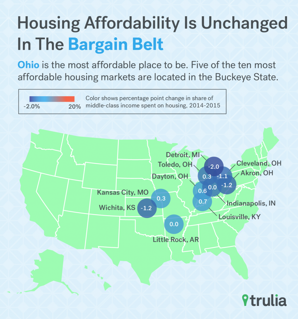
| America’s Most Affordable Housing Markets | |||||
| # | U.S. Metro | % of Monthly Middle-Class Income Spent on Housing, Aug 2015 | % of Monthly Middle-Class Income Spent on Housing, Aug 2014 | Percentage Point Change in Share of Middle-Class Income Spent on Housing, 2014-2015 | Median Listing Price, Aug 2015 |
| 1 | Akron, OH | 16.0% | 17.2% | -1.2% | $120,450 |
| 2 | Dayton, OH | 17.6% | 17.6% | 0.0% | $119,700 |
| 3 | Louisville, KY | 18.2% | 17.6% | 0.7% | $159,900 |
| 4 | Cleveland, OH | 18.2% | 19.3% | -1.1% | $129,900 |
| 5 | Little Rock, AR | 18.3% | 18.2% | 0.0% | $155,000 |
| 6 | Toledo, OH | 18.4% | 18.0% | 0.3% | $119,900 |
| 7 | Detroit, MI | 18.4% | 20.5% | -2.0% | $89,900 |
| 8 | Kansas City, MO | 18.5% | 18.2% | 0.3% | $164,900 |
| 9 | Wichita, KS | 19.3% | 20.5% | -1.2% | $150,000 |
| 10 | Indianapolis, IN | 19.5% | 18.9% | 0.6% | $169,950 |
| Click here to download all the findings for the 100 largest U.S. metros. | |||||
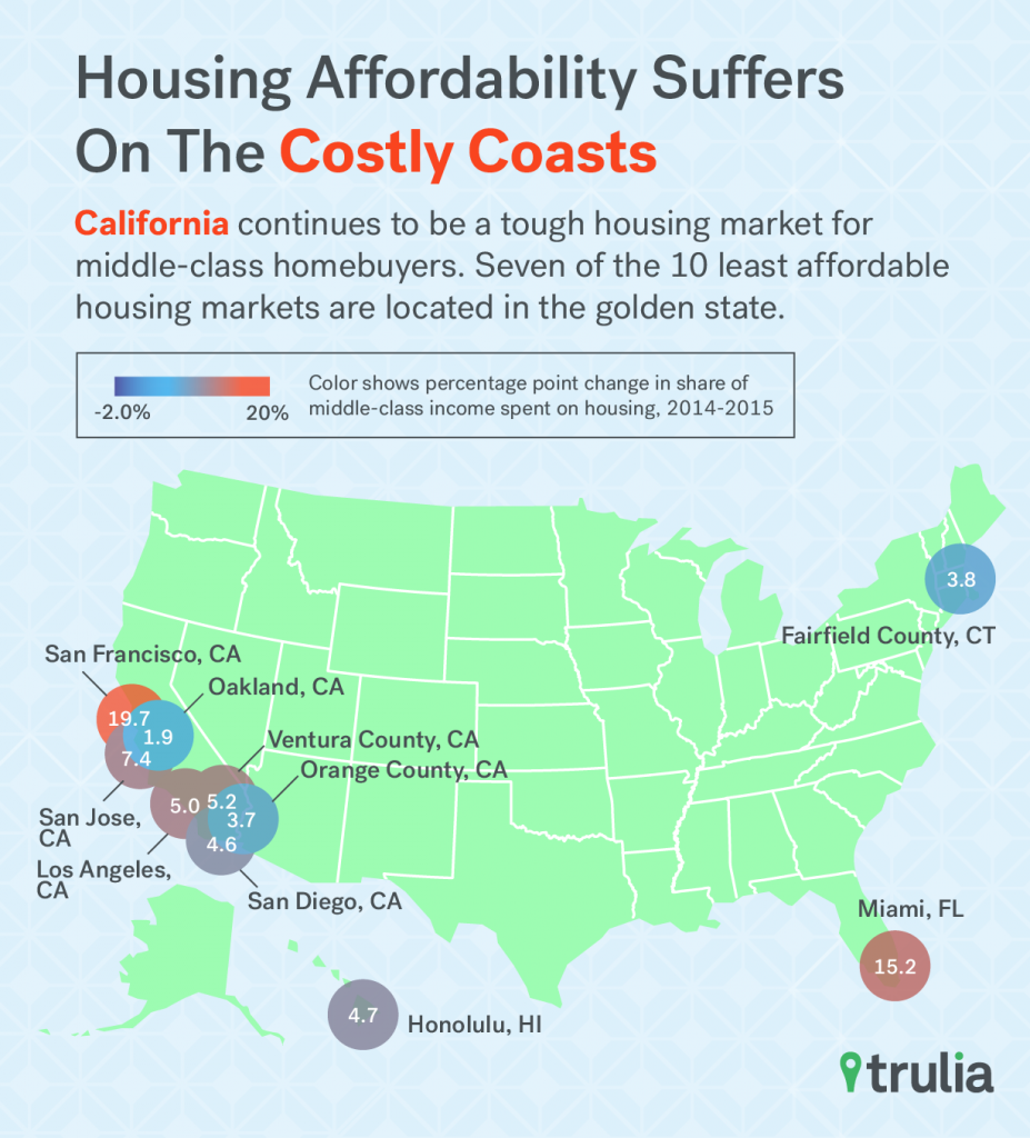
On the other hand, California continues to be a tough housing market for middle-class homebuyers. Seven of the 10 least affordable housing markets are located in the golden state, with Miami, Fairfield County, and Honolulu being the only non-California metros to make the list. In these least affordable markets, middle-class households would need to spend at least 42% of their monthly income to buy the median priced home. But in pricey San Francisco, that number jumps to an incredible 77% of income. San Jose, Miami, Orange County, San Diego, and Los Angeles follow with middle-class homebuyers needing to fork over at least 50% of their monthly income on housing
| America’s Least Affordable Housing Markets | |||||
| # | U.S. Metro | % of Monthly Middle-Class Income Spent on Housing, Aug 2015 | % of Monthly Middle-Class Income Spent on Housing, Aug 2014 | Percentage Point Change in Middle-Class Income Spent on Housing, 2014-2015 | Median Listing Price, Aug 2015 |
| 1 | San Francisco, CA | 77.0% | 57.2% | 19.7% | $1,190,900 |
| 2 | Los Angeles, CA | 59.6% | 54.4% | 5.2% | $580,000 |
| 3 | San Diego, CA | 52.9% | 48.3% | 4.6% | $579,000 |
| 4 | Orange County, CA | 52.8% | 49.1% | 3.7% | $725,000 |
| 5 | Miami, FL | 52.3% | 37.1% | 15.2% | $380,000 |
| 6 | San Jose, CA | 51.9% | 44.5% | 7.4% | $838,000 |
| 7 | Ventura County, CA | 46.3% | 41.3% | 5.0% | $649,000 |
| 8 | Fairfield County, CT | 46.1% | 42.4% | 3.8% | $598,000 |
| 9 | Oakland, CA | 45.0% | 43.1% | 1.9% | $599,000 |
| 10 | Honolulu, HI | 42.1% | 37.4% | 4.7% | $590,000 |
| Click here to download all the findings for the 100 largest U.S. metros. | |||||
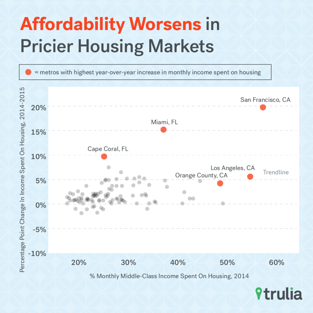
Furthermore, affordability isn’t getting any better in the most expensive markets either. Compared to last year, middle-class homebuyers in each these 10 metros will need to spend more of their income on housing if they bought a median priced home. Most notably in San Francisco and Miami, the share of income needed to be spent on housing has jumped more than 15 percentage points. What’s more, we found a strong positive relationship between housing affordability in September 2014 and the year-over-year change in the share of income spent on housing. In other words, the most expensive markets are getting even more expensive, and the least expensive have remained idle.
Non-Essential Housing Costs Can Add Up, Especially in the Cheapest of Housing Markets
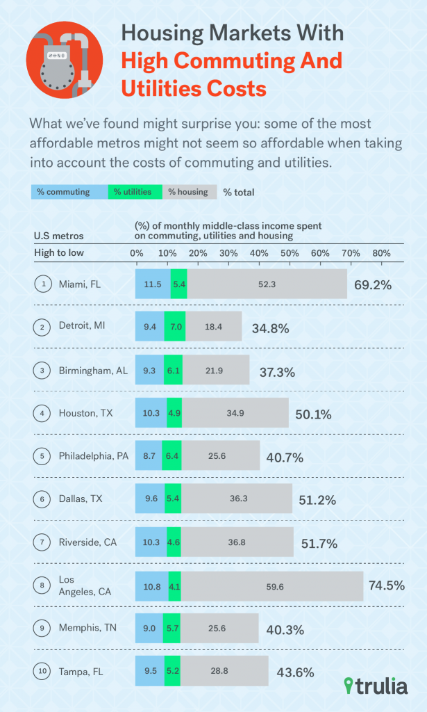
When it comes to housing, homebuyers need to consider other expenses beyond their mortgage, property tax, and insurance payments. What we’ve found might surprise you: some of the most affordable metros might not seem so affordable when taking into account the costs of commuting and utilities. For example, in five of the 10 metros with the highest share of income spent on commuting and utilities, middle-class homebuyer can actually purchase a median-price home and spend less than 31% of their monthly income on housing. But when taking into account commuting and utility costs, the share of income spent on housing and these non-housing essentials jumps significantly. For example, middle-class homebuyers in Detroit and Birmingham could spend less than 20% of their monthly income on housing if they bought a median priced home. However, the share of income jumps to nearly 40% when we factor in the median commuting and utility cost. In these two metros, the median households spend between 15-17% of their income towards non-housing essentials. Likewise in affordable Houston, the share of income spent on housing by middle-class homebuyers is a small-ish 34.9%, but jumps to over 50% when factoring in these other costs. A few expensive housing markets also make the list the too, with middle-class households in Los Angeles and Miami also spending between 15-17% of their income on non-housing essentials. What’s interesting is that in these two metros, much of the non-housing essential costs come in the form of commuting expenses (10.8% and 11.5%).
| Housing Markets with Highest Commuting and Utilities Costs | ||||||
| # | U.S. Metro | % of monthly Middle-Class Income Spent on Commuting and Utilities | % of monthly Middle-Class Income Spent on Commuting | % of monthly Middle-Class Income Spent on Utilities | % of monthly Middle-Class Income Spent on Housing | % of monthly Middle-Class Income Spent on Commuting, Utilities and Housing |
| 1 | Miami, FL | 16.9% | 11.5% | 5.4% | 52.3% | 69.2% |
| 2 | Detroit, MI | 16.3% | 9.4% | 7.0% | 18.4% | 34.8% |
| 3 | Birmingham, AL | 15.4% | 9.3% | 6.1% | 21.9% | 37.3% |
| 4 | Houston, TX | 15.2% | 10.3% | 4.9% | 34.9% | 50.1% |
| 5 | Philadelphia, PA | 15.1% | 8.7% | 6.4% | 25.6% | 40.7% |
| 6 | Dallas, TX | 15.0% | 9.6% | 5.4% | 36.3% | 51.2% |
| 7 | Riverside–San Bernardino, CA | 14.9% | 10.3% | 4.6% | 36.8% | 51.7% |
| 8 | Los Angeles, CA | 14.9% | 10.8% | 4.1% | 59.6% | 74.5% |
| 9 | Memphis, TN | 14.7% | 9.0% | 5.7% | 25.6% | 40.3% |
| 10 | Tampa, FL | 14.7% | 9.5% | 5.2% | 28.8% | 43.6% |
| Click here to download all the findings for the 100 largest U.S. metros. | ||||||
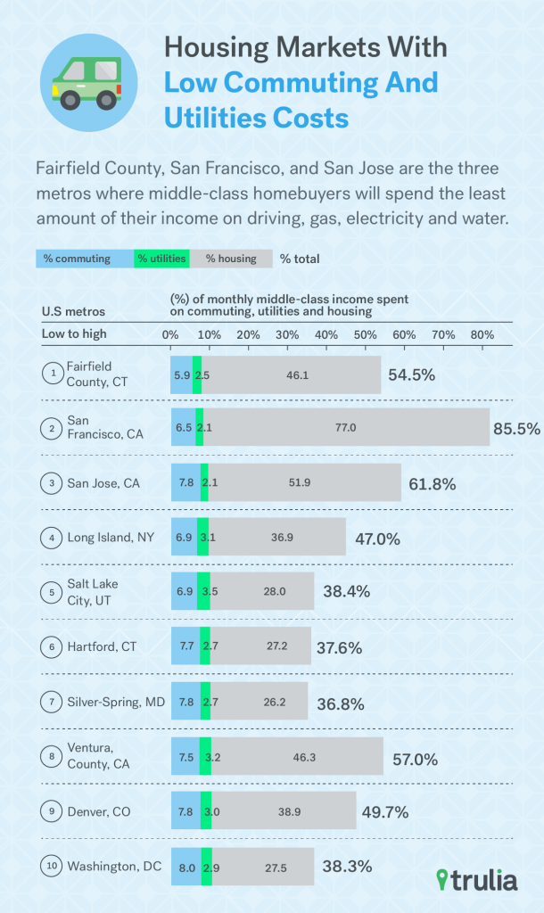
On the flipside, Fairfield County, San Francisco, and San Jose are the three metros where middle-class homebuyers will spend the least amount of their income on non-housing essentials –spending less than 10% of their income on commuting and utility costs. What’s also surprising about this list is that these three metros, along with Ventura County, also make the least affordable list when we add together the cost of housing, commuting and utilities. In other words, some of what homebuyers lose in affordability are made up by cheaper commuting and utility costs.
| Housing Markets with Lowest Commuting and Utilities Costs | ||||||
| # | U.S. Metro | % of monthly middle-class income spent on commuting and utilities | % of monthly middle-class income spent on commuting | % of monthly middle-class income spent on utilities | % of monthly middle-class income spent on housing | % of monthly middle-class income spent on housing, commuting, and utilities |
| 1 | Fairfield County, CT | 8.4% | 5.9% | 2.5% | 46.1% | 54.5% |
| 2 | San Francisco, CA | 8.6% | 6.5% | 2.1% | 77.0% | 85.5% |
| 3 | San Jose, CA | 9.9% | 7.8% | 2.1% | 51.9% | 61.8% |
| 4 | Long Island, NY | 10.1% | 6.9% | 3.1% | 36.9% | 47.0% |
| 5 | Salt Lake City, UT | 10.4% | 6.9% | 3.5% | 28.0% | 38.4% |
| 6 | Hartford, CT | 10.4% | 7.7% | 2.7% | 27.2% | 37.6% |
| 7 | Silver Spring–Frederick–Rockville, MD | 10.6% | 7.8% | 2.7% | 26.2% | 36.8% |
| 8 | Ventura County, CA | 10.7% | 7.5% | 3.2% | 46.3% | 57.0% |
| 9 | Denver, CO | 10.8% | 7.8% | 3.0% | 38.9% | 49.7% |
| 10 | Washington, DC | 10.8% | 8.0% | 2.9% | 27.5% | 38.3% |
| Click here to download all the findings for the 100 largest U.S. metros. | ||||||
All in all, these housing markets have a few things in common. They tend to be located in areas connected to extensive public transit systems, like San Francisco, Long Island, and Washington, DC, or are in areas with a moderate climates, such as San Jose, Ventura County, and Denver. In fact, this relationship holds up quite strongly amongst the largest 100 metros – areas that are more expensive tend to have lower commuting and utility costs, and less expensive metros tend to have higher costs. While some of this relationship is driven by the fact that households in expensive markets tend to have higher incomes, these are also other more practical reasons. Larger, more expensive markets tend to also have better access to public transportation and also tend to be in areas with a milder climate, such as California and Florida.
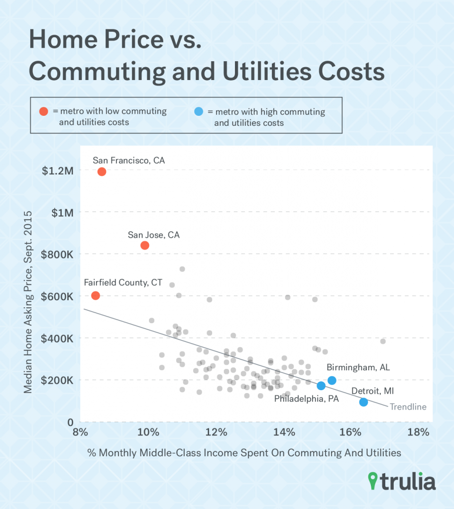
The moral of the story is that middle-class homebuyers should consider not just the price of a prospective home, but also other costs associated with the home’s location. After all, location, location, location affects not just the cost of the home itself, but also the how far one must commute and spend on heating, cooling, and water expenses. The good news for homebuyers in expensive housing markets is that the cost of pricier homes is somewhat balanced out by cheaper non-housing essentials.
