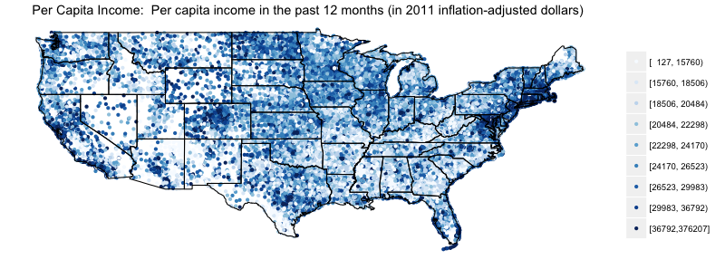
Recently I was pleased to write a blog post introducing the choroplethr package for R. One of the goals of choroplethr is to easily display data from the Census’ American Community Survey (ACS). To accomplish this, the choroplethr_acs function works with R’s ACS package to map results from the Census API. To demonstrate this, I displayed several images including this map showing 2011 per-capita income on a zipcode basis. (Technically, the census uses Zip-Code Tabulated Areas, or ZCTAs, and not postal ZIP codes. See this page for details about ZCTAs).
Twitter user @BrashEQLibrium made an interesting comment on this:
To the visual example provided in this: http://t.co/CC2HVHquvB, I say this: http://t.co/5hGAVTGkYI
— Brash Equilibrium (@BrashEQLibrium) January 22, 2014
If you click thru you will see a funny comic that says that many geographic profile maps wind up just being population maps. It wasn’t immediately clear to me whether ZCTA population and income would be correlated, so I decided to investigate.
Analysis 1: Side-by-side comparison
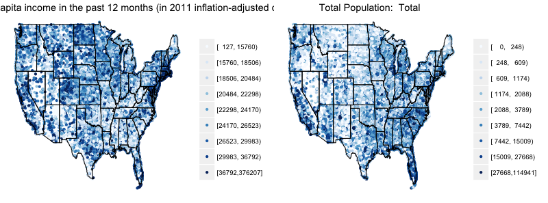
As a first pass, I simply used the choroplethr_acs function to place maps of population and income side by side:
library(choroplethr)

library(acs)

# create two maps, side by side, of the tables in question

# 2011 ACS table ids can be found here: http://factfinder2.census.gov/faces/help/jsf/pages/metadata.xhtml?lang=en&type=dataset&id=dataset.en.ACS_11_5YR#

incomeTableId     = "B19301"

populationTableId = "B01003"

map_income     = choroplethr_acs(tableId = incomeTableId    , lod = "zip");

map_population = choroplethr_acs(tableId = populationTableId, lod = "zip");

grid.arrange(map_income, map_population, nrow = 1, ncol = 2)
These maps appear to have significant differences. For example, the northern central part of the county appears much darker in the income map than in the population map.
Analysis 2: Animated GIF
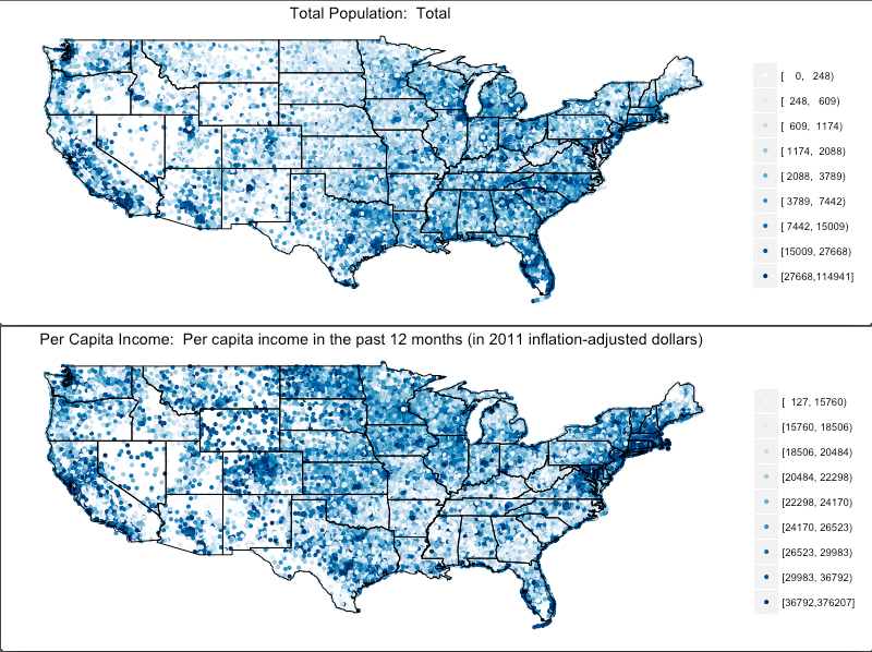
My colleague Chris Vensko recommended creating an animated GIF of these two images on an infinite loop. That way the differences between the images would have a stronger contrast. Here is the resulting image with a five second delay.
Analysis 3: Scatterplot
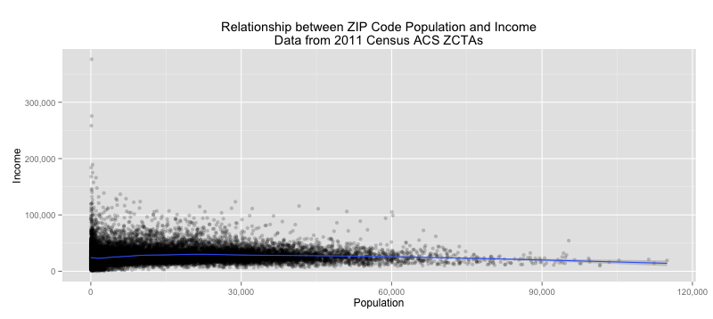
The traditional way to explore the relationship between two variables is a scatterplot with a smoothed conditional mean.
# data from 2011 ACS for ZCTAs for income

income.data = acs.fetch(geography=choroplethr:::make_geo("zip"), table.number = incomeTableId, col.names = "pretty")

income.df = choroplethr:::make_df("zip",income.data, 1)

colnames(income.df)[2] = "Income"

# data from 2011 ACS for ZCTAs for population

population.data = acs.fetch(geography=choroplethr:::make_geo("zip"), table.number = populationTableId, col.names = "pretty")

population.df = choroplethr:::make_df("zip",population.data, 1)

colnames(population.df)[2] = "Population"

final_df = merge(income.df, population.df)

ggplot(final_df, aes(Population, Income)) +

 geom_jitter(alpha=1/5) +

 geom_smooth() +

 scale_x_continuous(label=comma) +

 scale_y_continuous(label=comma) +

 ggtitle("Relationship between ZIP Code Population and IncomenData from 2011 Census ACS ZCTAs")
Again, there doesn’t seem to be a strong relationship here between ZIP (ZCTA) population and income. It does, indeed, seem to go up a bit in the beginning. But then it goes down.
Conclusion
The data seem to not bear out the relationship that some people expected between ZIP/ZCTA population and income. I thought about this for a while and have a possible explanation: people might be confusing ZCTA population with whether or not a given ZIP is rural or urban.
I am not an expert in demography, but I seem to remember there being many studies of the demographic differences between rural and urban America. For example, this article claims that there is a large difference in per-capita income between rural and urban counties. Some other references on the demographic differences between rural and urban America are here and here.
But the key point, I believe, is this: ZCTA population counts need not correlate with whether or not a ZIP is in a rural or urban county. ZIP codes can be of varying size, so the same population count in two different ZIP codes can mean two different population densities. ZIP codes are created and maintained by the postal service for the sole purpose of facilitating mail delivery. Here is a quote from my previous article which attempts to explain some of the issues related to using ZCTAs for data analysis:
The highest level of detail that choroplethr supports is the zip code. From both a mapping and demographic standpoint zip codes are problematic. On the one hand, zip codes are useful because they are smaller than counties (so you can get a higher level of detail) and everyone knows which zip code they live in (so they are an intuitive unit for people). On the other hand zip codes are managed by the postal service for the sole purpose of delivering mail. This means that they can change without notice and are not always polygons. For an in depth discussion of these problems see this article from georeference.org; for an overview of zip codes in general see this article on Wikipedia.
Despite these problems the US Census Bureau attempts to capture demographics at the zip level. They have created ZCTAs (Zip Code Tabulated Areas) which roughly correspond to zip codes. You can learn more about ZCTAs here. Because of these issues choroplethr renders zip code choropleths as scatterplots. It uses the zipcode package, created by Jeffrey Breen, to map each zip code to a longitude and latitude point.


