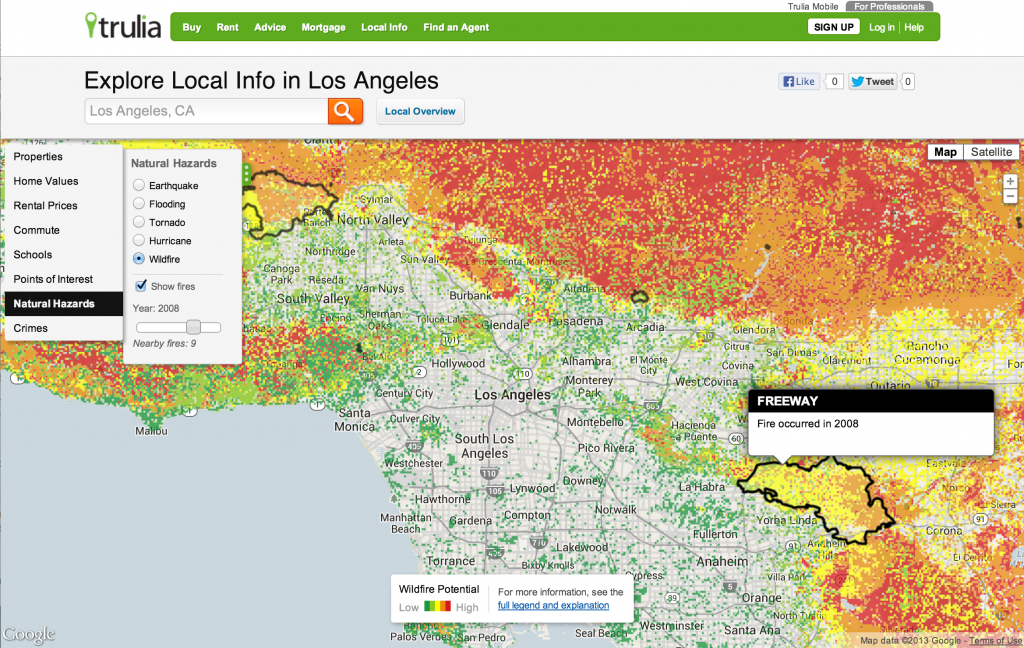
Hi, My name is Peter Black and I’m the lead geospatial engineer at Trulia. We’ve been making some interesting maps here at Trulia, displaying crime heatmaps, a commute tool that selects homes within a travel time polygon, and home value estimates down to the parcel level. Today, I’m writing to tell you the why’s and how’s of our most recent series on natural hazards.

When Hurricane (ok ok, it was an extra tropical storm) Sandy slammed into the New Jersey shoreline on October 30th, I watched with horror and tried to stay in contact with my loved ones and friends in harms way. Seeing the awful damage that resulted cemented my feeling that I had to incorporate maps on natural hazards that I knew were readily available from various federal sources into the Trulia experience. Doing so would open up a new avenue for millions of people to better understand the natural world and the risks they face when they’re making the decision on where to buy a home.
There are many types of natural hazards of course, and we couldn’t possibly put all of them on Trulia. So we chose the five hazards that have caused the most damage in the past few decades. These are: hurricanes, floods, earthquakes, tornadoes, and wildfires. Fortunately there is excellent data available for each hazard, mostly from federal sources. In compiling the data, I noticed some interesting things. For example, why was the Charleston South Carolina area at risk for earthquake? As it turns out, there was a magnitude 7.3 that shook the area in 1886.
There have been tornados in my neck of the woods in northern California. Southern New Jersey (the pine barrens) is at risk for a forest fire.
Given these revelations, it only made us work harder to create a new audience for this insightful information. We noticed that there wasn’t any really good mashup for all of the historical information around hurricanes and tornadoes. So for each, we took the historical track data along with their attributes, and assigned them to an underlying nested hexagon grid. Once that was accomplished, we classified the data and created a really cool visualization of historical hotspots for each hazard. I stress the word historical intentionally since we have no idea where the next hurricane or tornado will hit. Our intention is to solely show where the storms have hit in the past 60 years or so, when this meteorological data became more reliable and sophisticated due to the advent of technologies like radar (in the 40s) and satellite imagery (in the 60s).
On the technical side of things, we import shapefile or raster data from the various sources and use shp2pgsql or geodjango to import into our database. For that, we use the open source database postgresql, with the geographic information system extension PostGIS. We model our maps using the excellent and open source Tilemill by MapBox.. We utilize tilestache to serve the maps and if we desire interactivity in our layers we use geojson if the feature set is small enough to not slow down the browsing experience. For larger feature sets we use utfgrid and a modified version of wax for rendering within javascript. Utf is pretty amazing, as it allows for millions of points or polygons to have an interactivity that not long ago would have been completely out of the question.
I hope you enjoy the maps. They are pretty informative and provide an interesting tool for homebuyers that can help people make more informed choices. I’d like to thanks my excellent team of engineers whose talent and professionalism are truli-amazing, the awesome pr crew we have, as well as the senior management team at Trulia who supported this idea from its inception.


