I am pleased to announce that choroplethr version 1.1.0 is now available on CRAN! (If you are new to the choroplethr package, please see this blog post). There are three features that I would like to make users aware of.
Feature #1: Available on CRAN
Version 1.1.0 is the first version that is available on CRAN. This means that you can install and load it by typing the following on an R console:
install.packages("choroplethr")

library(choroplethr)
The first line will download and install the package – you only need to type this once. Each session where you want to use the package, you must type the library command.
Feature #2: Subsets of States
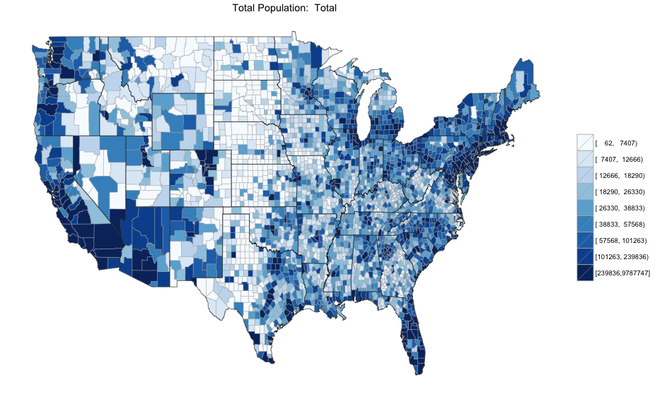
My previous blog post demonstrated how to use the choroplethr_acs command to create choropleth maps from data from the 2011 American Community Survey (ACS). Let’s look at an example of county level total population, table B01003.
choroplethr_acs("B01003", "county")
This map is very interesting in and of itself – the distribution of people across the US has many interesting patterns. But it also has limitations: many small but important counties such as New York County (Manhattan) are not visible at all. And because there is a population cluster in the Northeast, they all appear the same color. Each county in this map is assigned one of 9 colors, and there are an equal number of counties with each color. This means that we can’t see how counties in the Northeast compare with each other.
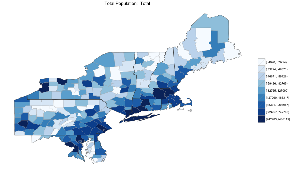
Version 1.1 of choroplethr attempts to solve these problems by allowing users to specify a states parameter which defaults to state.abb (a vector that has abbreviations of all 50 states). Here is how the county-level population map looks when we zoom in on the Northeast
northeast_states=c("CT", "DE", "ME", "MD", "MA", "NH", "NY", "PA", "RI", "VT")

choroplethr_acs("B01003", "county", states=northeast_states)
When choroplethr zooms in, it also recalculates the buckets. This map shows that there is a much larger variation in the Northeastern US than origionally appeared on the national map. Hopefully this feature will be useful to users in their own analyses.
Feature #3: View “any” ACS
By default choroplethr_acs maps data from the 2011 5 year ACS. However, the Census Bureau has been conducting the American Community Survey since 2005. You can see a list of all ACS here. I was originally quite excited by this wealth of data, and was hoping to make animated gifs showing demographic changes from 2005 to 2012. However, Ezra Glenn, the author of the package choroplethr uses to get census data, told me that this is not possible.
Simply put, the data that the Census makes available via their API is only a subset of all its data; choroplethr can only access the 5-year surveys that ended since 2010.
Comparing two Choropleths
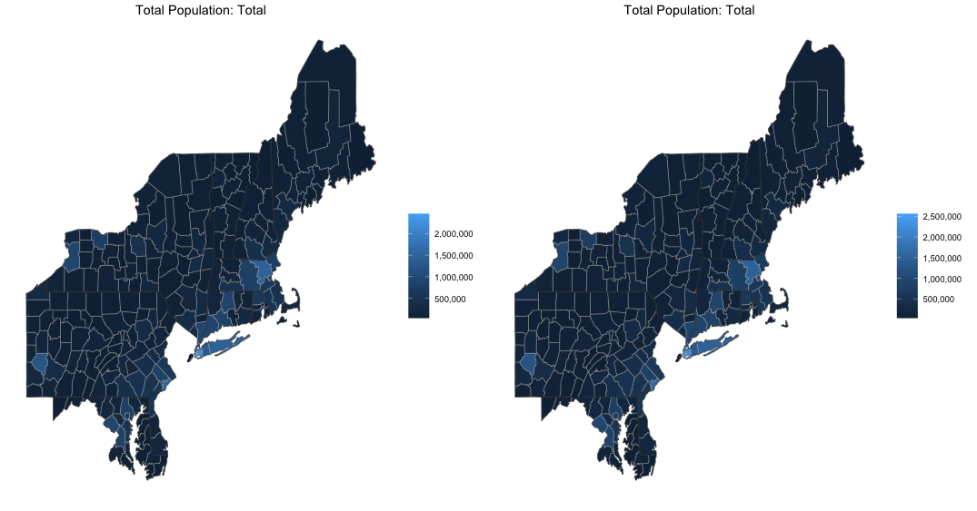
Even though the data is limited, let’s still try to compare the population of the Northeast between 2010 and 2012 (the largest date range that the Census API supports). In order to make the comparisons as valid as possible, let’s set the num_buckets parameter to 1 so that we use a continuous scale in both images. We can then compare the maps side by side:
pop_2010 = choroplethr_acs("B01003", "county", num_buckets=1, endyear=2010, span=5, states=northeast_states)

pop_2012 = choroplethr_acs("B01003", "county", num_buckets=1, endyear=2012, span=5, states=northeast_states)

library(gridExtra)

grid.arrange(pop_2010, pop_2012, nrow=1, ncol=2)
Interpreting the Results
The problem with the above comparison is that the legends are not equal. Therefore comparing the changes in colors between the maps has limited value. The problem is exacerbated if you choose a value of num_buckets greater than 1 (because then you are comparing divisions between populations with diffferent ranges). In the future I hope to create helper functions to support the comparison between choropleths. (One idea is create a new data.frame that is the difference between the data.frames that make each constituent map, and then plot that (as either a percent change or absolute value). Another idea is to force the same scale onto both choropleths). But since the range of data that is available via the Census API is so small, I’m not sure how high a priority to make this. This leads me to my final point: asking the Census Bureau to make more data available from its API.
Petitioning the Census Bureau to Add Historical Data
I think that if the Census Bureau added historical data to its API it would have tremendous value to researchers and all citizens who want to better understand the changing demographic nature of the US. To help make this happen I created a petition on whitehouse.gov to try and make this happen. The text of the entire petition reads:
WE PETITION THE OBAMA ADMINISTRATION TO:
make all Census data available via the Census API.
The US Census Department provides the most comprehensive demographic information about America. Unfortunately, most of this data is difficult for researches to access.
As an example, here is a list of all American Community Surveys (ACS): http://1.usa.gov/1geFSSj. However, only surveys taken since 2010 are accessible via the Developer API (http://1.usa.gov/1nYk8OU).
This makes it extremely difficult to perform historical demographics anlaysis. As an example of research that this API enables, please see my choroplethr R package which creates thematic maps (choropleths) of Census data: http://bit.ly/1eZzNWP.
I would like to empower people to view demographic maps of any Census data from any year. That is only possible if the data is made available via the API.
If this is something which you would also like to see, please consider signing the petition here.
Feedback is Welcome
If you would like to give feedback on version 1.1.0 of choroplethr, report bugs, request features, or share your own interesting choropleths, please consider posting on the choroplethr google group.


