Spring home buyers might be surprised that national housing data have pointed to a recent market slowdown. Although nationally new construction starts and existing home sales have been sluggish in recent months, buyers in many local markets will need to move a bit faster this year than last year in order to snag their dream house.
To measure how fast the homes in a market are moving, we calculated the share of homes for sale on Trulia two months ago (on February 14, 2014) that are still on the market today (as of April 14, 2014). Faster-moving markets have a lower percentage of homes still on the market after two months, while slower-moving markets have a higher percentage.
Our two-month measure is similar to days on market (DOM): in general, housing markets with more inventory and fewer buyers will have a higher share of for-sale homes remaining on the market after two months and a higher median DOM. But we prefer our two-month measure over DOM as an indicator of how quickly homes in a market are moving for the following reason: if lots of new inventory suddenly comes onto the market, then the median days on market could go down thanks to all those newly listed homes. Therefore, a low median DOM could indicate that (1) buyers are snapping up homes quickly, so homes aren’t staying on the market long (i.e. it’s a seller’s market) or (2) a lot of new inventory has just come onto the market (i.e. it’s a buyer’s market). As a result, it’s difficult to decipher what’s really going on based on DOM alone, making this traditional measure potentially misleading.
Inventory Is Up This Spring, But It’s Going Fast
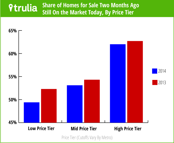
Nationally, 55% of the homes listed for sale in mid-February were still on the market in mid-April. That’s down a bit from 56% for the same period last year. The slight quickening of the national market is being driven mostly by homes priced at the low end of the market. To see this, we divided each of the 100 largest U.S. metros evenly into three price tiers (with each metro having its own price cutoffs based on what’s considered high-end, mid-range, and low-end locally). On average, at the national level, the low-price tier moved fastest, with 49% of the homes listed two months earlier still on the market in mid-April; in contrast, 62% of homes in the high-price tier were still on the market after two months.
Furthermore, the low price tier sped up more than the other tiers compared with a year ago, dropping 3 points in 2014 versus 2013, compared with 1-point drops for the middle and high tiers. As always, though, the national trend hides big differences in local markets, many of which are quickening while others are slowing.
The Market is Fastest in the Bay Area, Quickening in New York, and Slowing in SoCal
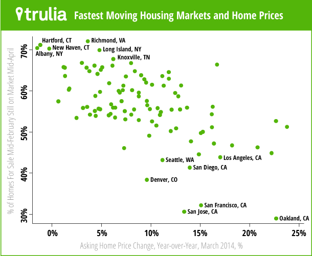
The share of homes for sale today after being on the market two months ago ranges from less than one third in the San Francisco Bay Area to more than two thirds in several markets in the Northeast and South. The fastest-moving markets are Oakland, San Jose, and San Francisco, where less than one third of homes on the market two months ago were still for sale in mid-April 2014. Outside of California, the fastest-moving markets are Denver and Seattle. Fast-moving markets tend to have larger price gains: in eight of the 10 fastest-moving markets, the year-over-year increase in asking prices exceeded the national average of 10%.
|
America’s Top 10 Fastest-Moving Housing Markets |
|||||
| # | U.S. Metro |
Share of homes still for sale after being listed for at least two months, mid-April 2014 |
Share of homes still for sale after being listed for at least two months, mid-April 2013 |
Difference in share still for sale, 2014 vs 2013 |
Asking prices, Y-o-Y % Change, March 2014 |
| 1 | Oakland, CA |
29% |
31% |
-2% |
22.7% |
| 2 | San Jose, CA |
31% |
35% |
-4% |
13.4% |
| 3 | San Francisco, CA |
32% |
36% |
-4% |
15.1% |
| 4 | Denver, CO |
38% |
47% |
-8% |
9.6% |
| 5 | San Diego, CA |
41% |
45% |
-4% |
14.0% |
| 6 | Seattle, WA |
43% |
49% |
-6% |
11.2% |
| 7 | Los Angeles, CA |
44% |
40% |
4% |
17.0% |
| 8 | Orange County, CA |
45% |
38% |
6% |
14.9% |
| 9 | Sacramento, CA |
45% |
41% |
4% |
22.2% |
| 10 | Middlesex County, MA |
46% |
52% |
-6% |
7.3% |
| Note: Among the 100 largest U.S. metros. The two-month shares and the difference are rounded to the nearest percentage point, and the difference was calculated before rounding; therefore, the rounded difference might not equal the difference between the rounded shares. To download the findings for the 100 largest U.S. metros, click here. | |||||
Some of the fastest-moving markets have slowed down since last year. While the share of homes for sale that are still on the market two months later in 2014 fell in the fastest-moving markets in 2013 (i.e., those markets sped up), it increased in Los Angeles, Orange County, and Sacramento (i.e., those markets slowed down). The share also increased considerably in Ventura County (from 38% to 48%) and Phoenix (48% to 55%) and moderately in Riverside–San Bernardino (from 49% to 53%). This means that many of the formerly hard-hit markets that led the housing recovery with price gains, investor buying, and bidding wars are now cooling off.
At the same time, markets elsewhere in the country are speeding up. Although the New York metro area isn’t one of the fastest-moving markets, the share of homes for sale that were still on the market two months later dropped from 65% in April 2013 to 54% in April 2014. Edison–New Brunswick, NJ, and West Palm Beach are speeding up at a similar pace to New York, even though homes in these markets aren’t moving quickly enough to land those markets on the top 10 fastest-moving markets list.
In contrast, the slowest-moving markets are in the South (e.g. Richmond, Knoxville) and the Northeast (e.g. Hartford, Albany, New Haven). All but one of the 10 slowest-moving markets had year-over-year price increases below the national average of 10%.
|
America’s Top 10 Slowest-Moving Housing Markets |
|||||
| # | U.S. Metro |
Share of homes still for sale after being listed for at least two months, mid-April 2014 |
Share of homes still for sale after being listed for at least two months, mid-April 2013 |
Difference in share still for sale, 2014 vs 2013 |
Asking prices, Y-o-Y % Change, March 2014 |
| 1 | Richmond, VA |
72% |
61% |
11% |
3.6% |
| 2 | Hartford, CT |
71% |
67% |
4% |
-1.2% |
| 3 | Albany, NY |
70% |
70% |
0% |
-1.5% |
| 4 | New Haven, CT |
70% |
68% |
3% |
-0.3% |
| 5 | Long Island, NY |
70% |
68% |
2% |
4.8% |
| 6 | Knoxville, TN |
68% |
64% |
4% |
6.2% |
| 7 | Springfield, MA |
67% |
66% |
1% |
3.0% |
| 8 | Columbia, SC |
67% |
67% |
0% |
8.0% |
| 9 | Birmingham, AL |
66% |
67% |
0% |
16.7% |
| 10 | Greenville, SC |
66% |
66% |
0% |
6.1% |
| Note: Among the 100 largest U.S. metros. The two-month shares and the difference are rounded to the nearest percentage point, and the difference was calculated before rounding; therefore, the rounded difference might not equal the difference between the rounded shares. To download the findings for the 100 largest U.S. metros, click here. | |||||
Why do some markets move faster than others? The tables above show that faster-moving markets have had bigger price increases: these fast-moving markets are sellers’ markets where homes don’t stay on the market for long. The scatterplot shows that markets with bigger price increases tend to move faster (though not always):
But fast-moving markets are different in other ways, too. They tend to be more expensive to begin with; in other words, they have had both higher price levels AND bigger price increases in the past year. Expensive markets – including many in California – have a perennially tight housing supply because of limited construction, so homes don’t stay on the market for long.
Finally, foreclosures are affecting the speed of the market, particularly at the low end. In metros that still have a significant foreclosure inventory– which are concentrated in states with slower “judicial” foreclosure laws – the low-priced tier moves more slowly than in metros with fewer foreclosures. Since many foreclosures tend to be lower-priced, fewer foreclosures mean a smaller supply of lower-priced homes, so homes in the low tier don’t stay on the market as long. The fast-moving low tier is yet another hurdle for first-time homebuyers: not only do potential first-timers face declining affordability and a slow jobs recovery, but the homes they can afford aren’t waiting on the market for them.


