Call it the greying of America. As baby boomers enter their golden years, a great demographic shift is taking place. Across the nation, the median age is creeping up. Yet this aging is not consistent from one place to the next. At Trulia, we wanted to know where exactly older people are concentrated. And how do different parts of the country compare as far as age distribution is concerned? To get a granular view of regional differences, Trulia took a look at the age structure of every county in the US.
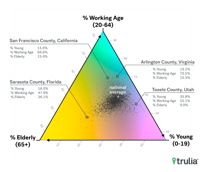
To distinguish counties with different age distributions, we divided populations into three age groups: young, 0-19; working age, 20-64; and elderly, 65 and over. We used three colors, magenta, cyan, and yellow, to represent these ages. How strong one color is compared with the others shows the share of the corresponding age group in the county relative to the national average. For example, the greater the share of elderly people, the more yellow a county will look.
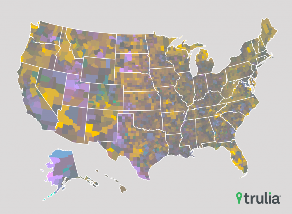
This method allows us to quickly observe regional age structures. Counties with large shares of elderly people are concentrated in the Sun Belt, in a northern strip from the interior Pacific Northwest to northern Michigan, and up through Appalachia and the Alleghenies to northern New England in the East. By contrast, Utah is stands out as the nation’s youngest state.
We took a closer look at counties in the top 100 metros to better understand how some populous areas are skewed in age:
- The counties with the highest proportion of working-age people are in metros where one industry reigns supreme. Arlington and Alexandria, Va., both near government-dominated Washington, D.C., are the top two counties with populations skewed toward working age. Respectively, 70.5% and 69.7% of residents are between 20 and 64. Tech powerhouse San Francisco County, which consists entirely of the city of San Francisco, comes in third, with 69.7% of residents of working age. Compare these with the national working-age average of 59.2%. These counties experience high housing demand from people in their wage-earning prime and, not surprisingly, have home values well above the national median: $672,700 in Arlington and a whopping $1,359,000 in San Francisco, compared with $217,300 nationally.
- San Francisco is also the county with the lowest share of kids in the nation: just 15.0% of the population is 19 or younger compared with the national average of 25.2%. Other kid-scarce counties are either quite old, like Sarasota County, Fla., or are expensive areas with large working populations, like New York County, NY, the borough of Manhattan.
- The counties that skew oldest in the nation—Sarasota County, Fla., Mathews County, Va., and Flagler County, Fla.—are all coastal areas with balmy weather. About one in three people in these places are over 65: 36.1% in Sarasota, 30.8% in Mathews, and 30.1% in Flagler. Retirees can also get some beachy bargains here—home values are near the national median, at $252,400 in Sarasota and $219,300 in Flagler.
- Tooele County, Utah has the largest proportion of youngsters in the nation at 35.9%. Utah is the state with the highest birth rate in the nation, and, in Tooele, it’s showing.
- Some counties have experienced an outsized age shift in the past seven years. Compared with their 2010 age makeup, Hudspeth County, Tex., Teller County, Colo., and Park County, Colo. have seen the biggest net swings in age proportions. All three have gained share of elderly and lost share of young people.
The image below shows where each county falls on the coloring scheme, compared to the national average:

Methodology
We used a ternary coloring scheme to map three sets of ages—young (0-19 years), working age (20-64) and elderly (65 and over). Each county is represented by a color mixture determined by its distance from the national age structure. This map is inspired by work done by Kashnitsky, I., & Schöley, J. (2018). Regional population structures at a glance. The Lancet, 392(10143), 209–210., and makes use of their code, published here.
Median home values by county are based on Trulia estimates. We use the Census Bureau’s 2010 and 2017 population estimates by age.


