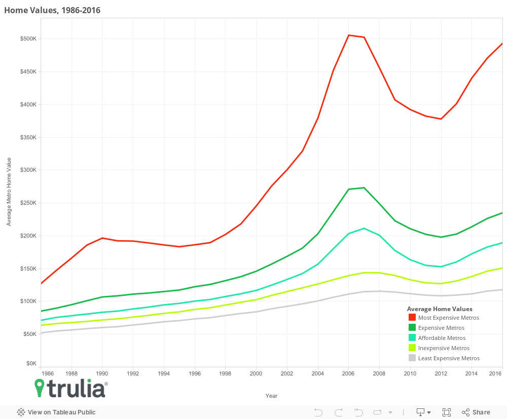
The U.S. housing market is growing more unequal. Over the past 30 years, prices in the 20 most expensive markets have risen much faster than prices in the 20 least expensive. What’s more, expensive markets almost always had bigger price gains compared to cheaper markets. In other words, the housing rich are getting richer while the housing poor are getting poorer.
Both trends suggest that economic convergence – the idea that over time, less expensive markets should “catch up” to more expensive ones – is not taking place. In fact, the most expensive housing markets in the U.S. are actually diverging from the rest of the pack, and as a result, long-time homeowners in the most expensive markets have had a much better return on their investment than homeowners in the least expensive. And much of the difference between high growth and low growth metros can be explained by two factors: income growth, and new housing supply.
We find that during the past 30 years:
- The pack of most expensive markets is diverging from the rest. The priciest metros were 144% more expensive than the least expensive metros in 1986 but that differential has grown to over 319%.
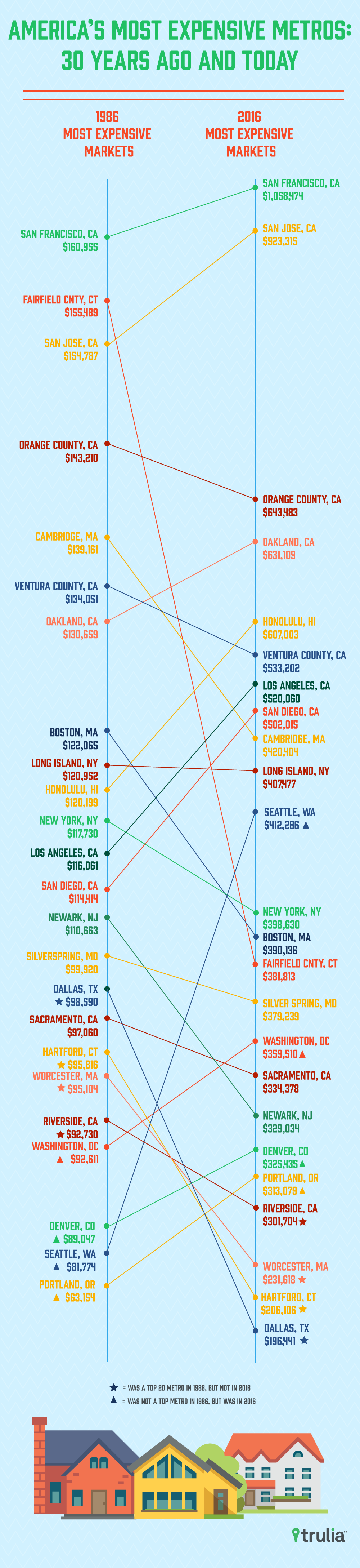
- Several markets we consider modern boom towns – such as San Francisco and San Jose – were also among the priciest 30 years ago, while others like Portland, Ore., Seattle, and Denver are the newcomers to the most expensive list.
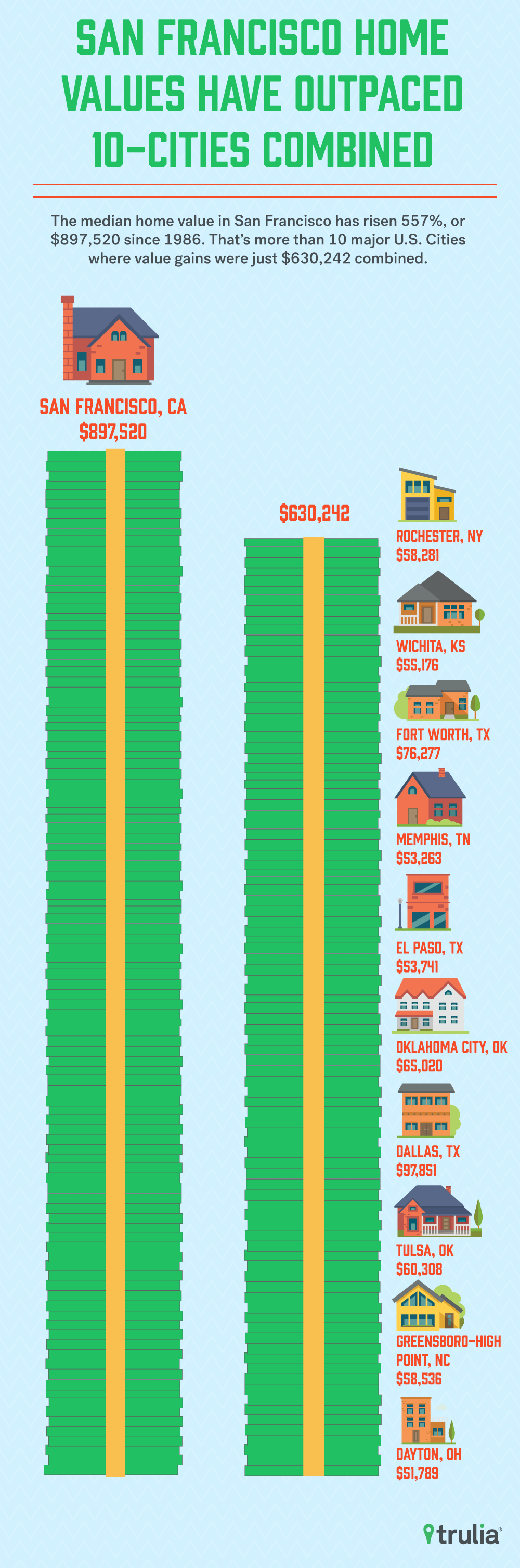
- There is wide regional variation in the amount of wealth generated from homeownership. Homeowners’ return on investment in Rochester, N.Y., and Wichita, Kans., have been +85% and +89.9%, respectively, while the return in San Francisco and San Jose has been +557.6% and +496.5%. This represents a cash return of approximately $50,000 in Dayton, Ohio, – the lowest cash return of the 100 largest metros – to nearly $900,000 in San Francisco.
- The 30-year change in home value across the largest 100 metros is strongly correlated with income growth and new housing construction, while population and employment growth aren’t.
The Great Housing Divergence
The financial fortune of homeowners in the U.S. has largely been determined by where they live. And since most households’ biggest investment is their home, regional disparities in home price growth may be effectively driving a geographical gap in wealth generation. Across the the 100 largest housing markets, homeowners that bought homes in the 20 most expensive markets 30 years ago have experienced much larger price gains than homeowners who bought in the 20 least expensive markets. In 1986, the average price of a home in the most expensive metros was $127,058, or 144% more expensive than the average price of $52,022 in the least expensive. By 2016, the most expensive metros grew to an average price of $493,504, or 319% more expensive that the average price of $117,827 in the least expensive metros.
Furthermore, the divergence isn’t just between the most expensive markets and the least. The 288.4% home value growth in the nation’s 20 most expensive has outpaced all others. For example, the 20 most expensive metros have grown from being 49.1% to 109.9% more expensive than the second 20 most expensive; 78.4% to 160.5% more expensive than the third; and 99.5.1% to 227% more expensive than the fourth. Clearly, those who were able to buy the most expensive homes in the U.S. have experienced a much greater return on their investment that the rest.
Club Expensive is an Exclusive One
What’s more, the list of the most expensive metros has changed little between 1986 and 2016. In fact, 16 of the most expensive 20 markets in 2016 also made the list in 1986. Only four metros – Portland, Ore., Seattle, Denver, and Washington, D.C. – joined the ranks of the most-expensive U.S. home markets in 2016. These metros replaced Dallas, Hartford, Conn., Worcester, Mass., and Riverside, Calif., from the 1986 list of most expensive markets. Furthermore, only two of the new entrants to the top 20 entered recently. Portland and Denver ascended to the pricey ranks in 2015 and 2014, respectively. While Seattle and Washington have also joined the club, they’ve been in the top 20 for at least the past 17 years, with the former joining in 1991 and the latter joining in 1999.
| The 20 Most Expensive Metros, 1986 v 2016 | |||||
| Most Expensive Markets, 1986 | Most Expensive Markets, 2016 | ||||
| 1986 Rank (2016 Rank) | Metro | 1986 Home Value | 2016 Rank (1986 Rank) | Metro | 2016 Home Value |
| 1 (1) | San Francisco, CA | $160,955 | 1 (1) | San Francisco, CA | $1,058,474 |
| 2 (14) | Fairfield County, CT | $155,489 | 2 (3) | San Jose, CA | $923,315 |
| 3 (2) | San Jose, CA | $154,787 | 3 (4) | Orange County, CA | $643,483 |
| 4 (3) | Orange County, CA | $143,210 | 4 (7) | Oakland, CA | $631,109 |
| 5 (9) | Cambridge-Newton-Framingham, MA | $139,161 | 5 (10) | Honolulu, HI | $607,003 |
| 6 (6) | Ventura County, CA | $134,051 | 6 (6) | Ventura County, CA | $533,202 |
| 7 (4) | Oakland, CA | $130,659 | 7 (12) | Los Angeles, CA | $520,060 |
| 8 (13) | Boston, MA | $122,065 | 8 (13) | San Diego, CA | $502,015 |
| 9 (11) | Long Island, NY | $120,952 | 9 (5) | Cambridge-Newton-Framingham, MA | $420,404 |
| 10 (5) | Honolulu, HI | $120,199 | 10 (32) | Seattle, WA+ | $412,286 |
| 11 (12) | New York, NY | $117,730 | 11 (9) | Long Island, NY | $407,477 |
| 12 (7) | Los Angeles, CA | $116,061 | 12 (11) | New York, NY | $398,630 |
| 13 (8) | San Diego, CA | $114,414 | 13 (8) | Boston, MA | $390,136 |
| 14 (18) | Newark, NJ | $110,663 | 14 (2) | Fairfield County, CT | $381,813 |
| 15 (15) | Silver Spring-Frederick-Rockville, MD | $99,920 | 15 (15) | Silver Spring-Frederick-Rockville, MD | $379,239 |
| 16 (48) | Dallas, TX* | $98,590 | 16 (21) | Washington, DC+ | $359,510 |
| 17 (17) | Sacramento, CA | $97,060 | 17 (17) | Sacramento, CA | $334,378 |
| 18 (35) | Hartford, CT* | $95,816 | 18 (14) | Newark, NJ | $329,034 |
| 19 (29) | Worcester, MA* | $95,104 | 19 (24) | Denver, CO+ | $325,435 |
| 20 (21) | Riverside-San Bernardino, CA* | $92,730 | 20 (66) | Portland, OR+ | $313,079 |
| NOTE: Among the 100 largest U.S. metro areas, full data available here. *denotes a metro that was on the 1986 list but did not make it in 2016, while + denotes a metro that was not on the 1986 list but made it in 2016. | |||||
The gist here is that the economic fortunes of homeowners who bought in the 1980’s have been tied closely to the random fortunes of U.S. geography. Homebuyers who were raised in, or migrated to, a few select areas of the country in the 1980s have experienced very different rates of home value appreciation than homebuyers in the rest of the country. Four areas in particular standout as homes to this exclusive “club:” the West Coast, Northeast, greater Washington, D.C., and Denver. All 20 of the most expensive markets in 2016 are in these four areas, and 19 made the list in 1986.
Long-Run House Prices Diverge in the West, Stale in the South
Across the U.S. over the past 30 years, there has been wide metro variation in how much value has been generated from homeownership. Homeowners in the 10 markets with the greatest appreciation have realized at least a 299% increase in homes value. In the 10 markets with the smallest rate of return over the past 30 years, homeowners were lucky to get a 100% return.
| Metros with the Largest Return on Home Value | |||||
| Rank | Metro | 1986 Median Home Value | 2016 Median Home Value | Change in Median Home Value | % Change |
| 1 | San Francisco, CA | $160,955 | $1,058,474 | $897,520 | 557.6% |
| 2 | San Jose, CA | $154,787 | $923,315 | $768,527 | 496.5% |
| 3 | Honolulu, HI | $120,199 | $607,003 | $486,804 | 405.0% |
| 4 | Seattle, WA | $81,774 | $412,286 | $330,512 | 404.2% |
| 5 | Portland, OR | $63,154 | $313,079 | $249,925 | 395.7% |
| 6 | Oakland, CA | $130,659 | $631,109 | $500,450 | 383.0% |
| 7 | Orange County, CA | $143,210 | $643,483 | $500,273 | 349.3% |
| 8 | Los Angeles, CA | $116,061 | $520,060 | $403,998 | 348.1% |
| 9 | San Diego, CA | $114,414 | $502,015 | $387,601 | 338.8% |
| 10 | Miami, FL | $62,385 | $249,326 | $186,941 | 299.7% |
| NOTE: Among the 100 largest U.S. metro areas, full data available here. Change in median home value estimates were calculated before rounding of 2016 and 1986 median home values, so may be different than the values presented above. | |||||
Of the 10 markets with the largest 30-year change in home value, nine are in the West. San Francisco tops the list with rate of return of 557.6%. San Jose grabs second place with an increase of 496.5%, and the third Bay Area metro – Oakland – places sixth with a gain of 383%. Three others are also in California (Orange County, Los Angeles, and San Diego). Outside of the Golden State, the Pacific Northwest makes a strong showing. Seattle and Portland take the fourth and fifth spot with returns of 404.2% and 395.7%, respectively. The only non-Western metro to make the list was Miami with an increase of 299.7%.
| Metros with the Smallest Return on Home Value | |||||
| Rank | Metro | 1986 Median Home Value | 2016 Median Home Value | Change in Median Home Value | % Change |
| 1 | Rochester, NY | $68,594 | $126,875 | $58,281 | 85.0% |
| 2 | Wichita, KS | $61,351 | $116,527 | $55,176 | 89.9% |
| 3 | Fort Worth, TX | $84,272 | $160,549 | $76,277 | 90.5% |
| 4 | Memphis, TN | $57,494 | $110,757 | $53,263 | 92.6% |
| 5 | El Paso, TX | $56,338 | $110,079 | $53,741 | 95.4% |
| 6 | Oklahoma City, OK | $65,672 | $130,692 | $65,020 | 99.0% |
| 7 | Dallas, TX | $98,590 | $196,441 | $97,851 | 99.3% |
| 8 | Tulsa, OK | $60,540 | $120,849 | $60,308 | 99.6% |
| 9 | Greensboro-High Point, NC | $57,918 | $116,455 | $58,536 | 101.1% |
| 10 | Dayton, OH | $51,093 | $102,882 | $51,789 | 101.4% |
| NOTE: Among the 100 largest U.S. metro areas, full data available here. Change in median home value estimates were calculated before rounding of 2016 and 1986 median home values, so may be different than the values presented above. | |||||
Returns on homeownership don’t look so great for those who bought homes in metros with the least returns. The smallest gains were in Rochester, N.Y. where the median homeowner gained just 85% in the value of their home over the past three decades. Several Texas metros also made the list, with homeowners in Fort Worth, El Paso, and Dallas gaining 90.5%, 95.4%, and 99.3%, respectively. Several other Southern metros had low appreciation, including Memphis, Tenn., Oklahoma City, Okla.,Tulsa, Okla., and Greensboro, N.C., None of the metros with the smallest home value gains over the past 30 years are west of the Rockies.
Why Have Some Metros Seen Larger Home Price Gains Than Others?
More generally, what explains these huge differences in price gains? While it’s hard to sort out all of the factors that might explain the differences, a few simple correlations help. After examining a wide range of demographic, economic, and housing measures, two factors stood out as being most strongly correlated with house price growth: (1) income growth and (2) the amount of housing construction relative to demand.
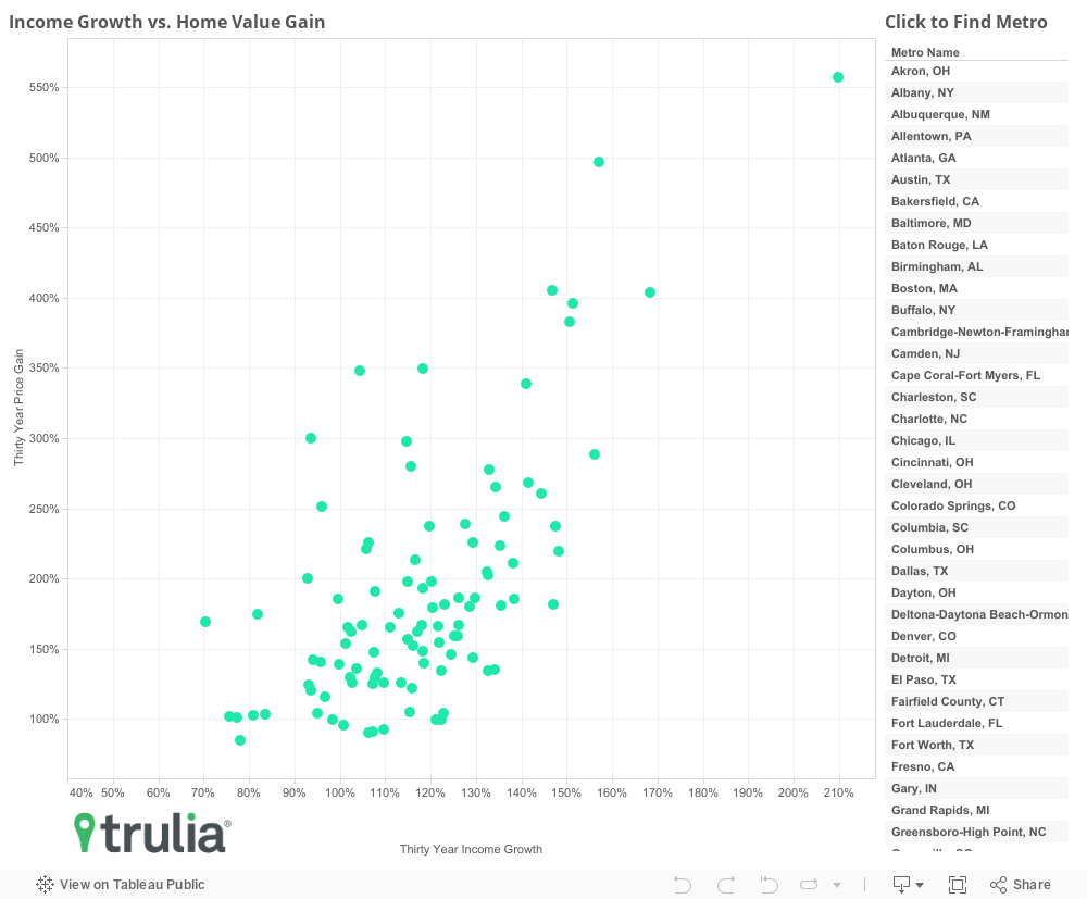
First, let’s take a look at income growth. The correlation between income growth and house price growth is large (0.66) and statistically significant. As the chart shows, three of the four metros with most income growth (San Francisco, San Jose, and Seattle) are also among those that have experienced the highest growth in house prices, while many metros with low income growth have seen the smallest gain in house prices (Fresno, Calif., Memphis, Tenn., and Rochester). Yet there are many exceptions to this pattern: Sarasota, Fla., Oklahoma City, and Austin, Texas, have also had high income growth but have had lower price appreciation, while places like West Palm Beach, Ventura County, and Miami haven’t experienced much income growth but have seen strong price gains.
It’s not difficult to understand why such a tight correlation exists between income growth and price growth, but the relationship is likely more complex than you might think. As incomes rise, so do the mortgage amounts that homebuyers can get. Since homebuying is an auction-like process where the highest bidders win homes, income growth translates into higher home prices through increased consumption of housing. In turn, as home prices rise, employers need to increase their wages in order to retain employees. The kicker, though, is that growing incomes should only lead to increased home prices if supply is limited. When adequate supply is available, prices aren’t usually bid up because there are fewer buyers bidding against one another for any given home. This likely explains why income growth in the San Francisco Bay Area has been accompanied by strong home price growth, while income growth in Austin hasn’t.
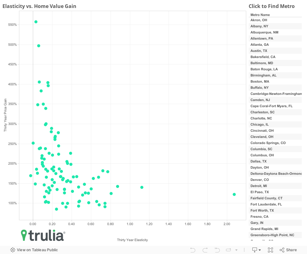
Building on this (pun intended), we also find that metros with higher supply elasticity over the past 30 years have experienced less house appreciation, while metros with lower elasticity have experienced greater price appreciation. The correlation is also quite strong at -0.41 and statistically significant. As we discussed last month, elasticity is the measure of how much new housing is built relative to demand, and the strong negative correlation between supply elasticity and house price growth implies that much of the house price divergence we identified in the first section of the report can be explained by how much new housing was built in each of these markets over the past 30 years. We also tested for correlations with house price gains and 30-year population and employment growth. Both of these correlations were small and not statistically significant.
Putting All the Bricks Together
So what does all this mean? While we hesitate to make bold conclusions from just simple correlations (a more sophisticated analysis would be needed to detangle the complex relationships between elasticity and income, population, and employment growth), the implication is that a lack of housing construction in many metros may be driving nation-wide wealth disparities through persistent supply-induced home price appreciation. This is emphasized by the fact that those who bought homes in the most expensive metros in the U.S. have realized significantly higher returns on their investment than those that bought in the least expensive, and that supply elasticity is strongly correlated with house price appreciation. These findings are meaningful, since wealth is often passed down to future generations, who in turn might use such inheritance to also purchase homes, which continues the cycle of wealth accumulation. For example, those that bought the median priced home in San Francisco in 1986 gained $897,520 in wealth from their home, while those that bought the median priced home in Dayton gained just $51,789. This matters, since an $897,520 inheritance is likely to generate much more long-term wealth through housing or other investments than $51,789. And since the priciest metros continue to diverge from others, these geographic disparities are sure to persist into the near future.
Methodology
We estimate annual home prices between 1986 and 2016 by first estimating home values as of Jan. 1, 2016 using Trulia’s internal measure of home values and chaining back to 1986 using the Federal Housing Finance Agency’s House Price Index for each of the largest 100 metropolitan areas or divisions where available. We then calculate home value quintiles using these home values, and then compare the average home value of each home value over time. Estimates of employment, population, income, and housing the housing stock are sourced from Moody’s Analytics estimates based on historical U.S. Census and Bureau of Labor Statistics data.