When it comes to choosing a home, an easy, fast commute to and from work ranks second only to a safe neighborhood for those looking to move.[1]
Today, Trulia launches the latest addition to its rental listings toolkit: Rent Near Transit. Rent Near Transit is a new search filter that helps people find rental listings near major subway and commuter train lines. The feature is first rolling out in six cities: Boston, Chicago, New York, Philadelphia, San Francisco and Washington, D.C.
To supplement these new tools, we identified places that are more amenable for riding public transit– or for driving – in the nation’s largest 25 metros that includes those six markets. The metros that top our list offer what we believe are the places that have relatively easier public-transit or driving commutes.
How did we arrive at our list? We tried to factor in things that make commutes hard:
First, we calculated transit length: how long it takes to drive or to take public transportation to work.
Then, we looked at departure times. We added in the how early a driver might have to wake up to beat the traffic.
Finally, we looked to see if the roads and railways were getting congested by tracking the change in the number of households that take public transit or drive to work in the most recent 5 years available from the US Census data.[2]
Some of the obvious cities top and bottom out our rankings, some might surprise you.
Please note that the two indexes we calculated, Transit-Friendly and Driver-Friendly Indexes, and their rankings are completely separate from one another. For instance, if a metro area scores high for the Driver-Friendly Index, it does not mean that residents in that metro area are better off driving rather than riding public transit. We are simply comparing metro areas to each other when it comes to how easy it is to drive to work in an area generally. Same logic applies for the Transit-Friendly Index.
Our analysis of public transit commuters found:
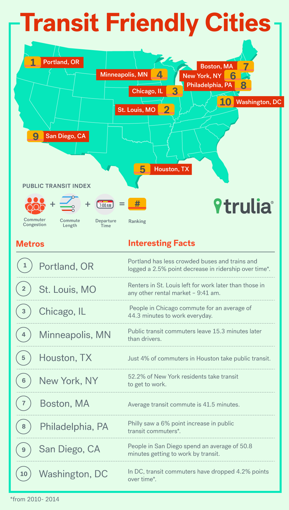
- Portland, St. Louis, and Chicago topped our Transit-Friendly rankings. These cities had one factor in common: Their increase in the percentage of households taking public transit to work from 2010 to 2014 was not as high as that of many of the other cities in our study.
- Renters taking public transit in St. Louis, on average, also left their homes for work later than those in any other rental market – 9:41 am. This number suggests that a large proportion of the population works during hours outside of the traditional 40-hour workweek, which also implies that rider congestion on public transit is more evenly dispersed throughout the day.
- Which Transit-Friendly factor helped Portland rank so high? Less crowded buses and trains. Portland logged a 2.5 percentage point decrease in ridership during the five years ending in 2014.
- New York, Boston, and Philadelphia, three of the cities that we are releasing our Rent Near Transit product feature for, ranked 5th and tied for 7th, respectively for transit-friendliness. San Francisco ranked 15th out of 25.
- The least transit-friendly markets were Baltimore, Oakland, and Riverside, Calif. Renters in Baltimore who take public transit to work leave for work the earlier than renters who take public transit to work in any other city. Not so great for those who like sleep. Oakland saw the 3rd highest increase in households that commute via public transit. Riverside had the longest average commute time for renters taking public transit.

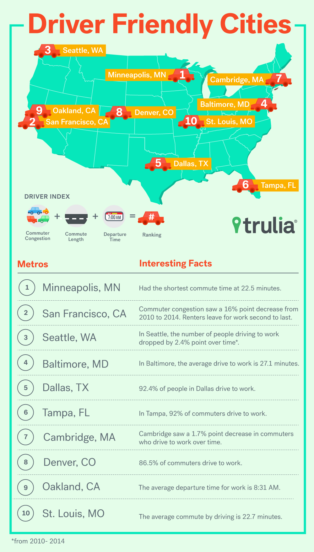
- Our analysis of driving commuters found: Minneapolis, San Francisco, and Seattle were 3 most driver-friendly places.
- Renters who drive to work in Minneapolis had the shortest commute time compared to renters who drive to work in other cities.
- San Francisco ranked best when it came to the change of the percentage of households that drive to work. It saw a 16 percentage point decrease from 2010 to 2014. Its renters who drive to work also leave for work the second latest compared to renters in other cities who drive.
- The cities where drivers are likely to experience crowded, long, and early-morning driver commutes are Washington, D.C., Riverside, Calif., Miami; New York; and Chicago. Washington, D.C. did poorly in all three Driver-Friendly factors we tracked: commute duration, departure time and road congestion increases. Commutes there were, on average, the 2nd longest of the top rental markets, while Chicago drivers’ commutes were the longest, on average.

[1] This data was from a Harris Poll survey that was conducted in the 1st quarter of this year found in the linked page.
[2] Please refer to our methodology section for more details about the data that we are using and time frame.
| Best Places For Transit-Friendly Commutes | |||||
| MSA | Transit Use % Point Change –Rank | Duration of Commute Taking Public Transit –Rank | Public Transit Departure Time –Rank | Transit-Friendly Index | Transit-Friendly Rank |
| Portland-Vancouver-Hillsboro, OR-WA | 2 | 5 | 7 | 21.43 | 1 |
| St. Louis, MO-IL | 6 | 15 | 1 | 13.64 | 2 |
| Chicago-Naperville-Arlington Heights, IL | 4 | 9 | 10 | 13.04 | 3 |
| Minneapolis-St. Paul-Bloomington, MN-WI | 18 | 1 | 6 | 12.00 | 4 |
| Houston-The Woodlands-Sugar Land, TX | 17 | 6 | 3 | 11.54 | 5 |
| New York-Jersey City-White Plains, NY-NJ | 3 | 12 | 11 | 11.54 | 5 |
| Boston, MA | 16 | 3 | 14 | 9.09 | 7 |
| Philadelphia, PA | 24 | 7 | 2 | 9.09 | 7 |
| San Diego-Carlsbad, CA | 9 | 20 | 4 | 9.09 | 7 |
| Washington-Arlington-Alexandria, DC-VA-MD-WV | 1 | 10 | 22 | 9.09 | 7 |
| Phoenix-Mesa-Scottsdale, AZ | 8 | 21 | 5 | 8.82 | 11 |
| Tampa-St. Petersburg-Clearwater, FL | 7 | 13 | 18 | 7.89 | 12 |
| Denver-Aurora-Lakewood, CO | 19 | 11 | 9 | 7.69 | 13 |
| Miami-Miami Beach-Kendall, FL | 5 | 18 | 16 | 7.69 | 13 |
| San Francisco-Redwood City-South San Francisco, CA | 25 | 2 | 13 | 7.50 | 15 |
| Dallas-Plano-Irving, TX | 10 | 14 | 19 | 6.98 | 16 |
| Atlanta-Sandy Springs-Roswell, GA | 13 | 23 | 8 | 6.82 | 17 |
| Seattle-Bellevue-Everett, WA | 21 | 8 | 15 | 6.82 | 17 |
| Anaheim-Santa Ana-Irvine, CA | 11 | 24 | 12 | 6.38 | 19 |
| Cambridge-Newton-Framingham, MA | 22 | 4 | 24 | 6.00 | 20 |
| Newark, NJ-PA | 14 | 22 | 17 | 5.66 | 21 |
| Los Angeles-Long Beach-Glendale, CA | 15 | 16 | 23 | 5.56 | 22 |
| Riverside-San Bernardino-Ontario, CA | 12 | 25 | 20 | 5.26 | 23 |
| Oakland-Hayward-Berkeley, CA | 23 | 17 | 21 | 4.92 | 24 |
| Baltimore-Columbia-Towson, MD | 20 | 19 | 25 | 4.69 | 25 |
| Transit-Friendly Index values were created by inverting the sum of each of the metro rankings for the 3 constituent Transit-Friendly factors, then scaling that quantity up by a factor of 300. We then ranked the metro areas by the Transit Friendly Index. | |||||
| Best Places for Driver-Friendly Commutes | |||||
| MSA | Car Use % Point Change –Rank | Duration of Driving Commute – Rank | Driver Departure Time –Rank | Driver-Friendly Index | Driver-Friendly Rank |
| Minneapolis-St. Paul-Bloomington, MN-WI | 5 | 1 | 3 | 33.33 | 1 |
| San Francisco-Redwood City-South San Francisco, CA | 1 | 14 | 2 | 17.65 | 2 |
| Seattle-Bellevue-Everett, WA | 4 | 9 | 9 | 13.64 | 3 |
| Baltimore-Columbia-Towson, MD | 9 | 13 | 1 | 13.04 | 4 |
| Dallas-Plano-Irving, TX | 13 | 7 | 4 | 12.50 | 5 |
| Tampa-St. Petersburg-Clearwater, FL | 11 | 8 | 7 | 11.54 | 6 |
| Cambridge-Newton-Framingham, MA | 7 | 12 | 10 | 10.34 | 7 |
| Denver-Aurora-Lakewood, CO | 6 | 6 | 20 | 9.38 | 8 |
| Oakland-Hayward-Berkeley, CA | 2 | 22 | 11 | 8.57 | 9 |
| St. Louis, MO-IL | 21 | 2 | 12 | 8.57 | 9 |
| Newark, NJ-PA | 8 | 15 | 13 | 8.33 | 11 |
| Phoenix-Mesa-Scottsdale, AZ | 14 | 3 | 19 | 8.33 | 11 |
| Portland-Vancouver-Hillsboro, OR-WA | 24 | 5 | 8 | 8.11 | 13 |
| Los Angeles-Long Beach-Glendale, CA | 10 | 18 | 14 | 7.14 | 14 |
| Philadelphia, PA | 3 | 21 | 18 | 7.14 | 14 |
| San Diego-Carlsbad, CA | 16 | 4 | 23 | 6.98 | 16 |
| Anaheim-Santa Ana-Irvine, CA | 12 | 10 | 24 | 6.52 | 17 |
| Boston, MA | 18 | 23 | 6 | 6.38 | 18 |
| Atlanta-Sandy Springs-Roswell, GA | 17 | 16 | 15 | 6.25 | 19 |
| Houston-The Woodlands-Sugar Land, TX | 15 | 11 | 25 | 5.88 | 20 |
| Chicago-Naperville-Arlington Heights, IL | 22 | 25 | 5 | 5.77 | 21 |
| New York-Jersey City-White Plains, NY-NJ | 19 | 20 | 16 | 5.45 | 22 |
| Miami-Miami Beach-Kendall, FL | 23 | 17 | 17 | 5.26 | 23 |
| Riverside-San Bernardino-Ontario, CA | 20 | 19 | 21 | 5.00 | 24 |
| Washington-Arlington-Alexandria, DC-VA-MD-WV | 25 | 24 | 22 | 4.23 | 25 |
| Driver-Friendly Index values were created by inverting the sum of each of the metro rankings for the 3 constituent Driver-Friendly factors, then scaling it up by a factor of 300. We then ranked the metro areas by the Driver Friendly Index. | |||||
The following table details how each of the 25 largest rental markets fared on each of the factors behind our Driver-Friendly and Transit-Friendly Indexes. (You can sort by whichever column you want in each of the tables by clicking on the column header).
A notable trend that can be seen in the underlying data is that renters who ride public transit tend to have commutes that are quite long – among all markets examined in our study, the average public transit commute for renters took 45 minutes. For example, renters in New York commute for an average of 46 minutes one-way, Philadelphia 44 minutes, and Washington, D.C. 45 minutes. Many renters in such expensive and crowded areas have no choice but to ride public transit due to high costs associated with owning a personal motor vehicle in these dense areas. We hope that Trulia can help you rent a home near transit to make your commute as hassle-free as possible.
Methodology:
US Census 1-year 2014 and 2010 American Community Survey data were used for this study. The data is credited to: Steven Ruggles, Katie Genadek, Ronald Goeken, Josiah Grover, and Matthew Sobek. Integrated Public Use Microdata Series: Version 6.0 [Machine-readable database]. Minneapolis: University of Minnesota, 2015.
Twenty-five metro Areas with the most renter occupied units as per the 2010 Census data were used for this study. We use Metropolitan Divisions wherever possible, and otherwise Metropolitan Statistical Areas for our Metro Area definitions. Household heads who are employed, are renters, and responded to what mode of commute they use, their usual hours worked, and the number of weeks they worked in the previous year, and only those household heads who reported a valid, non-negative household income were used to calculate constituent metrics feeding into our index calculations.
For the Hassle-Free Driving Commute index calculation, we used 3 inputs:
- The increase or decrease in percentage of households who drive to work
- Average time spent on a driving commute by renters
- The average departure time of renter drivers
Similarly, for the Hassle-Free Public Transit Index calculation, we used:
- The increase or decrease in percentage of households who ride public transit to work
- Average time spent on a public transit commute by renters
- The average departure time of renter public-transit riders
The average departure time and average time spent on commute measures, and hence rankings derived from them, were computed using only the 1-year 2014 ACS data. These are weighted average figures computed using household weights provided by IPUMS. The percentage point changes in drivers and public transit takers, and hence rankings derived from them, were derived by comparing 1-year 2014 ACS data to 1-year 2010 ACS data. We took the algebraic inverse of the sum of each of the rankings based on these constituent data, then multiplied this quantity by 300 in order to arrive at the Public Transit Happiness Index and the Wheel Friendly Index. Please note that the two indexes and their rankings are completely separate from one another. For instance, a metro Area having a low Public Transit Happiness Index does not mean that residents in that metro Area are better off driving rather than riding public transit. We are simply comparing metro Areas to each other when it comes to how friendly it is to ride public transit in the Public Transit Happiness Index rankings.


