
America’s 10 most expensive metros have a lot going for them. They’re big. They have plenty of jobs. And for many residents, they’re desirable places to live.
But there’s a catch: the cost of housing has become so expensive that lower-income households are getting squeezed out.
Rents and home prices have soared in Chicago, Los Angeles, New York, Oakland, Orange County, Calif., San Francisco, San Jose and Washington, D.C. In these cities, rents paid by tenants on average have increased 13%. Home values have risen 12.5% from 2010 to 2014. In addition, the share of households in these cities making more than $100,000 per year has risen 3.6 percentage points during the same period.
However, many residents of these cities have been left behind. The share of households making $30,000 or less per year – which makes up 30% of all households in these cities – has fallen just 2.2 percentage points. As a result, these lower-income residents have opted to move to less expensive areas of the country. In some cases, even those able to afford these expensive cities are leaving too.
To better understand who’s leaving and why, we looked at the income and industry of employment of those who moved away using the 2014 5-year U.S. Census American Community Survey and compared them to people who’ve stayed. See methodology below for more detail.
In a world where all things are equal, we would assume that heads of households who leave a metro, what we call “out-migration,” ought to occur at the same rate as the proportion of each demographic segment’s households. In other words, if people with brown eyes make up 60% of a city’s population, our expectation would be that 60% of everyone who moves out would have brown eyes. If 66% of those who move away have brown eyes, then 10% more people moved away than expected – what we call the “move-away rate relative to expectation,” (60% population/expectation vs. 66% actual equals 10% difference vs. expectation).
Substituting income for eye color, we found that in every metro we looked at, households that make $30,000 or less moved out at the highest rate relative to expectations (+50.8%), up from +48.1% during the 2005 to 2009 time period and also took up the greatest share of everyone that moved out of the 10 most expensive cities (25.5%), up slightly, 25.3%, from 2005-2009. Those earning more than $150,000 moved out at the smallest rate relative to expectations (-28.0%). Those earning between $120,000 and $150,000 took up the smallest share of everyone that moved out (7.1%).
| Income Group | Share of Households Currently Residing in Top 10 Metro | Share of Households That Moved Away From Top 10 Metro* | Move-Away Rate Relative to Expectation | ||
|---|---|---|---|---|---|
| NOTE: *Rounding may cause these numbers to not add up to 100%. These do actually add up to 100% when not rounded. | |||||
| $30k or less | 16.9% | 25.5% | 50.8% | ||
| $31k-$60k | 22.4% | 24.0% | 7.2% | ||
| $61k-$90k | 18.3% | 17.5% | -4.3% | ||
| $91k-$120k | 13.6% | 11.7% | -13.6% | ||
| $121k-$150k | 9.2% | 7.1% | -22.4% | ||
| More than $150k | 19.6% | 14.1% | -28.0% | ||
Breaking it down by city, those cities we studied saw very high and statistically significant move-away rates relative to expectation for those earning $30,000 or less as well as for those earning $60,000 or less. Even in New York, which had the smallest move-away rate relative to expectation for those making $30,000 or less among the top 10 cities, that rate was still very high at 35.1% (up from 21% from the 2005 to 2009 period).
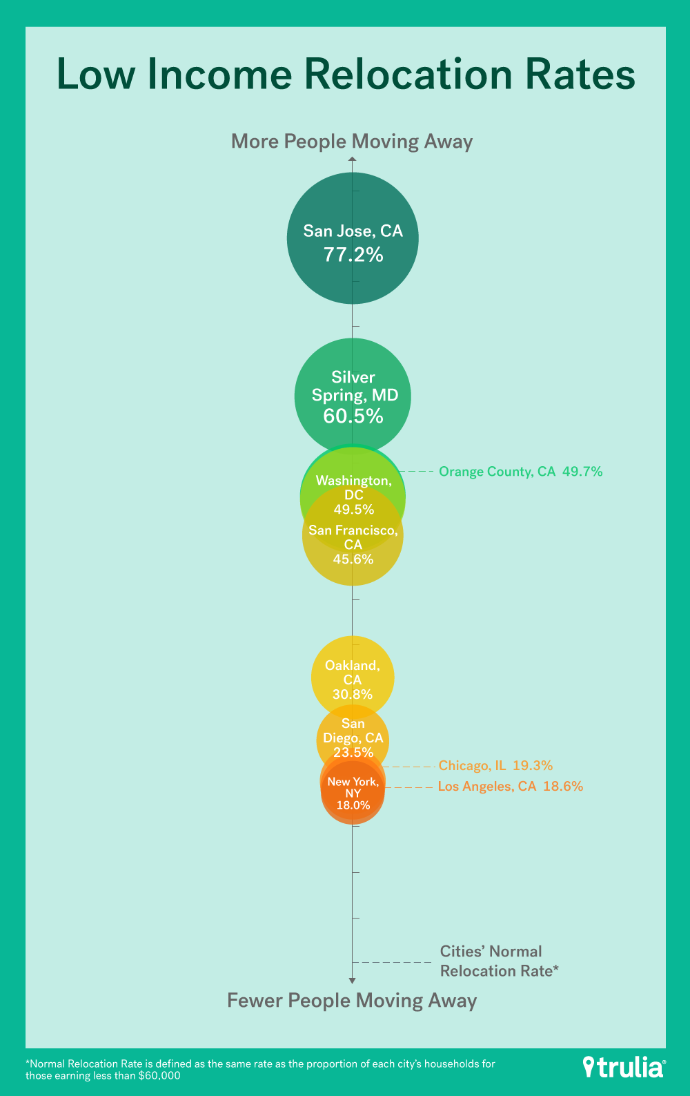
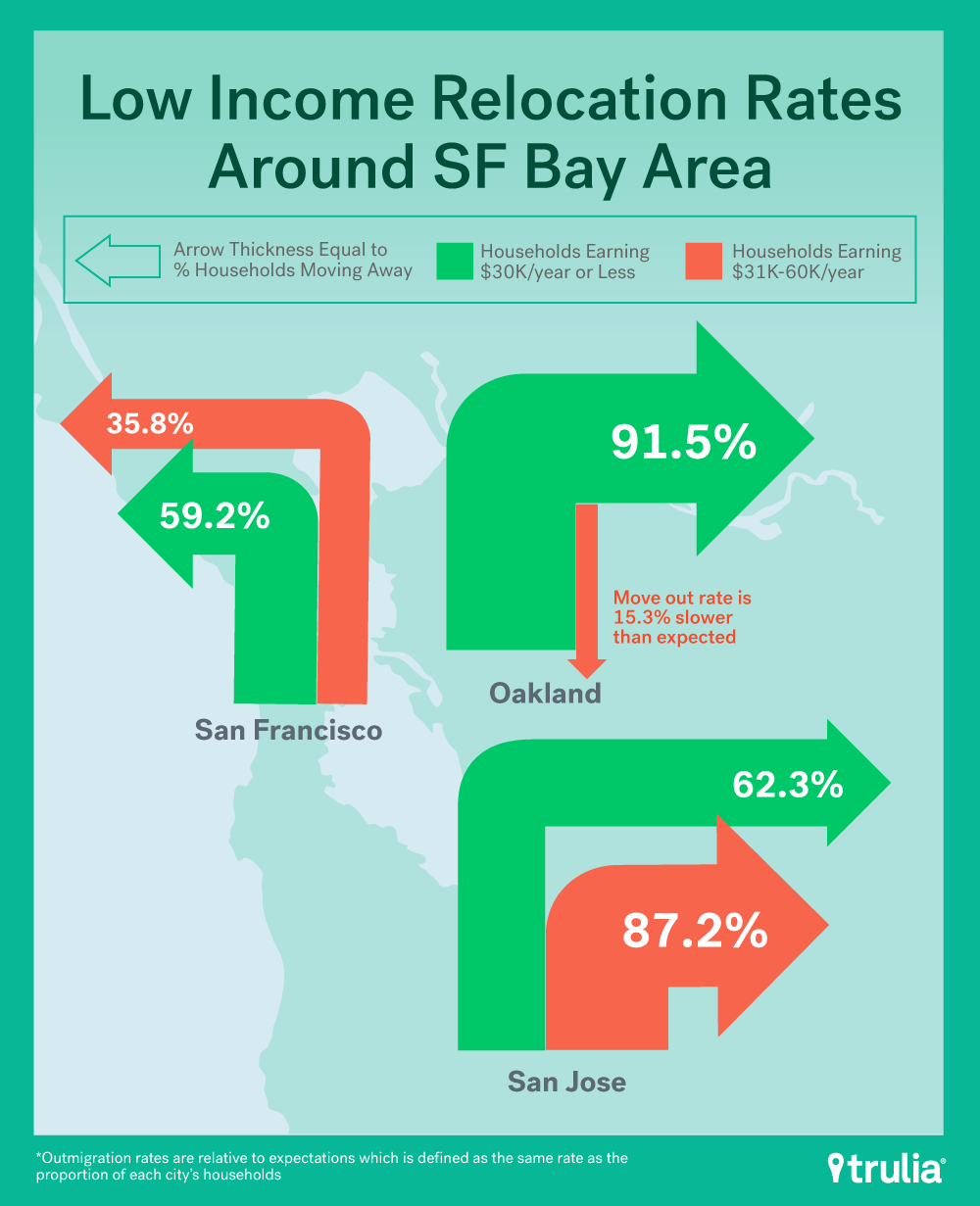
Interestingly, residents earning less than $60,000, which is still greater than the national median household income, represented nearly, and sometimes more than, half of everyone that moved out in every city studied. Residents making $30,000 or less are leaving the notoriously expensive San Francisco Bay Area at the highest rates: San Jose saw out-migration at a rate greater than expectation of 62.3% (building on losses between 2005 and 2009 when the rate relative to expectation was 89.7%), Oakland 91.5% (up from 66.3% in 2005-2009), and San Francisco 59.2% (down from 77.8%, 2005-2009). Silver Spring, Md., had the highest out-migration rate of 103.5% or twice the expected rate.
| Out Migration Among Lower Income Households | ||||||
| U.S. Metro | Share of Households Currently Residing in Top 10 Metro That Earn $30,000 Or Less | Share of Households Leaving From Top 10 Metro That Earn $30,000 Or Less | Move-Away Rate Relative To Expectation For Those Earning $30,000 Or Less | Share of Households Currently Residing in Top 10 Metro That Earn $60,000 Or Less | Share of Households That Moved Away From Top 10 Metro That Earn $60,000 Or Less | Move-Away Rate Relative To Expectation For Those Earning $60,000 Or Less |
| San Jose, CA | 11.0% | 17.9% | 62.3% | 27.4% | 48.6% | 77.2% |
| Silver Spring, MD | 8.7% | 17.7% | 103.5% | 26.0% | 41.7% | 60.5% |
| Orange County, CA | 13.1% | 24.3% | 85.9% | 33.9% | 50.7% | 49.7% |
| Washington, DC | 10.1% | 18.8% | 86.4% | 28.1% | 42.0% | 49.5% |
| San Francisco, CA | 12.4% | 19.7% | 59.2% | 29.5% | 43.0% | 45.6% |
| Oakland, CA | 14.6% | 28.0% | 91.5% | 33.9% | 44.3% | 30.8% |
| San Diego, CA | 15.8% | 23.8% | 50.9% | 40.5% | 50.0% | 23.5% |
| Chicago, IL | 18.4% | 27.1% | 47.8% | 43.0% | 51.2% | 19.3% |
| Los Angeles, CA | 21.5% | 32.2% | 49.7% | 47.5% | 56.3% | 18.6% |
| New York, NY | 19.2% | 25.9% | 35.1% | 42.0% | 49.6% | 18.0% |
For those households earning more than $150,000 a year, the move-away rate was significantly lower than expectation in all of the 10 cities that we studied. Tech hubs, San Jose and San Francisco, which saw the poorest households leave at extremely high rates, actually saw some of the lowest move-away rates relative to expectation at -52.7% and -39.4%, respectively, for those earning more than $150,000. This trend has worsened over time. Between 2005 and 2009 the move-away rates relative to expectation for San Jose and San Francisco were -39% and -34.5% respectively (the lower the number, the fewer people moving away).
| Out Migration Among Higher Income Households | |||
| U.S. Metro | Share of Households Currently Residing in Top 10 Metro That Earn More Than $150,000 | Share of Households Leaving From Top 10 Metro That Earn More Than $150,000 | Move-Away Rate Relative To Expectation For Those Earning More Than $150,000 |
| New York, NY | 18.4% | 17.2% | -6.5% |
| Chicago, IL | 15.0% | 12.8% | -14.5% |
| Los Angeles, CA | 14.2% | 10.0% | -29.7% |
| Oakland, CA | 23.8% | 16.7% | -29.7% |
| Silver Spring, MD | 29.8% | 20.2% | -32.3% |
| San Diego, CA | 16.5% | 10.0% | -39.2% |
| San Francisco, CA | 29.7% | 18.0% | -39.4% |
| Orange County, CA | 22.1% | 13.1% | -40.5% |
| Washington, DC | 27.3% | 14.5% | -46.9% |
| San Jose, CA | 31.3% | 14.8% | -52.7% |
Millennials accounted for the largest share of out migration at 51.1%, and they also had the highest move-away rate relative to expectation at +105.6%.
| Age Group | Share of Households Currently Residing In Top 10 Metro | Share of Households that Moved Away From Top 10 Metro | Move-Away Rate Relative to Expectation |
|---|---|---|---|
| 18 to 34 years old | 24.8% | 51.1% | 105.6% |
| 35 to 54 | 50.6% | 36.1% | -28.5% |
| 55 or older | 24.6% | 12.8% | -48.0 |
Although Millennials moved out at a rate greater than expected for every single city studied, one thing to note is that San Jose and San Francisco, known to be booming tech hubs, saw lower move-away rates relative to expectation compared to the other top cities.
| Millennial Out Migration | |||
| U.S. Metro | Share of Households Currently Residing in Top 10 Metro That Are Millennials | Share of Households Leaving From Top 10 Metro That Are Millennials | Move-Away Rate Relative To Expectation For Millennials |
| Silver Spring, MD | 20.1% | 49.2% | 144.2% |
| Orange County, CA | 20.6% | 46.0% | 122.7% |
| Oakland, CA | 22.6% | 47.8% | 111.5% |
| New York, NY | 24.8% | 51.2% | 106.4% |
| Chicago, IL | 26.6% | 54.5% | 104.8% |
| Washington, DC | 25.7% | 52.1% | 102.7% |
| Los Angeles, CA | 24.4% | 48.8% | 100.2% |
| San Jose, CA | 23.8% | 47.3% | 98.3% |
| San Diego, CA | 28.1% | 55.1% | 96.4% |
| San Francisco, CA | 27.4% | 52.3% | 91.1% |
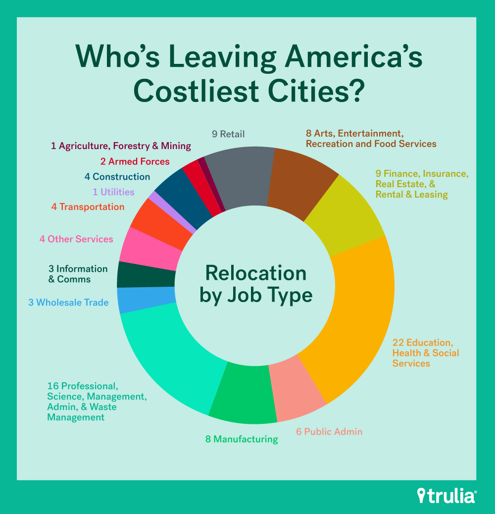
Lower-paying occupations also had higher move-away rates. There are some natural outliers. Those who work in armed forces, who by nature of their jobs are transient, and less urban-based industries such as agriculture and forestry, saw higher-than-expected rates. By contrast, those who work in information and communications, which includes highly paid tech workers, had an out-migration rate that is 11.8% lower than expectation.
| Out Migration By Occupation | |||
| Industry Category | Share of Households Currently Residing in Top 10 Metro* | Share of Households That Moved Away From Top 10 Metro* | Move-Away Rate Relative To Expectation |
| Armed Forces | 0.5% | 2.3% | 354.9% |
| Agriculture, Forestry, Fishing and Hunting, and Mining | 0.3% | 0.6% | 71.6% |
| Retail Trade | 7.8% | 9.0% | 15.8% |
| Arts, Entertainment, Recreation, Accommodations, and Food Services | 7.5% | 8.2% | 9.4% |
| Finance, Insurance, Real Estate, and Rental and Leasing | 8.5% | 8.9% | 4.0% |
| Educational, Health and Social Services | 22.0% | 22.4% | 1.7% |
| Public Administration | 6.2% | 6.1% | -0.3% |
| Manufacturing | 8.5% | 8.4% | -1.4% |
| Professional, Scientific, Management, Administrative, and Waste Management Services | 16.2% | 15.9% | -2.1% |
| Wholesale Trade | 2.7% | 2.6% | -2.9% |
| Information and Communications | 3.8% | 3.3% | -11.8% |
| Other Services (Except Public Administration) | 5.1% | 4.2% | -17.2% |
| Transportation and Warehousing | 4.6% | 3.6% | -21.8% |
| Utilities | 0.7% | 0.5% | -23.0% |
| Construction | 5.6% | 3.9% | -29.4% |
To summarize, those who earn very little income, those who work in unstable, less urban-based, and low-paying industries, and younger generation households that have not yet established a stable career have moved away from these pricey cities at much greater rates than the rest of the population.
Methodology
2014 5-year U.S. Census American Community Survey data gathered via IPUMS was used for this study. We only used household-heads that had positive household income, were paying either rent or a mortgage, and were 18 or older. “Move-Away Rate Relative to Expectation” metrics were calculated based on the percent-difference between the proportion of households living in a given MSA and the proportion of households that out-migrated from a given MSA. Metro Areas used in this study, by which we segment the data, follow Metropolitan Areas, or Divisions where available. We selected 10 Metro Areas, or divisions where available, that reported to have the highest gross rent paid by tenant, which includes housing utility costs as defined by the American Community Survey, and rent-equivalent monthly mortgage payments, including housing utility costs, with large enough population size for the study. Some Migration PUMAs collected via IPUMS map to multiple PUMAs. For those Migration PUMAs with multiple PUMA mappings, we assumed a uniform distribution amongst the PUMAs that the Migration PUMAs map to.
*Rounding may cause these numbers to not add up to 100%. These do actually add up to 100% when not rounded.