
Here’s some good news for frustrated starter home buyers: if you think you missed out on bagging that trophy starter home during this year’s peak buying season, think again. It turns out that starter home inventory actually increases by about 7% in the fall months compared to the spring. That leads to listing prices that are about 4.8% and 3.1% lower in the winter and spring than in the summer (or third quarter), respectively.
As a result, starter homebuyers should step up their hunt this fall, not end it.
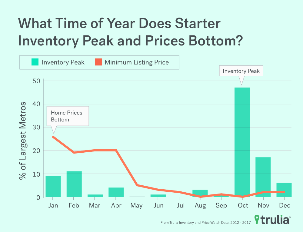
In this edition of Trulia’s Inventory and Price Watch, we examine the seasonality of starter homes to show homebuyers which markets are ripe for the picking this fall. We find that fall (what we consider the fourth quarter of Oct. 1 through Dec. 31) is peak hunting season for the starter homebuyer: 70 of the largest 100 metros see peak annual starter home inventory between October and December, based on Trulia Inventory and Price Watch data from 2012 to 2017. What’s more, listing prices of starter homes take an annual dip between January and March of each year, likely a result of the spike in inventory that happens at the end of the year.
The Trulia Inventory and Price Watch is an analysis of the supply and affordability of starter homes, trade-up homes, and premium homes currently on the market. Segmentation is important because home seekers need information not just about total inventory, but also about inventory in the price range they are interested in buying. For example, changes in total inventory or median affordability don’t provide first-time buyers useful information about what’s happening with the types of homes they’re likely to buy, which are predominantly starter homes.
Looking at the housing stock nationally and in the 100 largest U.S. metros from Q1 2012 to Q3 2017, we found:
- Nationally, the number of starter and trade-up homes on the market has decreased substantially, falling 20.4% and 12.5% respectively, during the past year, while inventory of premium homes has fallen just 2.3%.
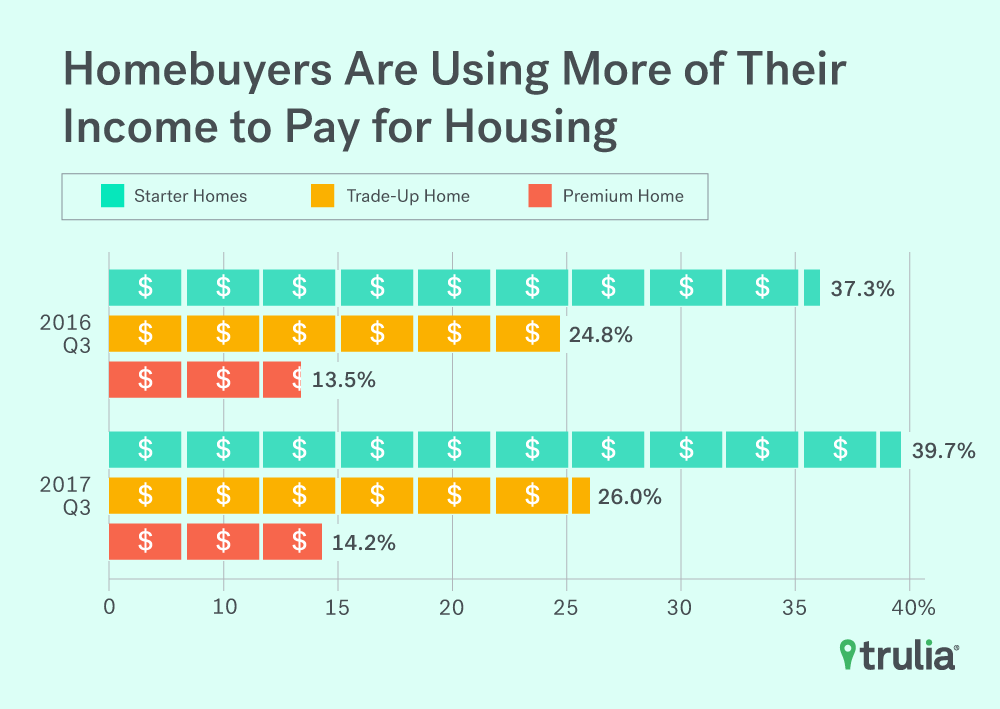
- The persistent and disproportional drop in starter and trade-up home inventory is pushing affordability further out of reach of homebuyers. Starter and trade-up homebuyers need to spend 2.3% and 1.2% more of their income than this time last year, whereas premium homebuyers only need to shell out 0.7% more of their income.
- Across the 100 largest metros, starter home listing prices in Wichita, Kan., Seattle, and San Jose, Calif., are listed 18.6%, 12.1%, and 11.1% lower, respectively, in the off season than during peak season. The number of for-sale homes in San Jose, Colorado Springs, Colo., and Portland, Ore., are 42%, 34.7%, and 34.7%, higher, on average, respectively in the peak season than off season.
Starter Home Inventory Drops More Than 20% in the Summer
Inventory of all homes continues to fall on a year-over-year basis. The inventory of all homes dropped 9.1%, but starter and trade-up homes have seen even bigger declines during the third quarter. In addition:
- The number of starter homes on the market dropped 20.4% year-over-year, while the share of starter homes dropped to 20.5% from 23%. Starter homebuyers today will need to shell out 2.3% more of their income towards a home purchase than last year;
- The number of trade-up homes on the market decreased by 12.5% year-over-year, while the share of trade-up homes dropped to 23.5% from 24%. Trade-up homebuyers today will need to pay 1.2% more of their income for a home than last year;
- The number of premium homes on the market decreased by 2.3% year-over-year, while the share of premium homes increased to 55.9% from 52.9%. Premium homebuyers today will need to spend 0.7% more of their income for a home than a year ago.
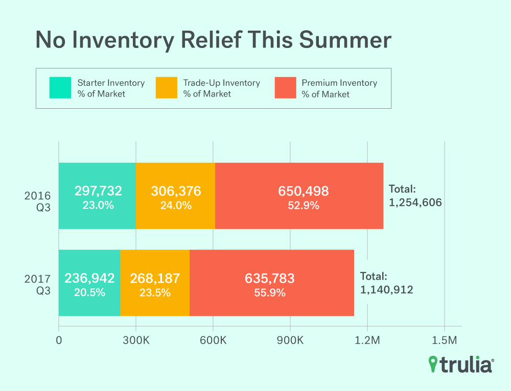
| 2017 Q3 National Inventory and Price Watch | ||||||||
| Housing Segment | 2017 Q3 Inventory | Change, 2016 Q3 – 2017 Q3 | ||||||
| Median
List Price |
Share | Inventory | % of Income Needed to
Buy Median Price Home in Segment |
% Change in Median
List Price |
Percentage
Point Change in Share |
% Change in Inventory | Additional Share of Income
Needed to Buy a Home (Percentage -Point Change) |
|
| Starter | $171,624 | 20.5% | 236,942 | 39.7% | 6.5% | -2.5 pts | -20.4% | +2.3 pts |
| Trade-Up | $294,150 | 23.5% | 268,187 | 26.0% | 4.8% | -0.5 pts | -12.5% | +1.2 pts |
| Premium | $615,929 | 55.9% | 635,783 | 14.2% | 6.2% | +3.0 pts | -2.3% | +0.7 pts |
| Among the 100 largest U.S. metro areas. Share is the percent of for-sale homes that fall into each segment, which is defined separately for each metro. Median price for each segment is the stock-weighted average of the median price of each segment in each metro. Some point change estimates may be slightly different than stated values because our differing procedure occurs before rounding. The full data set can be downloaded here. | ||||||||
Falling inventory has also pushed affordability of homes across all segments to new post-recession lows. Starter homebuyers have been hurt the most, as they’ll need to dedicate 39.7% of their monthly income to buy a starter home – a 2.3 percentage-point increase from last year and up 31% in the first three months of 2013, the most affordable period in the last five years. Though trade-up and premium homes are still relatively affordable, the share of income these buyers would have to spend on such homes also reached post-recession highs. For example, trade-up and premium home buyers would need to spend 26% and 14.2% of their income to buy a home, respectively, but both are up from 21.5% and 11.6% just four years ago.
Fall is Time to Ready the Starter Home Hunt, Especially Out West
The 20.4% year-over-year fall in starter home inventory in Q3 2017 is sure to have frustrated starter homebuyers this summer, but does that mean they should pack up their hunting gear and head home? Absolutely not. If fact, starter homebuyers in most markets should actually pick up their hunt in the fall, since that is when inventory tends to peak annually. There’s a caveat: seasonal swing in inventory varies quite drastically depending on where you live.
| Where Starter Home Seasonality is Largest | |||||
| Metros with Largest Seasonal Difference, Inventory | Metros with Largest Seasonal Difference, Listing Prices | ||||
| U.S. Metro | Seasonal Difference Between Non-Peak and Peak | Min (Man) Listing Count Quarter | U.S. Metro | Seasonal Difference Between Non-Peak and Peak | Min (Max) Listing Price Quarter |
| San Jose, CA | -42.0% | 1 (4) | Wichita, KS | -18.6% | 1 (2) |
| Colorado Springs, CO | -34.7% | 2 (4) | Seattle, WA | -12.1% | 1 (3) |
| Portland, OR | -34.7% | 2 (4) | San Jose, CA | -11.2% | 1 (3) |
| San Francisco, CA | -33.7% | 1 (4) | Oakland, CA | -10.4% | 1 (3) |
| Phoenix, AZ | -32.8% | 3 (1) | Denver, CO | -9.3% | 1 (3) |
| Fresno, CA | -32.7% | 3 (1) | Kansas City, MO | -9.2% | 2 (3) |
| Wichita, KS | -31.7% | 1 (2) | Dallas, TX | -9.0% | 1 (3) |
| Denver, CO | -30.3% | 2 (4) | San Francisco, CA | -8.7% | 1 (3) |
| Grand Rapids, MI | -29.1% | 2 (4) | Sacramento, CA | -8.7% | 1 (3) |
| Cape Coral-Fort Myers, FL | -28.7% | 3 (1) | Portland, OR | -8.4% | 1 (3) |
| NOTE: Among the 100 largest U.S. metro areas. Full data set available for download here. | |||||
It turns out that starter homebuyers looking to capitalize in markets with the largest seasonal fluctuations in starter home inventory should start their hunt out West. Seven of the top 10 metros with the largest seasonal swings in listing counts are there. San Jose tops the list of metros with the biggest swing in starter home inventory, with the number of starter homes on the market is 42% greater, on average, in the fourth quarter than when starter home inventory is at its lowest, which tends to be in the first quarter. Colorado Springs, Colo., Portland, Ore., San Francisco and Phoenix round out the top five with between 32% and 35% average seasonal swings in inventory, and with the exception of Phoenix, each sees their annual peak inventory in the fourth quarter of the year.
Metros with the biggest seasonal swings in starter home listing prices also are predominantly in the West. Seven of the 10 metros with the largest listing price swings are there. Wichita tops the list of metros with the biggest swing in starter home prices. The median starter-home listing price there is 18.6% lower, on average, in the first quarter than when starter home prices are at their peak in the third quarter. Seattle, San Jose, Oakland, Calif., and Denver round out the top five with between 9% and 12% average seasonal swings in prices. Each sees their annual low in starter home prices in first quarter of the year.
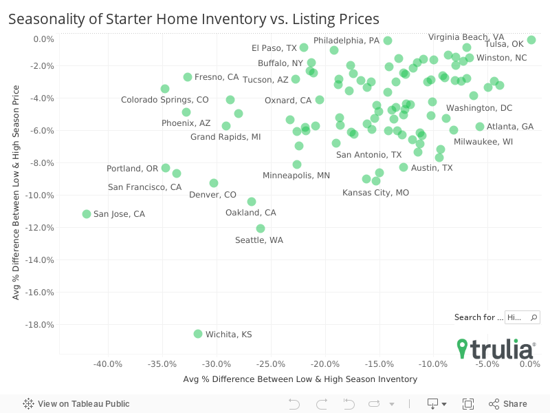
Why do some markets experience large swings in seasonality in starter home listing prices while others don’t? We can’t say for certain why individual markets see large or small swings, but we find a strong and statistically significant correlation between seasonal swings in listing prices and seasonal swings in inventory. Markets that witness bigger seasonal swings in starter home inventory tend to experience bigger seasonal swings in starter home listing prices. The connection, what we call linear correlation, was quite strong (-0.45) and statistically significant, suggesting that homebuyers in markets with big seasonality in inventory stand to benefit most from waiting to snag that starter home until the off-season.
A Starter Homebuyer’s Hunting Plan
The takeaway here is that even though starter home inventory is now at the lowest count since we first started keeping track in 2012, starter homebuyers should be able to find consolation at the end of the year. This is because a large majority of markets (70 of the largest 100 metros) actually see their starter home inventory peak in the fourth quarter of the year. What’s more, that seasonal spike in inventory also tends be followed to by lower listing prices at the beginning of the year. As a result, fall and winter is prime hunting time for starter homebuyers to think about trying to bag that all elusive starter home, rather than packing it in for the season.
Methodology
We define the price cutoffs of each segment based on home value estimates of the entire housing stock, not listing price. For example, we estimate the value of each single-family home and condo and divide these estimates into three groups: the lower third we classify as starter homes, the middle third as trade-up homes, and the upper third as premium homes. We then classify a listing as a starter home on the market if its listing price falls below the price cutoff between starter and trade-up homes. This is a subtle but important difference between our inventory report and others. This is because the mix of homes on the market can change over time, and can cause large swings in the price points used to define each segment. For example, if premium homes comprise a relatively large share of homes for sale, it can make the lower third of listings look they’ve become more expensive when in fact prices in the lower third of the housing stock are unchanged.
Our national metrics are a weighted sum of listings and weighted average of affordability of the 100 largest metropolitan areas and our inventory measure is an average of snapshots taken on the first of each month of the quarter. Last, we measure affordability as the share of income needed to purchase the median priced home in each segment relative metro household income terciles. To lessen the downward skew of income of households in the lowest tercile, we estimate starter homebuyer’s income using only household incomes of homeowners within this segment.
To find out how seasonal starter homes are in a given market, we calculated seasonal averages of inventory and median listing prices of starter homes across each quarter (Q1, Q2, Q3, and Q4) and in each metro between the Q1 2012 and Q3 2017. We then identified the quarters in which inventory and prices peak and trough. To calculate the magnitude of seasonal inventory and price swings, we took the percentage difference between the quarters with the minimum and maximum listing counts and percentage difference between the minimum and maximum median listing price, respectively. National figures on seasonality are derived from the weighted average of the metro-level statistics using the number of occupied housing units as the weight.