Everyone agrees the U.S. housing market is being squeezed by low inventory. What they don’t agree on is why.
As home inventory sits near post-recession lows, there are many hypotheses on why there are so few homes for sale today. Here are the five leading theories: (1) investors bought up too many foreclosures during the bust and are hording them as rentals, (2) rising prices have made buying a home unaffordable, (3) owners don’t want to sell if they don’t think they can buy another home, (4) too many home-owning boomers can’t or don’t want to move, and (5) owners who want to trade up can’t find an affordable home at the next level.
To date, these educated guesses have primarily been tested in isolation through simple correlations with inventory, with little or no regard to analyzing what their impact is relative to other factors. When you wear statistical blinders, you run the risk of ignoring potentially more impactful factors when you’re trying to identify the cause of a problem. To be fair, we’re just as guilty as anyone of looking at possible reasons for low inventory in in isolation when we looked at rising home values and a widening price gap.
To remedy this, we tested each of the five major hypotheses while controlling for the impact of each other hypotheses. The good news is that we found a statistically significant effect for each, which means there is some direct correlation with inventory.
The surprising news? Homebuilding’s impact – or a lack of it in some places – is by far and away the biggest influence when it comes to inventory woes, outweighing other explanations by a large margin. Across the 100 largest metros, our findings show that:
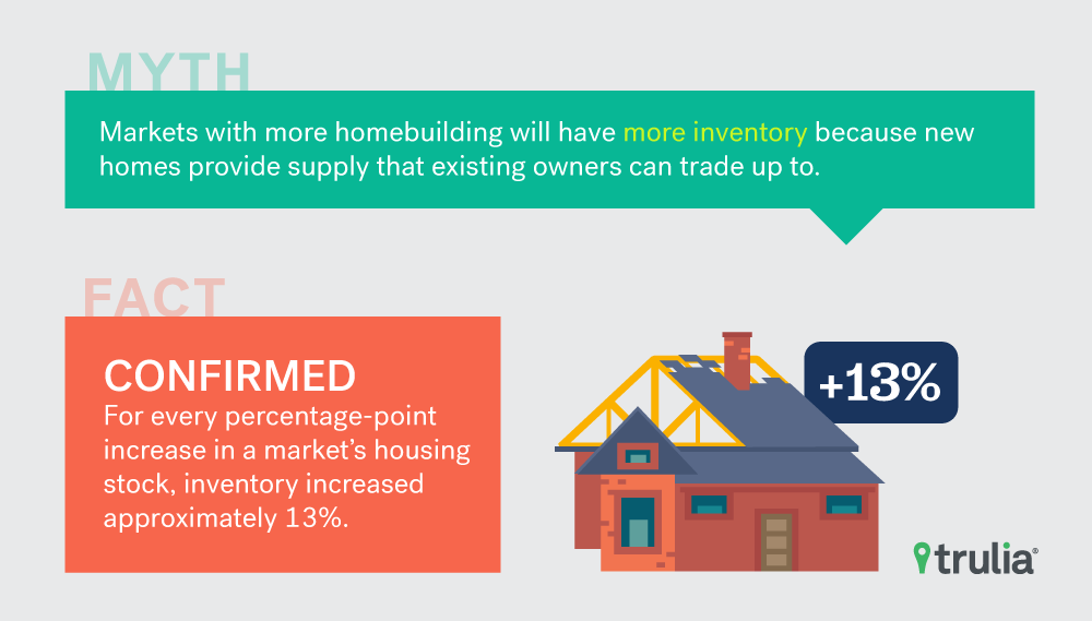
- New home construction is strongly related to inventory. Every one percentage point increase in a market’s housing stock between 2010 and 2016 is, on average, correlated with inventory that is approximately 13% higher.
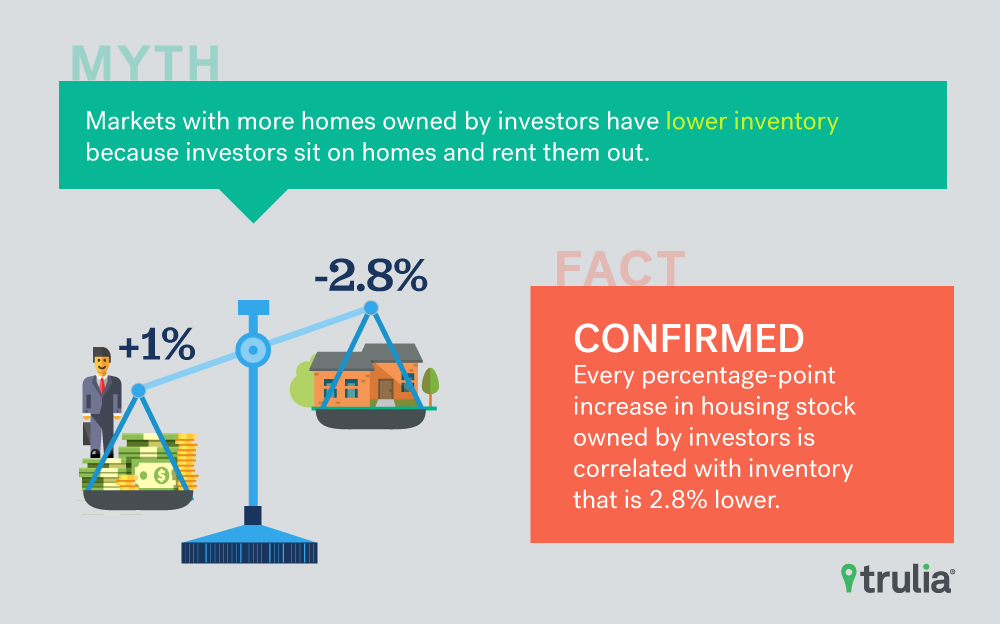
- Investor ownership is tied to lower inventory. Every one percentage point increase in the housing stock owned by investors in a market is, on average, correlated with inventory that is 2.8% lower.
- Older households – by hanging on to their homes – aren’t necessarily driving down inventory, at least not yet. Every one percentage point increase in the housing stock owned by those aged 55 and over is, on average, correlated with inventory that is actually 3.6% higher.
The Hypotheses
To test the impact of five popular explanations of why inventory is low across the 100 largest housing markets, we ran a regression model (see below for details) on the number of homes for sale in a market in 2017 Q2. We standardized inventory by dividing inventory by the number of occupied homes in that market. Here’s what we tested:
- Markets with a higher share of investors will have low inventory because investors sit on homes and rent them out;
- Markets with a bigger recent price increases will have lower inventory because higher home values make affordability worse;
- Markets with a larger increase in price spread – or the gap between prices for premium, trade-up and starter homes — will have lower inventory because as prices of expensive homes outpace less expensive ones it’s harder for existing homeowners to trade up;
- Markets with a larger share of older homeowners will have lower inventory because older households don’t tend to move often;
- Markets with more homebuilding will have more inventory because more new homes helps provide new supply that existing homeowners can trade up to.
The Results
We found that proponents of each of the five popular explanations aren’t wrong – at least not entirely: when controlling for the role that other explanations play, each individual explanation has a statistically significant relationship with inventory. The surprising news is that when it comes to relative impact, homebuilding and investor activity are about the only ones that matter – as they had the highest positive and negative impact of the five explanations.
| Inventory Model Results | |
| For every 1 percentage point increase in … | …there is a __ change, on average, in inventory across the 100 largest metros. |
| Homebuilding | +13.3% |
| Share of homeowners aged 55+ | 3.4% |
| Price Spread | 0.2% |
| Home Value Recovery | -1.8% |
| Investor Ownership | -2.5% |
| See methodology section for more details on our model. | |
First, the factor with the largest impact is homebuilding. Across the largest 100 metros, every one percentage point increase in a market’s housing stock between 2010-2016 is, on average, correlated with inventory that is approximately 13% higher. For example, if the Los Angeles metro had increased their housing stock by 2.6% instead of 1.6% between 2010 – 2016, we could have expected their existing home inventory to increase from 10,181 homes on the market to 11,504 in 2017 Q3: an increase of over 1,300 homes.

Second, the factor with the second largest economic significance is investor ownership. Across the largest 100 metros, every one percentage point increase in the housing stock owned by investors in a market is, on average, correlated with inventory that is 2.8% lower. For example, if investors in the Boston metro reduced their ownership of the housing stock from 43.7% to 42.7%, we could have expected their existing home inventory to increase from 3,290 homes on the market to 3,382 in 2017 Q3: an increase of nearly 100 homes.

Third, and surprisingly, we find the share of owner occupied homes owned by boomers is actually positively correlated with inventory. Every one percentage point increase in the housing stock owned by those aged 55 and over is, on average, correlated with inventory that is actually 3.6% higher. Why is this? It’s tough to say exactly why, but we think the effect is driven by the fact that markets with the largest share of boomers just happen to be in retirement destinations such as Florida and Arizona – states that haven’t much been impacted by low inventory because they tend to build a lot of homes. This also isn’t to say that boomers owning a larger share of the housing stock won’t become problematic in the future. Their decision to either age in place of move to a retirement home could have a substantial impact on home inventory as well as the broader economy.
Last, we find that relative to these other explanations, home value recovery and price spread have relative small economic significance. A one percentage point increase in home value recovery is correlated with a 1.6% decrease in inventory across the 100 largest metros. A one percentage point increase in the price spread is correlated with just a 0.2% increase in inventory, which renders the correlation close to being economically insignificant. Both effects, however, are small relative homebuilding and investor activity.

Where Myths Do, or Don’t, Play out in the Biggest U.S. Housing Markets
The Conclusion
The takeaway here is that not all explanations for low inventory fully explain why the national home inventory is at or near historic lows. While our modeling of all five of these theories are not definitive, they do provide a step forward in explaining which explanations matter most. It turns out the leading explanation for low inventory is that investor activity and a lack of homebuilding are both significant predictors of low inventory. On the contrary, home value recovery and price spread play a much smaller role while an aging population plays a countervailing one. The silver lining from these results are that homebuilding and investor activity are factors that could be made more attractive through a combination of strategically targeted land use, tax, and financial policies.
Methodology
We quantitatively measure each explanation is as follows:
- Homebuilding: percentage change in a metro’s housing stock between 2010 and 2016, sourced from the U.S. Census;
- Boomer control: share of owner-occupied housing stock owned by a head of household who is aged 55 and over, sourced from the 2015 American Community Survey (ACS);
- Price spread: percent difference between the median priced premium home and the median price starter home, per our 2017 Q2 inventory report;
- Home value recovery: the total value of a metro’s housing stock relative the its pre-recession peak value, sourced from Trulia’s home value estimates;
- Investor ownership: share of a metro’s occupied housing stock that is rented, sourced from the 2015 (ACS).
Below is a table of the regression results.
| Regression Model Results. | |
| Variable | Coefficient (T-Value) |
| Homebuilding | 0.133 (6.44)* |
| Share of homeowners aged 55+ | 0.034 (4.49)* |
| Price Spread | 0.002 (4.73)* |
| Home Value Recovery | -0.018 (-7.24)* |
| Investor Ownership | -0.025 (-4.10)* |
| Diagnostics | |
| R2 | .6 |
| Observations | 100 |
| NOTE: *Denotes statistical significance at the < 1% level. The dependent (outcome) variable is Inventory per occupied household in Q3 2017. The full data used in the regression model is available for download here. | |


