Nearly 50 years after the passage of the Fair Housing Act of 1968, racial and ethnic minorities still face few housing opportunities than all other households: they own homes at a lower rate, spend more of their income on rent and continue to contend with residential segregation.
The Great Recession disproportionately impacted black and Latino households as gains in these housing opportunities before 2000 were largely erased in the last 10 years. Locally, however, some metros bucked national trends to emerge as areas where housing prospects for black and Latino households improved.
Looking back at the changes in housing opportunities for the past few decades, we found:
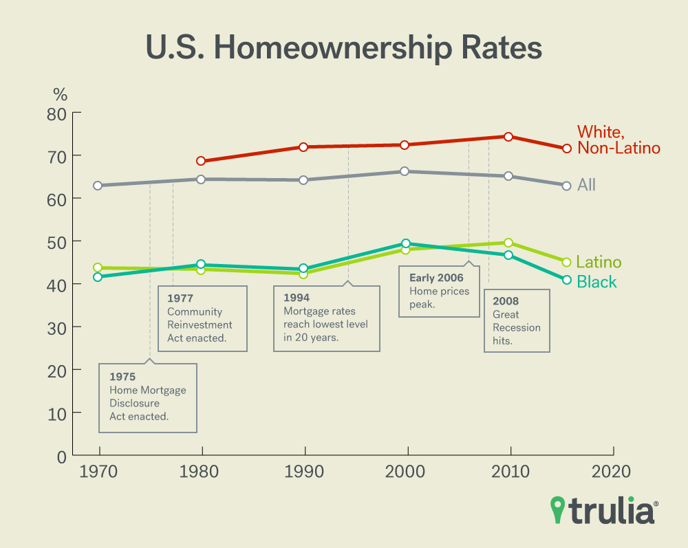
- Nationally, the homeownership gap between all households and black and Latino households has changed little since 1970.
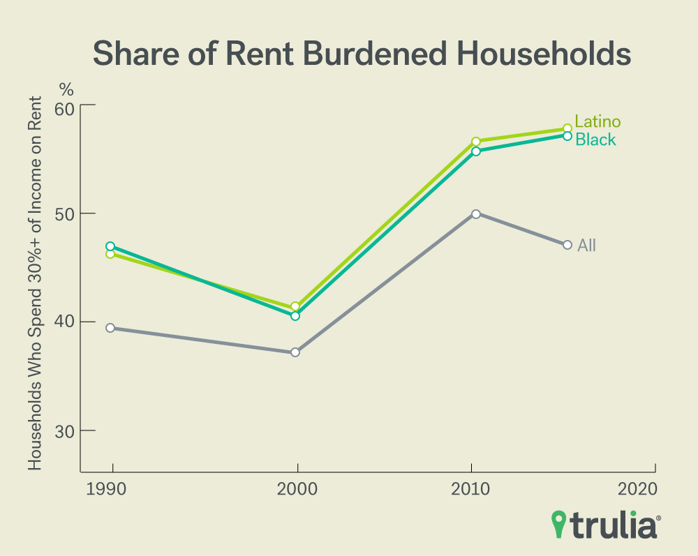
- The share of households that are rent burdened—spend 30% of their income or more on rent—increased after the housing crisis. More than 55% of black and Latino households are rent burdened compared to 47% of all households.
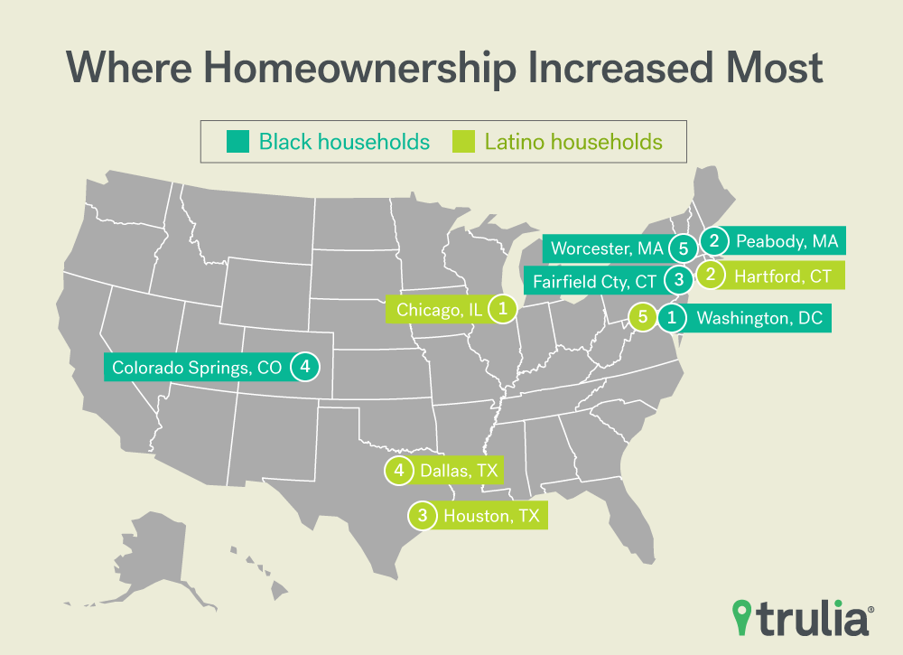
- Homeownership increased the most for black households in the Northeast and Mid-Atlantic from 1990 to 2015, increasing the most in Washington, D.C. (9.6 percentage points), Peabody, Mass. (9.3 points) and Fairfield County, Conn. (9.3 points).
- Rust Belt cities like Troy, Mich. (-13.1 points), Grand Rapids, Mich. (-10.1 points) and Akron, Ohio (-9.4 points) topped the list of metros where homeownership decreased the most for black households.
- Latino households saw double-digit increases in homeownership in Chicago (13.0 points), Hartford, Conn. (11.7 points) and Houston (11.7 points).
- Residential black-white segregation decreased in 94 of the largest 100 metros from 1980 to 2015, improving the most in in the Florida metros of Fort Lauderdale, Sarasota and Cape Coral.
- Texas metros of El Paso and San Antonio saw the largest decreases in white-Latino segregation.
In honor of Fair Housing Month and in recognition of the Fair Housing Act’s mission to protect home buyers and renters from discrimination, Trulia investigated how housing opportunities have shifted for underrepresented groups nationally and in the 100 largest U.S. metros. Using U.S. Census Bureau data, we examine three measures of housing opportunities: 1) homeownership rates; 2) residential segregation; 3) affordability (as measured by rent burden, or those who spend 30% or more of their household income on rent). We focused on how these opportunities have changed for African-Americans and Latinos, the two largest racial and ethnic minorities in the United States.
Homeownership Rates Unchanged Nationally, But Improving in Some Metros
The national gap between the homeownership rate for all households and black households has remained nearly the same whereas the gap between all households and Latino households has narrowed slightly since the passage of the Fair Housing Act. This gap is even starker when comparing non-Latino white homeownership with black or Latino homeownership.
Since 1980, the gap between non-Latino white homeownership rates and black homeownership rates has widened from 24.1% to 30.63%, but the gap between non-Latino white households and Latino households has remained the same. The homeownership rate among Latino households overtook the homeownership rate among black households after 2000. Ownership rates across all groups have remained relatively flat. The housing crisis erased any gains in homeownership, with black homeownership facing the steepest decline from 2000 to 2010.

A few metro areas like Washington, D.C., Fairfield County, Conn., and Worcester, Mass. saw gains in homeownership for both black and Latino households. Otherwise, increases in Latino homeownership were driven by metros with large shares of Latino populations, such as Chicago and Texas metros.
|
Ten Metros where Homeownership Increased the Most from 1990 to 2015 |
||||
| Increases in Black Homeownership | Increases in Latino Homeownership | |||
| Metro | Percentage Point Change | Metro | Percentage Point Change | |
| 1 | Washington, D.C. | 9.6 | Chicago, IL | 13.0 |
| 2 | Peabody, MA | 9.3 | Hartford, CT | 11.7 |
| 3 | Fairfield County, CT | 9.3 | Houston, TX | 11.7 |
| 4 | Colorado Springs, CO | 9.1 | Dallas, TX | 11.2 |
| 5 | Worcester, MA | 8.8 | Washington, D.C. | 10.0 |
| 6 | Rockville, MD | 8.0 | Fort Worth, TX | 9.6 |
| 7 | Hartford, CT | 7.9 | Worcester, MA | 9.1 |
| 8 | Boston, MA | 7.6 | Fairfield County, CT | 7.8 |
| 9 | Honolulu, HI | 7.2 | Springfield, MA | 7.4 |
| 10 | Atlanta, GA | 6.9 | Raleigh, NC | 6.7 |
Homeownership rates among black households suffered the most in Rust Belt metros in Michigan and Ohio as well as in markets that were hit hard by the housing crisis. California’s Central Valley metros of Bakersfield and Fresno were heavily impacted by foreclosures during the housing crisis and are still struggling to recover. The black homeownership decline in Bakersfield is more than three times that of the metro’s entire homeownership rate decline, indicating that black households were particularly susceptible to the economic downturn.
|
Ten Metros where Homeownership Decreased the Most from 1990 to 2015 |
||||
| Decreases in Black Homeownership | Decreases in Latino Homeownership | |||
| Metro | Percentage Point Change | Metro | Percentage Point Change | |
| 1 | Troy, MI | -13.1 | Knoxville, TN | -13.4 |
| 2 | Grand Rapids, MI | -10.1 | Indianapolis, IN | -12.1 |
| 3 | Akron, OH | -9.4 | Baton Rouge, LA | -11.5 |
| 4 | Knoxville, TN | -9.2 | Tampa, FL | -10.7 |
| 5 | Bakersfield, CA | -9.1 | Toledo, OH | -9.5 |
| 6 | Philadelphia, PA | -8.3 | Louisville, KY | -9.0 |
| 7 | Phoenix, AZ | -8.3 | Nashville, TN | -8.7 |
| 8 | Fresno, CA | -8.1 | Pittsburgh, PA | -8.7 |
| 9 | Tulsa, OK | -8.0 | Minneapolis, MN | -8.3 |
| 10 | Toledo, OH | -7.9 | Dayton, OH | -7.5 |

Rent Burden Still High for Black and Latino Households
Those who are unable to buy have seen rent as a share of income increase as the cost of housing has outpaced income growth. The share of rent-burdened households, or those that spend 30% or more of their household income on rent reached nearly 50% of all renter housing in 2010. For black and Latino households, the share of those burdened by rent remains at more than 55% for both groups, while in 2015 the share of those rent burdened eased for the rental population at large.

High rent burdens are prevalent among the nation’s largest metros, but in some areas the problem is particularly acute. Across all renter households, the largest share of rent-burdened households in 2015 consisted of major metros in Florida and Southern California, including Miami (64.5%), Fort Lauderdale, Fla. (58.5%), Riverside, Calif. (58.2%), Los Angeles (58.2%) and Ventura County, Calif. (56.9%). Pittsburgh, with the lowest share of rent-burdened households, still has 43.5% of renters paying 30% or more of their income on rent.
Among black renters, Grand Rapids, Mich., (69.4%), Riverside, Calif., (67.1%), Rochester, N.Y. (66.9%), Fresno, Calif. (66.9%) and West Palm Beach, Fla. (66.0%) are the metros with the highest share of rent-burdened households. Peabody, Mass. has the second lowest rate of rent-burdened black households at 47.1%. Among Latino renters, Miami (66.8%), Honolulu (64.1%), Ventura County, Calif. (63.5%), Fairfield County, Conn. (63.4%) and Orange County, Calif. (63.2%) have the highest share of rent-burdened households.
While the national picture appears grim in terms of housing opportunities for black and Latino households, some housing markets saw greater shares of homeownership, lower levels of segregation, and lower rent burdens for these groups.
Residential Segregation Declining in Most Markets
Residential segregation between blacks and whites decreased in all but six of the 100 metros. Half of these metros were also those that saw the largest increase in black homeownership: Rockville, Md., Peabody, Mass. and Honolulu. The combination of higher rates of homeownership and increased segregation for blacks in these metros suggests that upper-income African-Americans may have formed enclaves in these metros. Increases in Latino-white segregation on the other hand is likely due to recent influxes of Latinos settling in communities across Tennessee and the mid-South.
|
Ten Metros where Segregation Increased the Most from 1980 to 2015 |
||||
| Increases in White-Black Segregation | Increases in Latino-White Segregation | |||
| Metro | Change in Index | Metro | Change in Index | |
| 1 | Rockville, MD | 6.53 | Nashville, TN | 26.41 |
| 2 | Peabody, MA | 5.31 | Tulsa, OK | 25.64 |
| 3 | Orange County, CA | 3.61 | Indianapolis, IN | 22.29 |
| 4 | Salt Lake City, UT | 3.12 | Charlotte, NC | 20.97 |
| 5 | Albuquerque, NM | 0.81 | Knoxville, TN | 20.42 |
| 6 | Honolulu, HI | 0.73 | Columbus, OH | 20.25 |
| 7 | — | — | Raleigh, NC | 20.17 |
| 8 | — | — | Oklahoma City, OK | 19.84 |
| 9 | — | — | Las Vegas, NV | 19.20 |
| 10 | — | — | Louisville, KY | 19.14 |
Metros with the largest decreases in white-black segregation are also those that started with some of the highest levels of segregation. Fort Lauderdale, Sarasota, Cape Coral and West Palm Beach had dissimilarity indices of over 80 in 1980. As a measure of segregation, a 100 on the dissimilarity index means a market is completely segregated, while 0 means there is none. So while there have been considerable reductions in segregation, the improvements come from a very high starting point.
|
Ten Metros where Segregation Decreased the Most from 1980 to 2015 |
||||
| Decreases in White-Black Segregation | Decreases in Latino-White Segregation | |||
| Metro | Change in Index | Metro | Change in Index | |
| 1 | Fort Lauderdale, FL | -25.63 | El Paso, TX | -13.39 |
| 2 | Sarasota, FL | -25.63 | San Antonio, TX | -12.29 |
| 3 | Cape Coral, FL | -25.32 | Gary, IN | -11.66 |
| 4 | West Palm Beach, FL | -24.90 | Camden, NJ | -10.71 |
| 5 | Las Vegas, NV | -23.14 | Hartford, CT | -9.50 |
| 6 | Tampa, FL | -22.35 | Tampa, FL | -9.17 |
| 7 | Orlando, FL | -21.84 | Albuquerque, NM | -8.93 |
| 8 | Dallas, TX | -21.04 | Chicago, IL | -7.83 |
| 9 | Fort Worth, TX | -20.75 | Toledo, OH | -7.02 |
| 10 | Troy, MI | -20.10 | Rochester, NY | -6.51 |
With nearly 40 years of the Fair Housing Act now in the books, some areas have improved housing opportunities for minority households, but there is considerable more work to be done. Identifying where progress has been made and where Americans continue to face impediments to securing safe and affordable housing is the first step to furthering housing opportunities for communities and ensuring they remain economically resilient.
Methodology
The top 100 metros examined in this report are comprised of metropolitan statistical areas and metropolitan divisions definitions from 2000. Data for this report comes from the U.S. Census except for measures of segregation prior to 2015 which are from Brown University’s American Communities Project.
Throughout this report black households are households that identify as “black alone” and are not of Hispanic origin. Latino households are households that identify as Hispanic or Latino. The 1970 Census, however, did not ask a question about Hispanic origin but instead restricts the count to householders that report Spanish as their native language.
Homeownership is defined by the share of housing units that are owner-occupied. Figures for homeownership are from the Decennial Census or Historical Census of Housing Tables, except for 2015 which uses data from the 5-Year American Community Survey (ACS)
Rent burden is calculated by dividing the monthly gross rent by total household income (since household income is measured annually this is divided by 12). The share of those that are rent burdened are the total number of households that have a rent burden of 30% or more divided by all renter households. This share was reported in the 2000 Decennial Census, otherwise rent burden figures are calculated using Census microdata from IPUMS-USA, University of Minnesota.
Segregation is measured using the Index of Dissimilarity (DI), which is used to measure how evenly distributed distinct groups are across census tracts in a given metro. The DI reports the share of one group that would need to move to another census tract in order to achieve the same makeup of the larger metro, and can take on values from 0 to 100. For example, a DI of 55 for white-black segregation in a metro would mean that 55% of either group would need to move to another census tract for that metro to become fully integrated. This measure is appropriate when comparing non-continuous groups and is applied here when discussing rental and ownership housing as well as race. We rely on Brown University’s American Communities Project data and used their methodology to create segregation indices for 2015 using the 2015 5-Year ACS.


