The U.S Census on Thursday released its 2016 annual population estimates for counties and metropolitan areas. Taking a dive into the data, we’ve found a couple of interesting takeaways:
- The Rust Belt continues to rust, while the Sun Belt continues to shine;
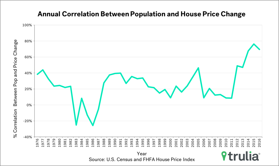
- The correlation between population growth and home price is near a 30-year high.
The Rust Belt continues to rust, while the Sun Belt continues to shine
Let’s first take a look at the basics. The metros with the fastest and slowest population growth between 2015 and 2016 are roughly the same as metros with the fastest and slowest population growth between 1986 and 2016, and they are concentrated in Sun Belt and Rust Belt states, respectively. For example, each of the 10 metros with fastest one-year and 30-year increases in population are in just 10 states, nine of which are in the Sun Belt : Arizona, California, Colorado, Florida, Georgia, Nevada, North Carolina, South Carolina, Texas, and Washington (non-Sun Belt). Cape-Coral-Ft. Myers, Fla., leads the one-year pack, growing its population by 2.9% during that span. Las Vegas leads the 30-year pack with more than a 270% increase in population.
| Sun Belt Metros Have Most Short-Run and Long-Run Population Growth | |||||
| One Year Change (2015 – 2016) | 30 Year Change (1986 – 2016) | ||||
| Metro | % Change in Population | % Change in Real House Prices | Metro | % Change in Population | % Change in Real House Prices |
| Cape Coral-Fort Myers, FL | 2.9% | 5.1% | Las Vegas, NV | 271.2% | 4.9% |
| Austin, TX | 2.8% | 6.0% | Raleigh, NC | 169.7% | 10.5% |
| North Port-Sarasota-Bradenton, FL | 2.5% | 6.5% | Austin, TX | 159.3% | 39.5% |
| Deltona-Daytona Beach-Ormond Beach, FL | 2.3% | 8.7% | Cape Coral-Fort Myers, FL | 157.5% | 31.2% |
| Raleigh, NC | 2.3% | 4.9% | Orlando, FL | 135.1% | 16.9% |
| Orlando, FL | 2.3% | 7.0% | Phoenix, AZ | 131.5% | 23.9% |
| Charleston, SC | 2.2% | 5.6% | Riverside-San Bernardino, CA | 126.9% | 47.6% |
| Colorado Springs, CO | 2.1% | 5.4% | Atlanta, GA | 107.9% | 3.0% |
| Tacoma, WA | 2.1% | 6.9% | Charlotte, NC | 98.3% | 19.5% |
| Jacksonville, FL | 2.0% | 9.0% | Dallas, TX | 94.4% | -1.7% |
| Among the 100 largest U.S. metro areas. Full data set can be downloaded here. | |||||
On the other hand, the 10 metros with slowest one-year and 30-year changes in population are in more geographically diverse states, but mostly concentrated in Rust Belt metros. These metros are scattered among nine states, six of which are in the Rust Belt : California (non RustvBelt), Connecticut, Illinois, Michigan, Hawaii (non Rust Belt), Louisiana (non Rust Belt), New York, Ohio, and Pennsylvania. Honolulu had the slowest one-year change population, but the drop was small with just a 0.6% decrease in population. Detroit had the largest decrease over 30 years, with a 19.3% population decline.
| Rust Belt Metros Have Slowest Short-Run and Long-Run Population Growth | |||||
| One Year Change (2015 – 2016) | 30 Year Change (1986 – 2016) | ||||
| Metro | % Change in Population | % Change in Real House Prices | Metro | % Change in Population | % Change in Real House Prices |
| Honolulu, HI | -0.6% | 4.6% | Detroit, MI | -19.3% | 15.7% |
| Syracuse, NY | -0.6% | 1.9% | Pittsburgh, PA | -6.9% | 28.9% |
| Detroit, MI | -0.6% | 4.0% | New Orleans, LA | -5.8% | 18.1% |
| Chicago, IL | -0.5% | 1.8% | Buffalo, NY | -4.4% | 22.9% |
| Pittsburgh, PA | -0.5% | 1.8% | Cleveland, OH | -3.1% | -2.1% |
| Fairfield County, CT | -0.4% | -0.2% | Philadelphia, PA | -2.5% | 47.6% |
| Hartford, CT | -0.4% | -0.5% | Toledo, OH | -1.1% | -8.6% |
| Los Angeles, CA | -0.3% | 4.5% | Syracuse, NY | 1.2% | -11.4% |
| Long Island, NY | -0.3% | 2.8% | Dayton, OH | 1.2% | -10.6% |
| New Haven, CT | -0.3% | -1.3% | Rochester, NY | 7.5% | -20.2% |
| Among the 100 largest U.S. metro areas. Full data set can be downloaded here. | |||||
Population Growth Highly Correlated with Home Price Growth
How much is population growth potentially driving the housing market? Quite strongly. It turns out 2015-2016 population change across the 100 largest U.S. metropolitan areas is highly correlated with house price growth across the same 100 metros. This is good news since population growth is a fundamental economic determinant of housing demand. Across U.S. metros, population growth had a 69.5% (out of a possible 100%) positive correlation with house price growth, the second largest correlation over the past 30 years and second only to last year’s correlation of 76.1%. The 30-year average correlation is 25.2%. While there are undoubtedly other economic fundamentals that are also correlated with price growth, such as changes in income and land availabilitybetween population and house price growth does provide evidence that bubble-phobes need not worry that non-economic fundamentals are pushing prices higher. That said, the housing market does face one other fundamental headwind: low inventory.


