The housing crisis hurt Democratic- and Republican-leaning markets similarly, but today blue markets have lower affordability, lower homeownership, and greater income inequality.
As Election Day 2014 approaches, we see sharp differences in local housing markets depending on whether they are blue or red. As the political urgency of the housing crisis fades, longer-term issues like declining affordability, low homeownership, and rising inequality are taking center stage. And these issues play out differently in Democratic- and Republican-leaning metros.
To show this, Trulia categorized the 100 largest metros as red or blue depending on their 2012 presidential vote. In 32 metros—the red markets—the Republican candidate, Mitt Romney, got more votes than the Democrat, President Obama. These include places like Houston, Cincinnati, and Salt Lake City. In 40 light-blue markets, including St. Louis, Austin, and Buffalo, Obama beat Romney by less than 20 percentage points. And in 28 dark-blue markets, including Los Angeles, New York, and San Francisco, Obama’s margin exceeded 20 points.
When we looked at housing trends in these metros, we found that the housing crisis and recovery affected red and blue markets similarly. But today’s pressing housing issues are more severe in blue markets.
The Housing Crisis Hit Both Red and Blue America
When the housing bubble of the mid-2000s burst, both red and blue markets felt the pain. The markets with the most severe housing busts included dark-blue metros like Detroit and Oakland as well as red markets like Bakersfield and Cape Coral – Fort Myers, FL. The peak-to-trough price decline averaged 16% in red markets, 26% in light-blue markets, and 25% in dark-blue markets. But the relationship between price declines and redness or blueness was not statistically significant. (See note.)
Nor does the recent recovery show any clear bias toward red or blue markets. In September 2014, home prices were up 7.0% year-over-year in red markets, 6.2% in light-blue markets, and 6.3% in dark-blue markets. The markets with the largest price increases included red metros like Palm Bay-Melbourne-Titusville, FL, and Birmingham, AL, and dark-blue metros like Miami and Toledo, OH. The relationship between year-over-year price increases and 2012 voting patterns is not statistically significant. Another recovery measure, the share of homes in foreclosure, also doesn’t show a statistically significant correlation with 2012 voting patterns.
| Key Housing Data in the Reddest Metros | |||||
| U.S. Metro | 2012 Vote Margin: Obama vs. Romney | Price Decline in Housing Bust, Peak-to-Trough | Year-Over-Year Price Change, Sept. 2014 | Median Asking Price Per Square Foot, $ | |
| 1 | Knoxville, TN | -34% | -8% | 2.1% | $98 |
| 2 | Tulsa, OK | -32% | -4% | 7.3% | $90 |
| 3 | Greenville, SC | -30% | -8% | 5.9% | $92 |
| 4 | Oklahoma City, OK | -27% | -3% | 4.0% | $98 |
| 5 | Fort Worth, TX | -23% | -6% | 6.4% | $94 |
| 6 | Salt Lake City, UT | -21% | -22% | 4.7% | $129 |
| 7 | Colorado Springs, CO | -21% | -12% | 4.0% | $107 |
| 8 | Birmingham, AL | -20% | -13% | 11.5% | $96 |
| 9 | Jacksonville, FL | -19% | -38% | 7.0% | $109 |
| 10 | Bakersfield, CA | -17% | -52% | 8.2% | $126 |
| Note: among 100 largest U.S. metros. Reddest metros are those with highest negative margin for Obama vs. Romney in 2012. See blogpost note for data sources. Data for all 100 metros available here. | |||||
| Key Housing Data in the Bluest Metros | |||||
| U.S. Metro | 2012 Vote Margin: Obama vs. Romney | Price Decline in Housing Bust, Peak-to-Trough | Year-Over-Year Price Change, Sept. 2014 | Median Asking Price Per Square Foot, $ | |
| 1 | San Francisco, CA | 58% | -23% | 9.9% | $613 |
| 2 | Oakland, CA | 50% | -39% | 11.9% | $342 |
| 3 | New York, NY-NJ | 49% | -18% | 4.3% | $320 |
| 4 | Detroit, MI | 47% | -40% | 11.4% | $75 |
| 5 | San Jose, CA | 42% | -26% | 8.6% | $430 |
| 6 | Los Angeles, CA | 42% | -35% | 6.9% | $334 |
| 7 | Honolulu, HI | 39% | -11% | 4.1% | $439 |
| 8 | Washington, DC-VA-MD-WV | 37% | -25% | 3.2% | $177 |
| 9 | Fort Lauderdale, FL | 35% | -48% | 6.9% | $143 |
| 10 | Seattle, WA | 35% | -26% | 8.9% | $197 |
| Note: among 100 largest U.S. metros. Bluest metros are those with highest positive margin for Obama vs. Romney in 2012. See blogpost note for data sources. Data for all 100 metros available here. | |||||
Affordability Is a Bigger Problem for Blue Markets
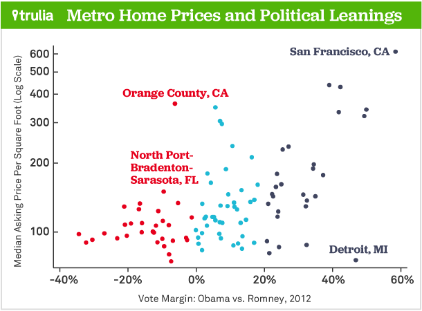
Things look fundamentally different when we compare red and blue markets in terms of affordability and related measures. The tables above show that none of the 10 reddest markets had a median asking price per square foot above $130 in Sept. 2014. But nine of the 10 bluest markets did. Looking across all 100 largest metros, the correlation between price-per-square-foot and 2012 vote margin was positive, high (0.63), and statistically significant. In fact, the only expensive red market was Orange County, CA, at $363 per square foot. There was a huge drop-off to the next-most-expensive red market—North Port-Bradenton-Sarasota, FL, at $150 per square foot.
When we plot local market home price per-square-foot and the 2012 presidential vote, we see that most of the red metros are clustered in the lower left-hand corner of the figure, where prices were lowest.

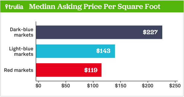
Strikingly, housing costs nearly twice as much in dark-blue markets ($227 per square foot) than in red markets ($119).

Sure, households in blue markets tend to have higher incomes. But those higher incomes are not enough to offset higher home prices. Our middle-class affordability measure, which reflects the share of homes for sale within reach of a median-income household, is significantly lower in bluer markets. Furthermore, blue markets have lower homeownership and greater income inequality than red markets. As with affordability, the relationships between homeownership and inequality on one hand and 2012 voting patterns on the other hand are statistically significant.
What does all this mean? The point is not that Democrats cause expensive housing, lower homeownership, or greater inequality. Determining whether and how the political views of voters or their elected officials affect local housing markets is the stuff of scholarly research, not short blogposts. But because blue markets are less affordable, have lower homeownership, and have greater income inequality, political leaders in Democratic-leaning and Republican-leaning metros may push for different policies.
Furthermore, these local differences in home prices mean that some national housing policies favor red markets and others blue markets. For instance, the current system of conforming loan limits benefits red markets more because homes in those markets are likelier to fall within local loan limits. But the mortgage interest deduction benefits blue markets more, thanks to higher home prices and more residents in higher tax brackets. Such differences could make it harder to reform these long-standing policies. In short, the differences between blue and red local housing markets may add to the challenge of reaching agreement on national housing policies.
Note: Metro-level 2012 Presidential election data are aggregated from county-level data in the Atlas of U.S. Presidential Elections. Peak-to-trough price declines are calculated from the Federal Housing Finance Agency House Price Index. Year-over-year price changes and median asking prices per square foot are from the Trulia Price Monitor. Correlations mentioned in this post are metro-level, weighted by number of households in the metro, and statistically significant if p<.05. The correlation of price per square foot and vote margin is calculated using the natural log of price per square foot.

