Introduction
At Trulia we deal with a lot of spatial information: housing markets vary dramatically from one part of the country to another, as do the demographics of each region. Being able to visualize these regional differences helps us to understand them. Choropleth maps are a useful way to visualize this kind of information. In a choropleth, regions are colored based on some metric, such as which presidential candidate a state voted for. I recently created a package in R to facilitate creating choropleths called choroplethr. choroplethr also makes it easy to visualize data from the US Census. You can install it from an R console like this:
# install.packages("devtools")

library(devtools)

install_github("choroplethr", "trulia")

library(choroplethr)
The American Community Survey (ACS)
choroplethr was initially created to visualize information from the American Community Survey (ACS). The ACS is an ongoing statistical survey run by the US Census Bureau. Most people are familiar with the decennial census, which asks a handful of questions of all Americans every 10 years. The ACS, by contrast, asks a large number of questions of a sampling of the population every year. You can learn more about the ACS here. An important point to note is that, because the ACS only samples the population, all of the reported numbers are estimates. The results from the ACS are summarized and available as tables. You can see a list of the 2011 5-year ACS tables here. Thoughout this blog post we will be using table B19301 which contains information about per capita income in the last 12 months. choroplethr uses the R package acs to get ACS data. The acs package was developed by Ezra Glenn, a lecturer in the Department of Urban Studies and Planning at MIT.
The choroplethr_acs function
The State level of detail
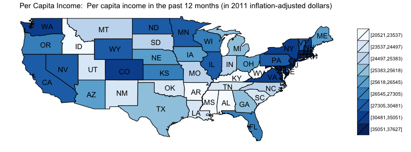
To view a choropleth of an ACS table you simply need to call the function choroplethr_acs and pass it a table number from the 2011 5-year ACS and a level of detail (LOD). Valid LODs are “state”, “county” and “zip”. For example, to see a choropleth of state-level per-capita income type:
choroplethr_acs(tableId="B19301", lod="state")
By default choroplethr divides the lower 48 states into 9 equally sized buckets and colors the buckets using a sequential brewer scale, where darker colors indicate a larger value. Many patterns become immediately apparent when the data is displayed this way. For example, there are clusters of wealth in the northeast and west coasts, as well as the north central part of the county. Additionally, there is a cluster of lower-income states in the southeast. From the legend we can see that the difference between the richest and poorest states is approximately $17,000, and each bucket covers approximately $2,000. choroplethr renders maps with the ggplot2 library.
The County level of detail
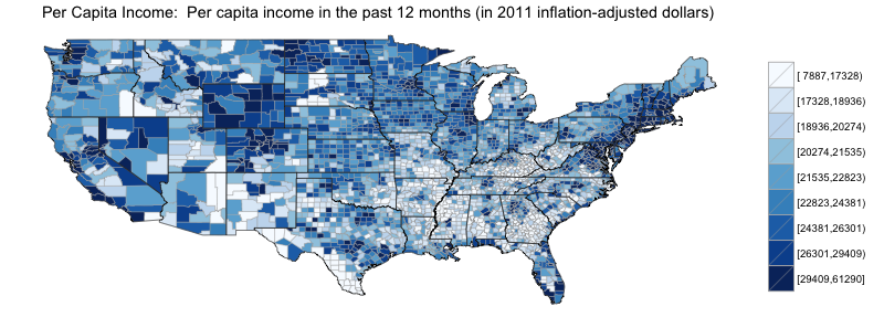
Things change dramatically when we look at the same dataset at the county level of detail:
choroplethr_acs(tableId="B19301", lod="county")
Many people are not familiar with county-level maps of the continental US and are surprised by both the number of counties (3,076) and their relative size (counties on the west coast tend to be larger than counties on the east coast). Like before, choroplethr divides each region into 9 equally sized buckets. This map allows us to look within a state, and see that some states have both extremes of wealth, while some are more consistent. It is instructive to compare and contrast these two maps.
It is worth studying the legend as well. Now the scale has a range of $53,000; moving from the state LOD to the county LOD increased the range of our scale by over 3x. This is a trend that occurs frequently in choropleths: as the level of detail becomes higher the range of the scale increases as well. Another trend is that the buckets at the extremes cover an increasingly large amount. The highest bucket now covers a range of approximately $32,000, which is larger than the entire range covered in the state choropleth. The lowest bucket now covers approximately $9,000.
The Zip level of detail
The highest level of detail that choroplethr supports is the zip code. From both a mapping and demographic standpoint zip codes are problematic. On the one hand, zip codes are useful because they are smaller than counties (so you can get a higher level of detail) and everyone knows which zip code they live in (so they are an intuitive unit for people). On the other hand zip codes are managed by the postal service for the sole pupose of delivering mail. This means that they can change without notice and are not always polygons. For an in depth discussion of these problems see this article from georeference.org; for an overview of zip codes in general see this article on Wikipedia.
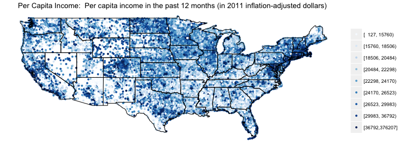
Despite these problems the US Census Bureau attempts to capture demographics at the zip level. They have created ZCTAs (Zip Code Tabulated Areas) which roughly correspond to zip codes. You can learn more about ZCTAs here. Because of these issues choroplethr renders zip code choropleths as scatterplots. It uses the zipcode package, created by Jeffrey Breen, to map each zip code to a longitude and latitude point. To render an estimate of per capita income at the zip code level type this:
choroplethr_acs(tableId="B19301", lod="zip")
The acs package returns 32,481 ZCTAs for this query, so overplotting is a serious issue. That being said, it is still an informative map. For example, many people are surprised by the low number of zip codes in the western part of the US. Also, the color distribution between the county and zipcode maps is roughly analogous. Additionally, the range of the scale has increased dramatically to $375,900. The highest bucket alone accounts for $339,000 of that range.
At the zip LOD outliers and sampling error become a serious issue. For exampe, it is unlikely that the median annual per-capita income in zip 54307 is truly $137. The acs package was developed to make it easy to access not only estimates, but also the statistical uncertainty measurements that accompany these estimate. You can learn more about these features of the acs package here. As an aside, you can learn more about zip code 54307 by simply typing zip 54307 in google.
Discrete and ?Continuous Scales
Discrete Scales
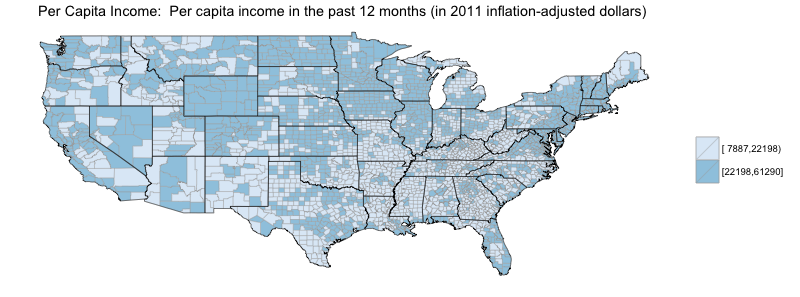
By default choroplethr creates a scale by dividing each region into 9 equally sized buckets. This is an example of a discrete scale. For discrete scales you can choose between 2 and 9 equally sized buckets, and each bucket size provides you with different information. For example, using two buckets will show you which regions are above and below the median. Here is how to show which counties have above and below the median income:
choroplethr_acs(tableId="B19301", lod="zip", num_buckets=2)
Continuous Scale
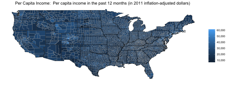
Setting num_buckets to 1 will force a continuous scale:
choroplethr_acs(tableId="B19301", lod="county", num_buckets=1)
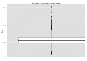
What’s notable about this map is that most of the regions appear to be the same color. To understand why, it is ?useful to view the values as a boxplot:
Most counties have a per capita income in the range of $20,000-$25,000. But there are outliers both over $60,000 and below $6,000. Because a single color range must contain all values, most values are mapped to a similar color.
The choroplethr function
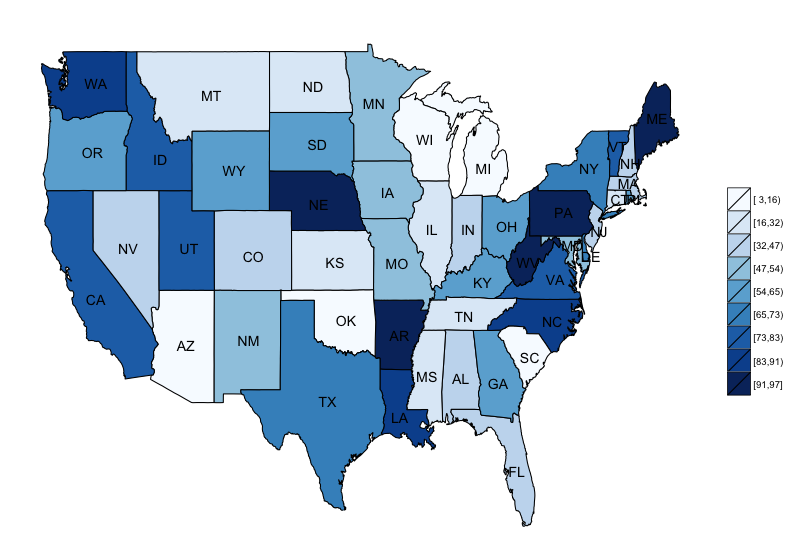
All of our examples so far has used the choroplethr_acs function to create choropleths of ACS data. But we can create similar maps of arbitrary data with the choroplethr function. All of the parameters are the same except for the first: instead of a tableId, we pass in a data.frame with one column named region and one column named value. For state level choropleths region can be any common naming of a state (e.g. “California”, “california” or “CA”):
df = data.frame(region=state.abb, value=sample(100, 50))

choroplethr(df, lod="state")
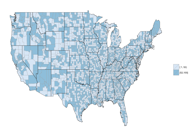
For county level choropleths region must be a 4 or 5 digit county FIPS code:
data(county.fips, package="maps")

df = data.frame(region=county.fips$fips, value=sample(100, nrow(county.fips), replace=TRUE))

choroplethr(df, lod="county", num_buckets=2)
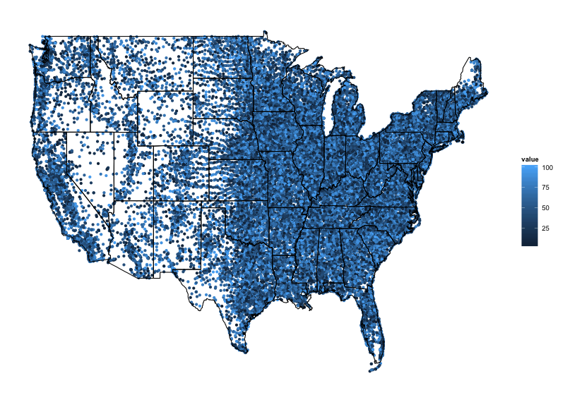
For zip level choropleths, region must be a 5 digit zip code
data(zipcode, package="zipcode", envir=environment())

df = data.frame(region=zipcode$zip, value = sample(100, nrow(zipcode), replace=TRUE))

choroplethr(df, lod="zip", num_buckets=1)
Conclusion
I hope that you found this tour of choroplethr version 1.0.0 useful. In summary, choroplethr seeks to provide a simple interface to create choropleths in R at 3 levels of detail (state, county and zip) and 2 scale types (discrete and continuous). It attempts to work seemlessly with the acs package to create choropleths of US Census data.
Version 1.1.0, which is already under development, will support rendering choropleths for a subset of states, as well as mapping data from any ACS, not just the 2011 5-year survey.
Questions and Discussion
If you have any technical support issues, feature requests or want to share your results, please post at the choroplethr google group.
