This post is a continuation of our recent article describing Trulia’s approach to collaboration between design and engineering, and will give a deep dive into the animation frameworks used for Trulia’s Affordability Calculator. Specifically, we’ll cover the initial design requirements and the animation frameworks evaluated.
Initial Design Requirements
Before we dive in, it’s important to consider our goal with the Affordability Calculator: help consumers understand what they can afford in a home, so they can tailor their search to their reality.
Mortgage can be a scary word to many people, especially first-time buyers, so we knew the calculator had to be friendly, and easy to understand and use. Design and development went through several different design iterations before landing on the final design.
You can see subtle, yet, important differences in the below comparison, which looks at the original UI requirements and the final implementation. You might notice the input fields are generally larger in the final version to address ease-of-use for mobile devices, and that the pattern at the top of the page is more subtle and less distracting, among other things.
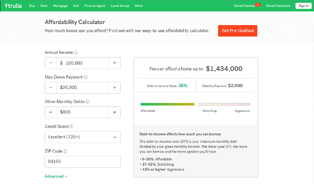
Initial design of the Trulia Affordability Calculator
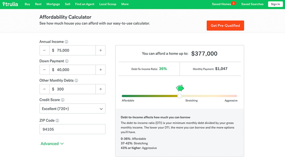
Final design of the Trulia Affordability Calculator
Adding Animations
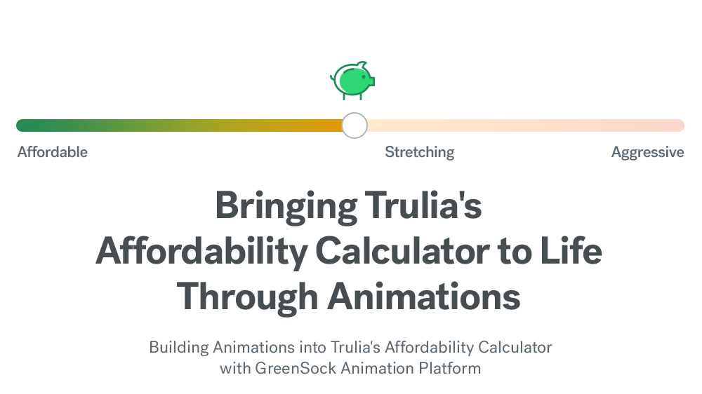
As part of our effort to ensure the calculator is friendly and easy to use, we decided to add an animation that shows how the debt-to-income (DTI) ratio affects money spent versus money saved. Our intent is for this animation to be a fun element that clearly displays important information but doesn’t distract too much from the financial tool.
We settled on animating a piggy bank that scales with the DTI ratio. Once that was settled, it was time to analyze some of the animation libraries available in React so we could start building. Here’s what we considered:
ReactTransitionGroup & ReactCSSTransitionGroup
To build our piggy bank slider, we used React. React has some great animation add-ons, like ReactTransitionGroup and ReactCSSTransitionGroup. ReactCSSTransitionGroup is a higher-level API to access the functionality exposed by ReactTransitionGroup. These APIs are based on Angular’s ngAnimate module.
These add-ons are great to tie CSS animations with React’s lifetime events, like when a component – in this case our piggy bank –mounts or unmounts. In our case, the animations are in response to consumer interactions. We wanted the option to stop and reverse the animation timeline while playing. So, instead of introducing multiple CSS keyframe animations, we decided to have animations defined in JavaScript in order to better control the playback.
React Motion
React Motion is one of the most widely adopted animation libraries for React. React Motion uses a physics-based approach to animate components. Simply define the attributes of a spring – stiffness and damping – and the library will update the animation targets. The benefit of defining the desired final state of the animation, instead of the parameters to achieve it, is that it promotes a more continuous and fluid approach. Meaning, the animation is seamless and doesn’t stop and restart if a consumer changes direction. The animations feel natural and never end in an inconsistent state, even when halted in response of user input.
While our engineering team is very fond of this library, it isn’t always easy to achieve the desired behavior and feel detailed in the design specifications. In the end, we opted for a more declarative animation platform: GreenSock Animation Platform. We chose GSAP because of its powerful API, comprehensive documentation and ease of use.
With the framework choice settled, we needed to work through the animation timelines. We envisioned two timelines:
- The scale of the piggy bank, driven by the value of the DTI slider
See the Pen Affordability Animations | Piggy Bank by matteom_zillowgroup (@matteom_zillowgroup) on CodePen. - The flow of the coins: either floating in or out of the piggy bank
See the Pen Affordability Animations | Coins by matteom_zillowgroup (@matteom_zillowgroup) on CodePen.
To optimize performance and reduce memory allocation, we define the scale timeline once, when the component mounts. “Scrubbing” the DTI slider drives the progress on the animation timeline.
The coin animation starts when the user starts dragging or changes direction. When the animation is reversed, we add additional keyframes to ensure the previous animation doesn’t end too abruptly.
Additionally, we check for continuous drag motion and only queue a new animation when the previous one completed.
Other improvements
Once the layout implementation was complete, we focused on areas to make using the calculator “feel nice.” Throughout the development of the calculator, we identified and implemented the following improvements to enhance the user experience:
Slider with non-uniform scale
The slider range values go from 0 to 50, but we mapped the values to an inverted bell curve to ease the selection and have more control over the DTI value, when supported by the browser.
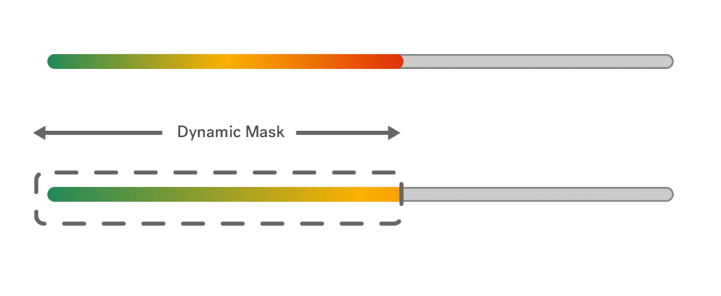
SVG gradient implementation
Lower DTI values are considered less risky and we wanted to express this correlation with a color gradient. Specifically, we didn’t want to show a red bar upon loading the page, given the negative connotation it would have. Dynamically updating the color stops of the gradient in JavaScript is tedious and especially hacky when targeting pseudo selectors, so we implemented our sliders as SVG graphics and resized a mask to show a portion of the gradient based on the DTI slider.
This Affordability Calculator aside, Trulia engineering is always looking for ways to improve the consumer experience, which is part of what makes working at Trulia fun. If you’re interested in joining us, check out our current job postings here.