
The share of U.S. homes listed for sale with at least one price cut is at its highest level since 2014, more evidence of a market that may finally be tilting in homebuyers’ favor. But not all would-be home buyers are likely to benefit equally.
For much of the first half of 2018 the share of listings on Trulia with a price reduction was largely unchanged from 2017, before shooting up in July and August. Coupled with home price growth that has begun to slow, and inventory levels that are creeping back up in some places, a higher rate of price cuts could be a critical third confirmation that things may finally be shifting in buyers’ favor.
Here’s what we found:
- On a month-to-month basis, after a steady start to the beginning of the year, the percent of listings nationwide with at least one price reduction climbed to 17.2 percent in August – the highest national rate since August 2014.
- Looking at a whole year of data from August 2017 through August 2018, the share of listings with a price cut rose in 58 of the 100 largest metros.
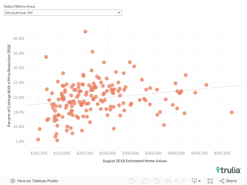
- In 79 of the 100 largest metros, there is a positive relationship between how expensive a neighborhood is and the proportion of listings with at least one price cut over the past year: Homes in pricier neighborhoods have listing prices slashed more often than those listed in neighborhoods where homes are less expensive. Budget-conscious buyers in more-affordable neighborhoods may have a harder time finding a bargain.
- The typical price reduction has gotten smaller since the early years of the recovery. Across the 12 months ending August 2018, the median reduction nationwide knocked 2.6 percent off the listing price – during the same period in 2011-2012, the median reduction was 4 percent.
After Holding Steady, Price Cuts Rising Again
For much of the first half of 2018, the nationwide prevalence of price reductions was largely unchanged from the same time in 2017. But as summer progressed, price reductions increased, reaching 17.2 percent of all U.S. listings in August – the highest rate since August 2014 (17.3 percent). An increasing prevalence of price cuts doesn’t necessarily indicate a definitively cooling market. But given that home value appreciation rates are also edging lower and inventory is increasing in many supply-strapped markets, it seems clear the home-search process may getting easier for buyers for the first time in a long time.
At least for some buyers – because as with most things, it pays to have a bigger budget and time to do some research.
| Metros With The Largest Swings in Price Cuts YoY | ||||||
| Rank | Geography | % of Listings with at Least One Price Reduction In the Month of – | Percentage Point Change in Reductions | Estimated Home Values | ||
| Aug-18 | Aug-17 | 2017-2018 | Aug-18 | 2017-2018 Change | ||
| 1 | Las Vegas-Henderson-Paradise, NV | 20.8% | 12.6% | 8.1 | $273,094 | 15.3% |
| 2 | San Jose-Sunnyvale-Santa Clara, CA | 15.5% | 7.6% | 7.9 | $1,285,620 | 21.5% |
| 3 | Seattle-Bellevue-Everett, WA | 20.0% | 12.0% | 7.9 | $567,612 | 8.3% |
| 4 | Anaheim-Santa Ana-Irvine, CA | 21.6% | 15.8% | 5.7 | $726,727 | 5.4% |
| 5 | San Diego-Carlsbad, CA | 26.4% | 21.0% | 5.4 | $592,325 | 6.1% |
| 6 | Riverside-San Bernardino-Ontario, CA | 18.8% | 13.6% | 5.2 | $364,313 | 7.3% |
| 7 | Los Angeles-Long Beach-Glendale, CA | 16.5% | 12.1% | 4.4 | $612,809 | 6.3% |
| 8 | Sacramento–Roseville–Arden-Arcade, CA | 22.0% | 17.7% | 4.3 | $404,082 | 5.2% |
| 9 | Tacoma-Lakewood, WA | 19.9% | 15.8% | 4.1 | $336,529 | 10.8% |
| 10 | Oakland-Hayward-Berkeley, CA | 13.6% | 9.5% | 4.1 | $766,886 | 7.9% |
| National | 17.2% | 16.7% | 0.5 | $216,700 | 6.5% | |
| 91 | St. Louis, MO-IL | 16.5% | 18.3% | -1.8 | $163,012 | 5.8% |
| 92 | Raleigh, NC | 17.9% | 19.7% | -1.8 | $258,692 | 6.0% |
| 93 | Pittsburgh, PA | 14.0% | 15.8% | -1.8 | $142,953 | 7.5% |
| 94 | Columbia, SC | 17.0% | 18.8% | -1.8 | $136,586 | 5.7% |
| 95 | Wichita, KS | 15.8% | 18.3% | -2.5 | $129,331 | 4.8% |
| 96 | Montgomery County-Bucks County-Chester County, PA | 17.8% | 20.4% | -2.6 | $321,754 | 4.2% |
| 97 | Austin-Round Rock, TX | 17.7% | 20.6% | -3.0 | $300,911 | 6.4% |
| 98 | Oklahoma City, OK | 19.7% | 23.2% | -3.5 | $143,942 | 3.3% |
| 99 | Denver-Aurora-Lakewood, CO | 21.0% | 24.7% | -3.6 | $401,539 | 6.9% |
| 100 | San Antonio-New Braunfels, TX | 20.2% | 24.0% | -3.8 | $188,345 | 6.1% |
| Note: Click here for the full data | ||||||
Bigger Budgets = Better Bargains?
To ensure that we had a big enough pool of listings to run our analysis at a neighborhood level and to control for different seasonality trends between metros, we examined all listings in a given area over the past 12 months (Sept. 1 2017-Aug. 31 2018) and calculated the percent of these listings that had at least one price reduction over the course of the year. In 79 of the largest 100 metros, there is a positive relationship between how expensive a neighborhood is and the proportion of listings with at least one price cut over the past year: Pricier neighborhoods have listing prices slashed more often than neighborhoods where homes are less expensive. So budget-conscious buyers searching in their city’s most affordable neighborhoods might have a harder time finding a bargain.
This relationship is especially strong in places like Camden, N.J., and Raleigh, N.C. Raleigh’s more expensive Glenwood and Five Points Neighborhoods, where median home values are currently $676,500 and $519,400, respectively (compared to a metro-wide median of $258,692), have seen 18.9 percent and 16.7 percent of their listings go through at least one price cut over the past year. Meanwhile, in the less expensive neighborhoods of South Raleigh and Southeast Raleigh, only 5.8 percent and 6.7 percent of listings have had a price cut in the past 12 months. In Camden, N.J., it’s a similar story: 21.5 percent of listings in Springdale, the city’s most expensive neighborhood, had a price cut in the year-ended in August; in Bergen Square, among the city’s least expensive areas, just 8.6 percent of listings had a price cut over the same time.
Diligent buyers may also want to take some time traversing their city to find neighborhoods with more bargains. In Atlanta as a whole, 12.1 percent of all listings had at least one price reduction during the year-ended August 2018. But in the Bankhead neighborhood just northwest of downtown there was not a single listing with a price reduction over the same period, while more than half (51.7 percent) of listings in the Fernleaf neighborhood had a least one price reduction – the highest such share of any neighborhood nationwide.[1]
This type of variation from neighborhood-to-neighborhood is common within metros. Sacramento’s Del Paso Park had only 1.7 percent of its listings go through a price reduction over the period analyzed, while 46.5 percent of listings in Carelton Tract, on the other side of the downtown area, had a price reduction. Click here for neighborhood level data.
[1] Among neighborhoods analyzed with a minimum of 25 homes listed for sale from September 1, 2017 through August 2018.
What Goes Down, Can Also Go Up
The growing prevalence of price reductions is likely to be welcomed by home shoppers, but the news could be tempered somewhat by the fact the median price reduction itself is getting smaller. For the 12 months ending August 2018, the median listing price reduction nationwide knocked 2.6 percent off the listing price. This has been declining steadily from the same 12-month period ending in 2012, when the median U.S. price reduction was 4 percent. The median percent decrease of a price reduction today is less than the median price reduction at the outset of the recovery in 97 of the 100 largest metros analyzed.
The smallest price cuts, at just 1.3 percent at the median, can currently be found in San Antonio. The largest price drops are on homes in San Francisco and Detroit, where listings that go through a price reduction see a median drop of 4.6 percent (or roughly $64,000 based on the median home value) and 4.1 percent (or roughly $3,140 based on the median home value), respectively.
Finally, there’s one last catch for buyers examining price changes: Prices don’t always have to come down, and in fact, price hikes are also somewhat more common among listings than they used to be. During the year ending this August, 15.9 percent of all listings nationwide had a price change of any kind – 88 percent of which were reductions (meaning, presumably, that 12 percent had their price nudged upward to some degree). In 2012, only 13.7 percent of listings had any kind of price change, and 93.2 percent of those were reductions.
And that’s where the similarities between the City by the Bay and Motown largely end. In San Francisco, just 7.3 percent of listings went through a price change in August – up or down – and only 79.7 percent of those price changes were reductions. In Detroit, over the same period, 16.9 percent of listings had at least one price change, and 89.4 percent of were reductions.
Methodology
This report was developed using our For-Sale listing data. The report uses the entire price history of every listing found on Trulia’s website, dating from Sept. 1, 2011 through Aug. 31, 2018. We calculated the total number of unique properties in each month and, the number of unique properties each month that saw at least one price change and broke those changes out into reductions vs increases. This enabled us to calculate the percentage of listings that saw a price reduction. Metro areas found in this report are metropolitan divisions where available, but are otherwise metropolitan statistical areas, both as defined by the U.S. Census Bureau. For neighborhood-level data, only neighborhoods with at least 25 listings over a year were considered, compared and discussed.